Transformed a mix of visuals into a consistent, trust-driven AI brand
When your tech saves lives, your brand better look the part
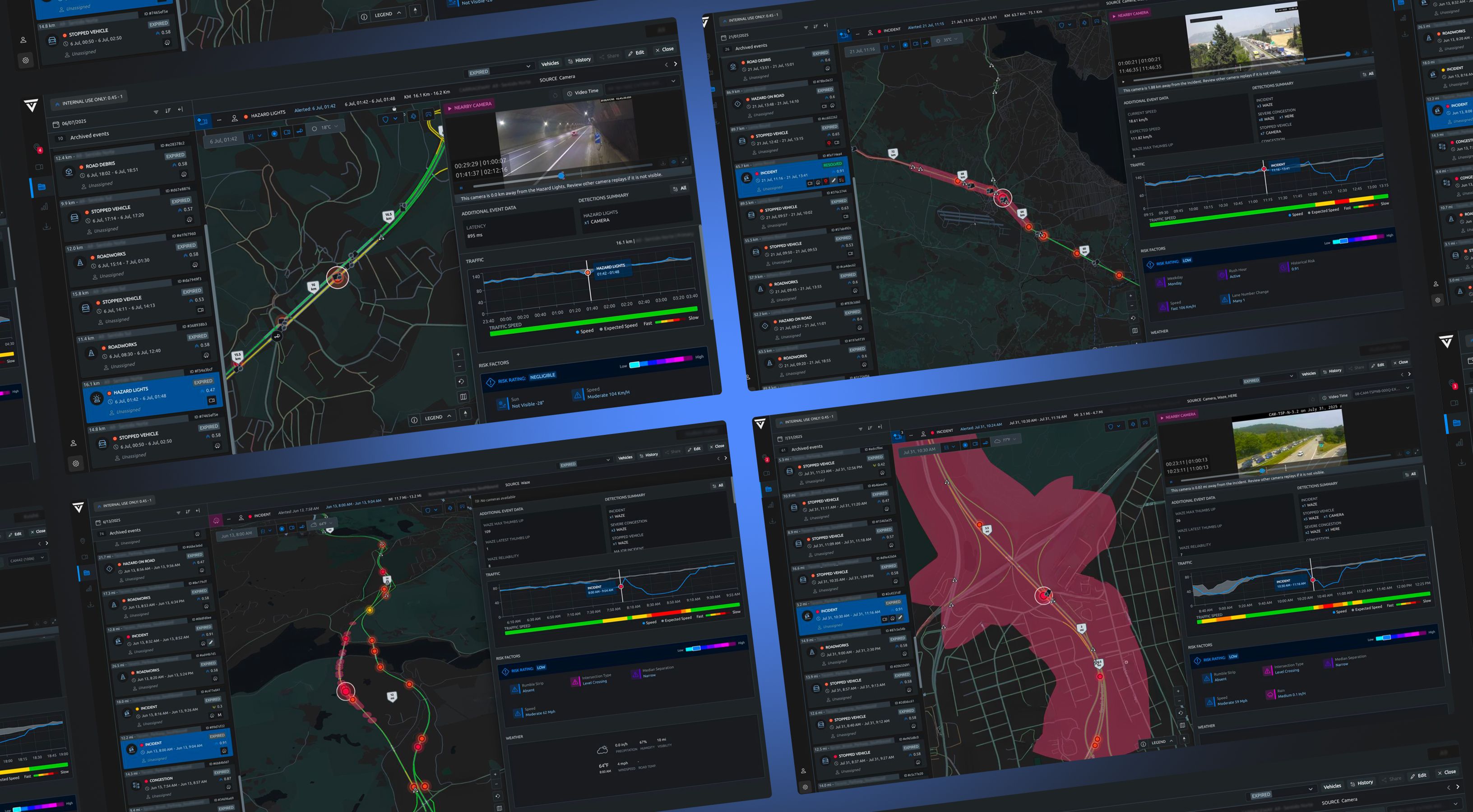
Valerann is a British AI company that helps road owners spot incidents in real-time—from stalled vehicles on highways to recurring accident hotspots. Their system sends alerts and analytical reports that inform critical infrastructure decisions.
When we first started working together, the main challenge was speed—delivering videos and massive presentations in just a day or two. But soon we realized the real design challenge wasn’t time—it was turning a noisy mix of visuals into a consistent brand that could earn the trust of a tough audience: officials and road owners. So we initiate a rebranding.
From dark tech to document-inspired design
Working with government and infrastructure clients means looking the part. The old concepts felt dark and overly techy, so we go light, clean, and document-inspired. Built on Swiss typography, the design feels systematic and neutral without the sci-fi vibe. The geometric logo became our anchor: strong enough to carry the whole system.
Occasional glass accents add openness and trust—essential when you’re asking governments to integrate your AI. We dropped the 3D models of traffic lights or road cameras—we didn't want to suggest Valerann sells physical equipment. They sell intelligence, not hardware.
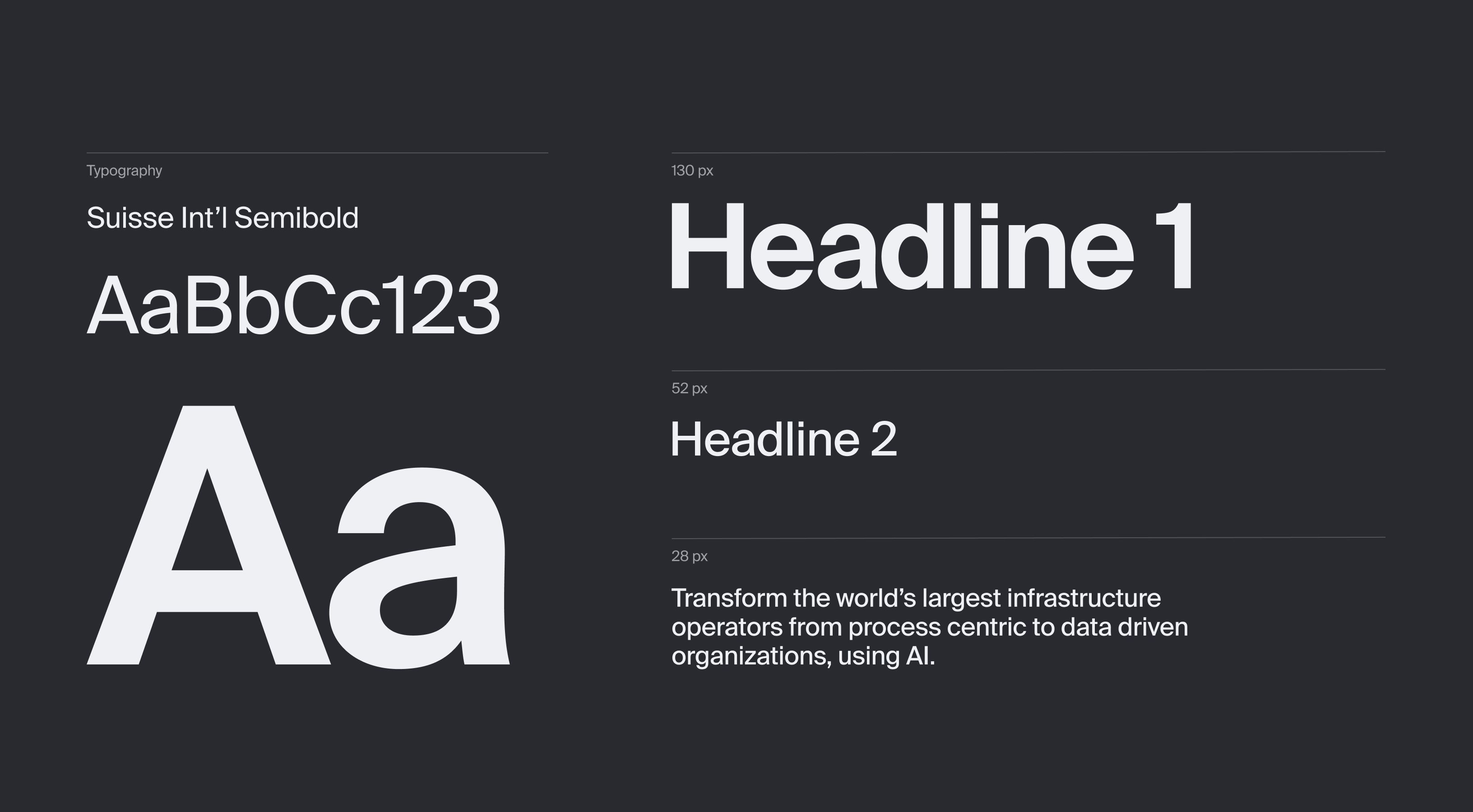
Swiss precision meets digital trust
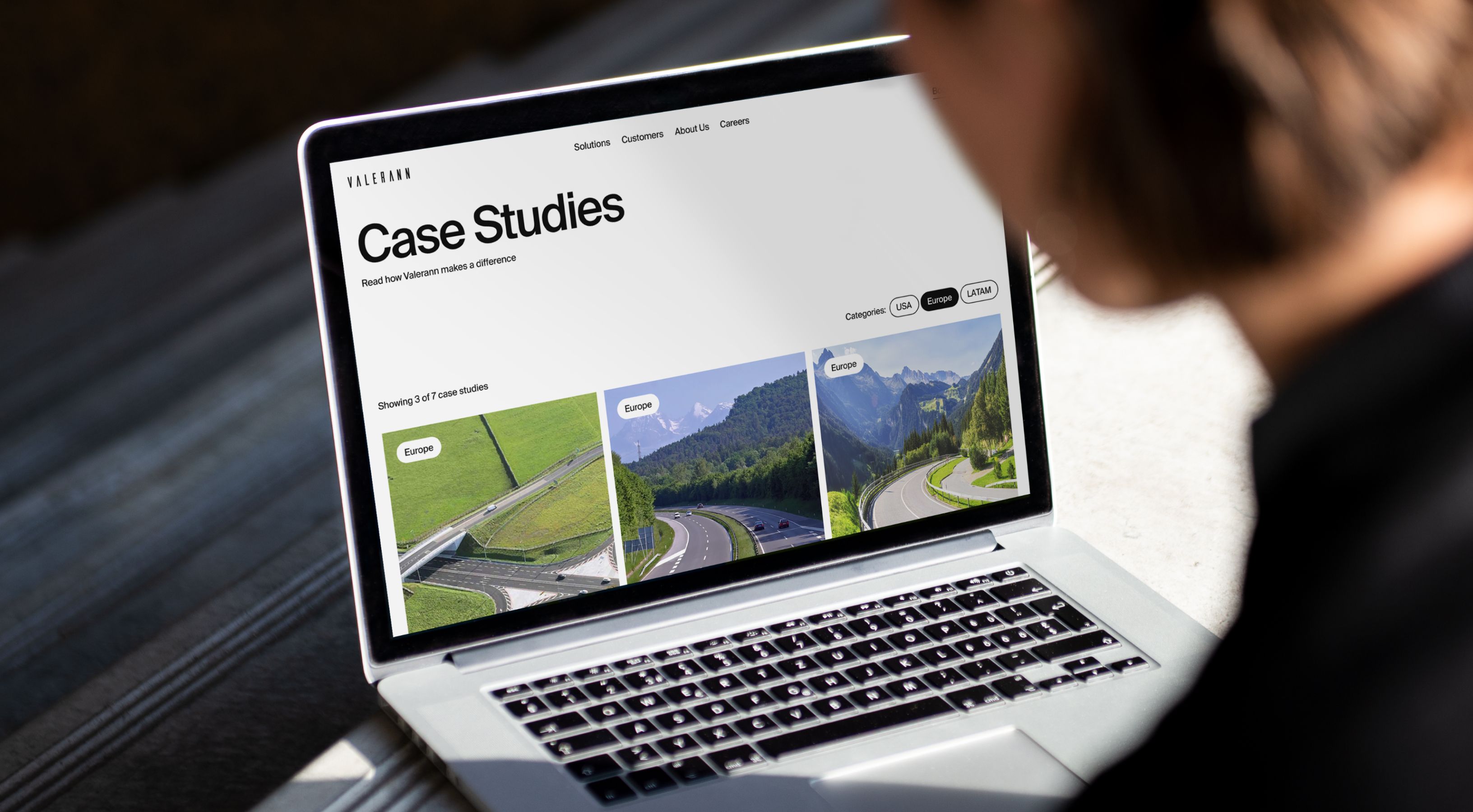
We designed a homepage concept to show how the new identity performs on Valerann’s most important digital touchpoint. The layout handles complex information clearly, builds trust through a clean, professional look, and showcases technology.
The homepage opens with high-quality road footage that sets the scene instantly. Square icons with soft interiors keep the interface consistent, while subtle hover effects in brand colors add interactivity without clutter. The case study page includes country-based filtering for quick navigation.
Q-mates—the on-demand creative department
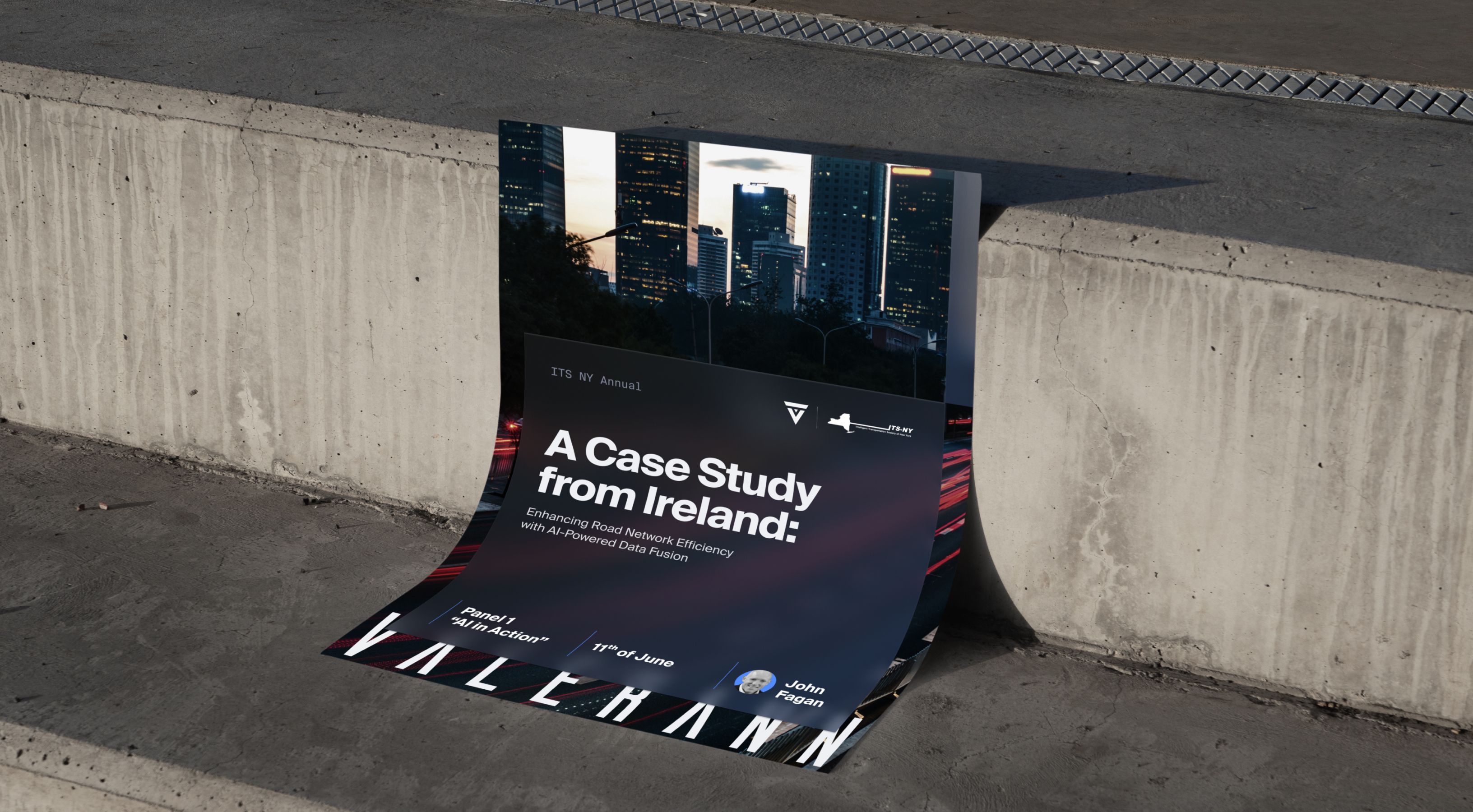
Qream became their rapid-response design team—adapting to constant pivots, tight timelines, and evolving needs. We deliver LinkedIn posts announcing conference appearances and partnerships, email signatures with animated elements, key cards for hotel partnerships at awards ceremonies (yes, we design those too), intro/outro templates that maintain brand consistency across all video content. Q also delivers presentation decks built under brutal 1-2 day deadlines.
The transformation that sticks
The brand that builds trust
Mature aesthetic that's serious enough for government contracts and global partnerships.
Consistent system
Every asset now works together, reinforcing brand recognition
across all touchpoints.
Quick design’s approval
What used to require multiple revision rounds now gets approved with minimal changes.