Designing clarity for brutal industrial engineering: website for Triol
Let’s make complex tech feel effortless
Triol builds hardcore tech for hardcore environments: variable speed drives, downhole telemetry, and automation platforms for oil & gas, mining, marine, water, and manufacturing industries. Their systems work in 30+ countries and thousands of projects, turning brutal conditions into stable performance. But their digital presence didn’t reflect their power.
The brand lives in a space where everyone looks the same, so our goal was to show complex engineering in a way that is usable and even visually pleasing. We had to translate tech into an interface that’s intuitive, conversion-focused, and still respects the seriousness of the field.
We had a starting point—not a black canvas
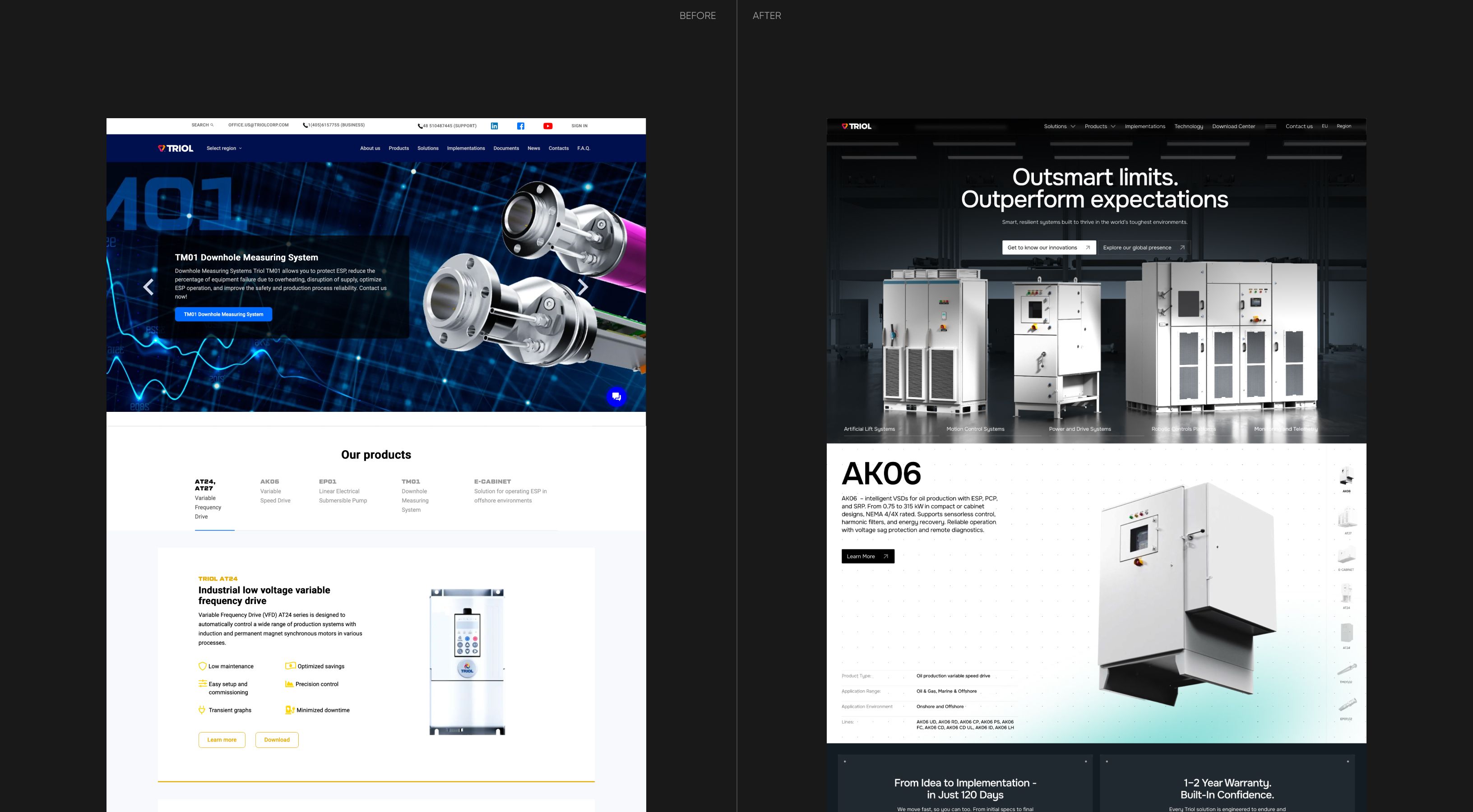
Triol had wireframe drafts and a vision for the key pages, so we didn’t start from scratch. But the structure felt a little overloaded, the content would look heavy on pages, and UX could’ve only complicated their products.
That’s why we redefined the page logic, redistributed blocks, and trimmed the noise, so users could actually find what they needed. In the result, we got focused screens that guide, won’t confuse, and are aimed straight at conversion.
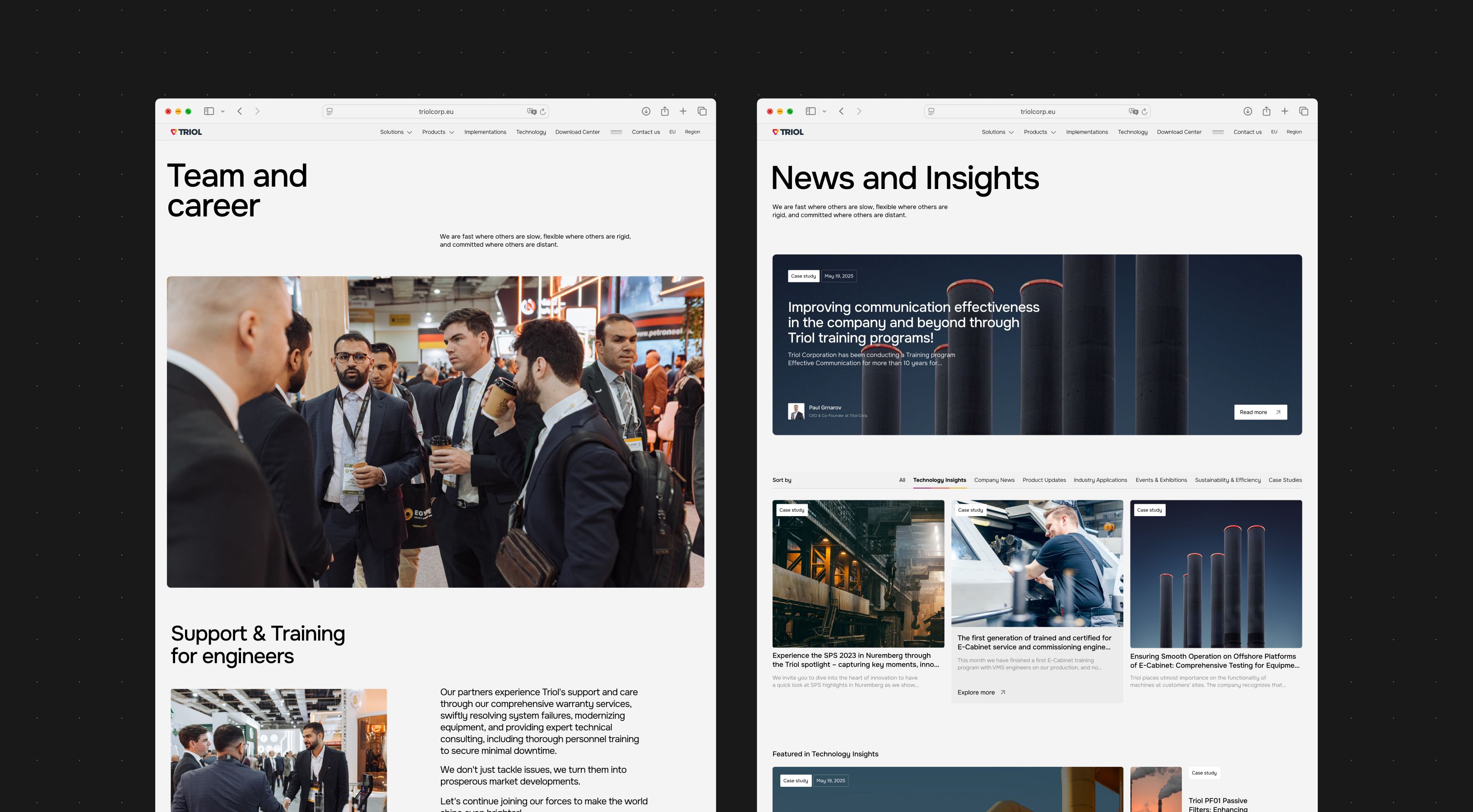
Creating visual architecture
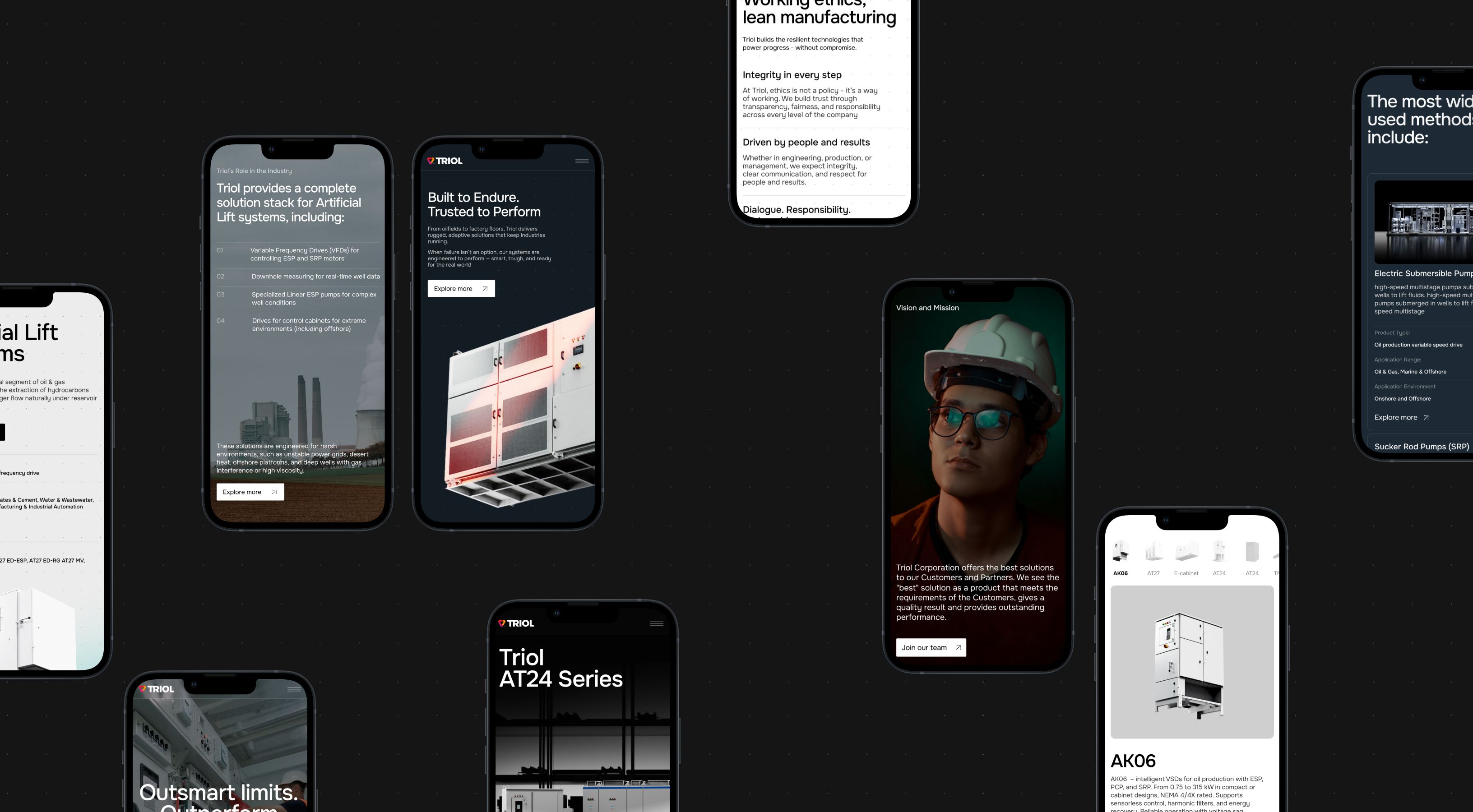
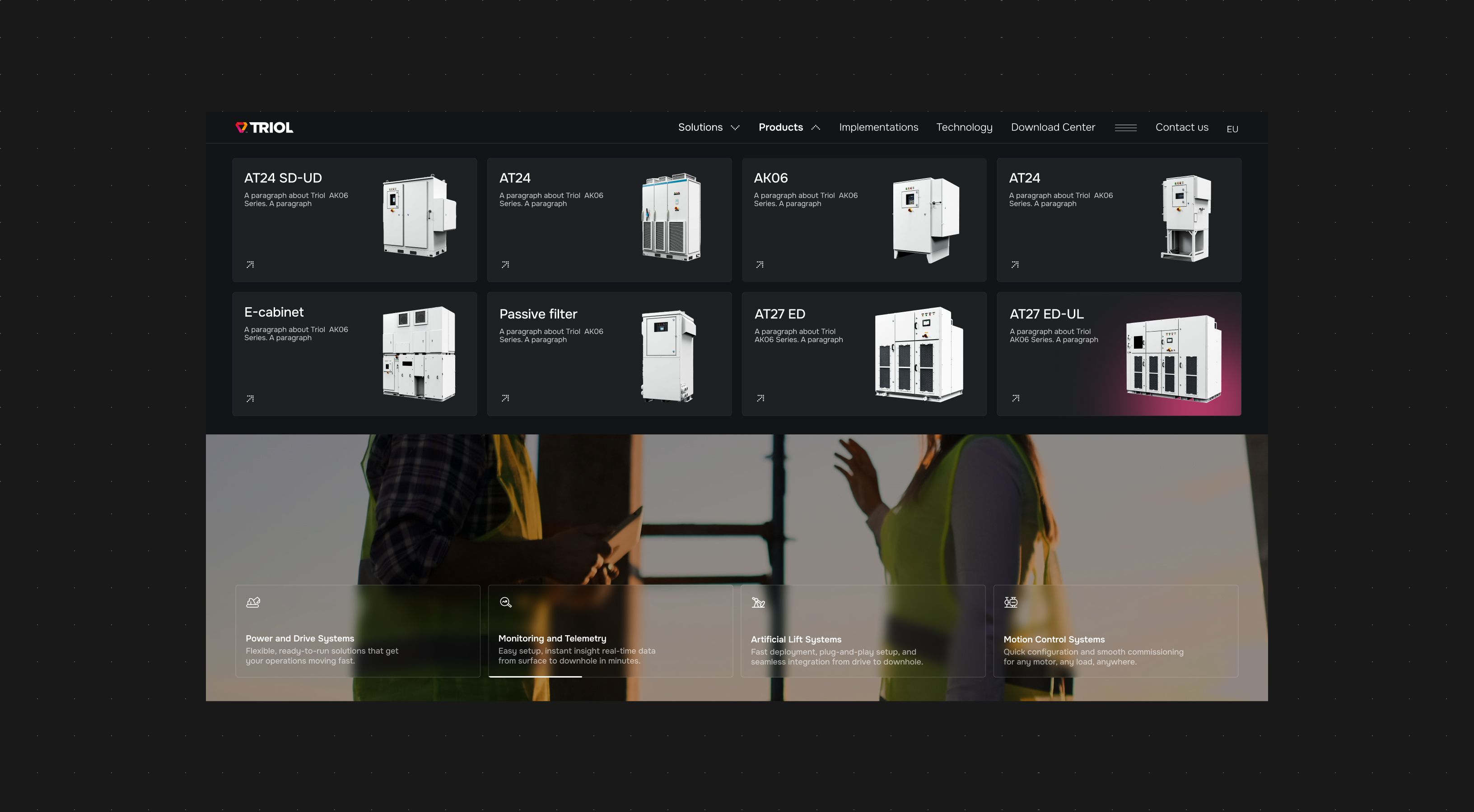
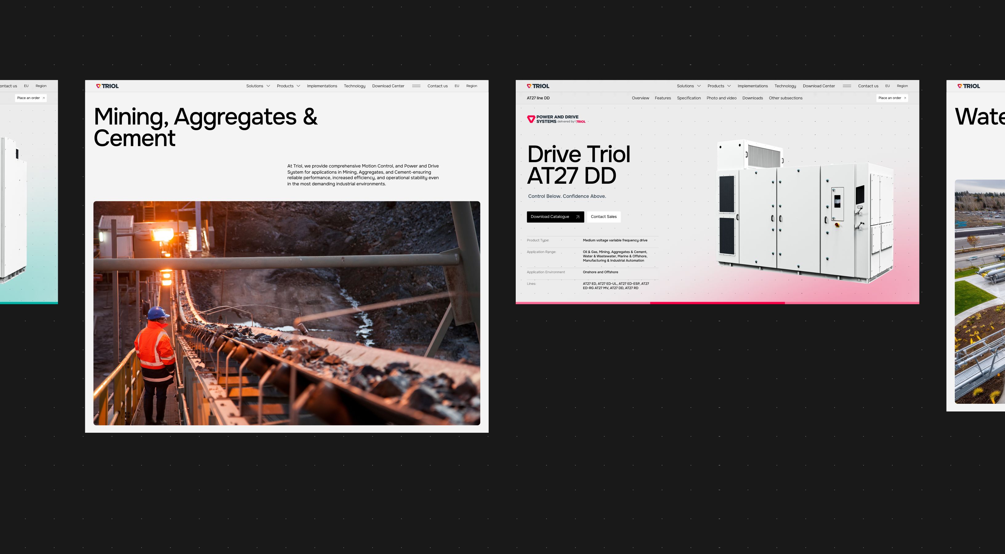
We built a logical flow through a very complex ecosystem. First, navigate by industry, then land on service pages that show exactly which models fit your world. From there, users move into solution pages that unpack the “how” behind each application. Product family pages group models, so teams can compare options without drowning in unnecessary info.
Clarifying brand perception from industry fog to an outstanding brand
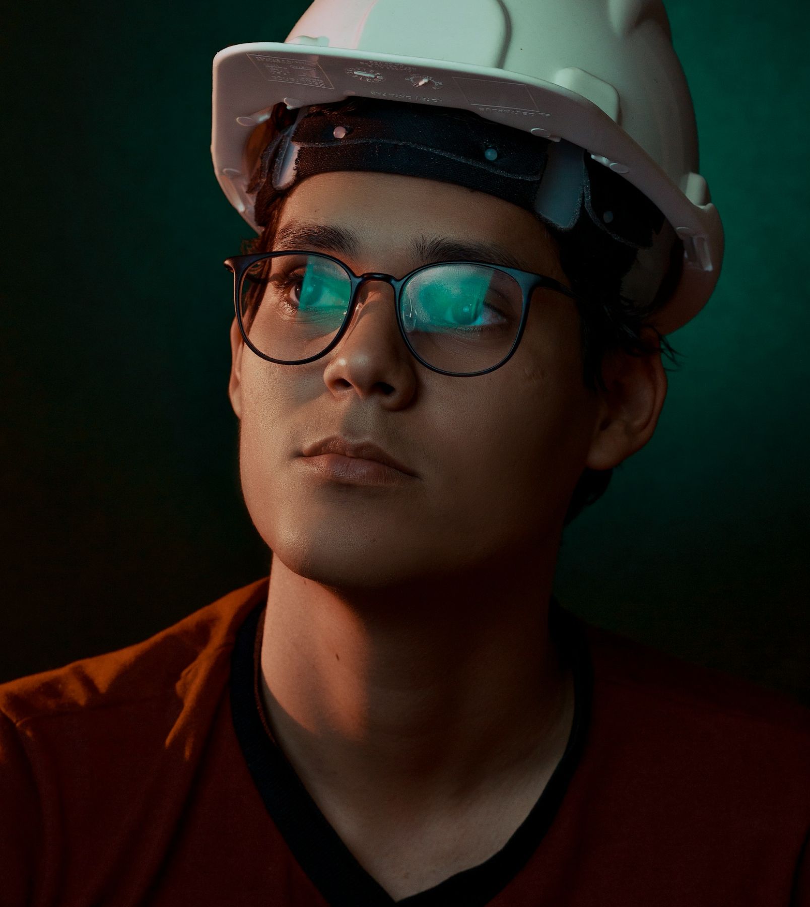
Triol already had a brand, but it lacked a fresh digital presence. We translated their identity into a cohesive interface that feels premium and engineered, not corporate and dusty. Every screen reinforces who they are: resilient, precise, and technical—yet approachable.
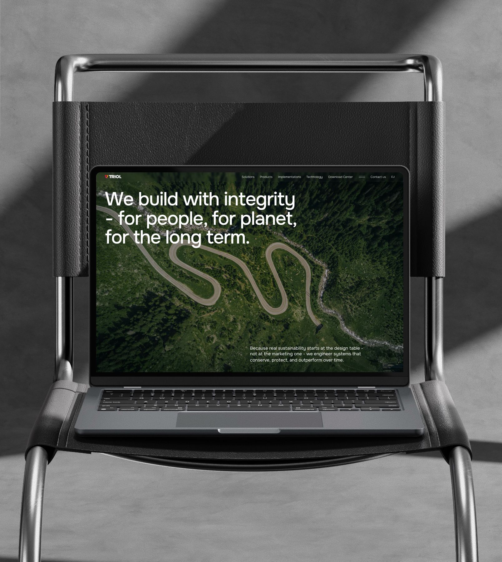
Balance of the trust & hardcore tech
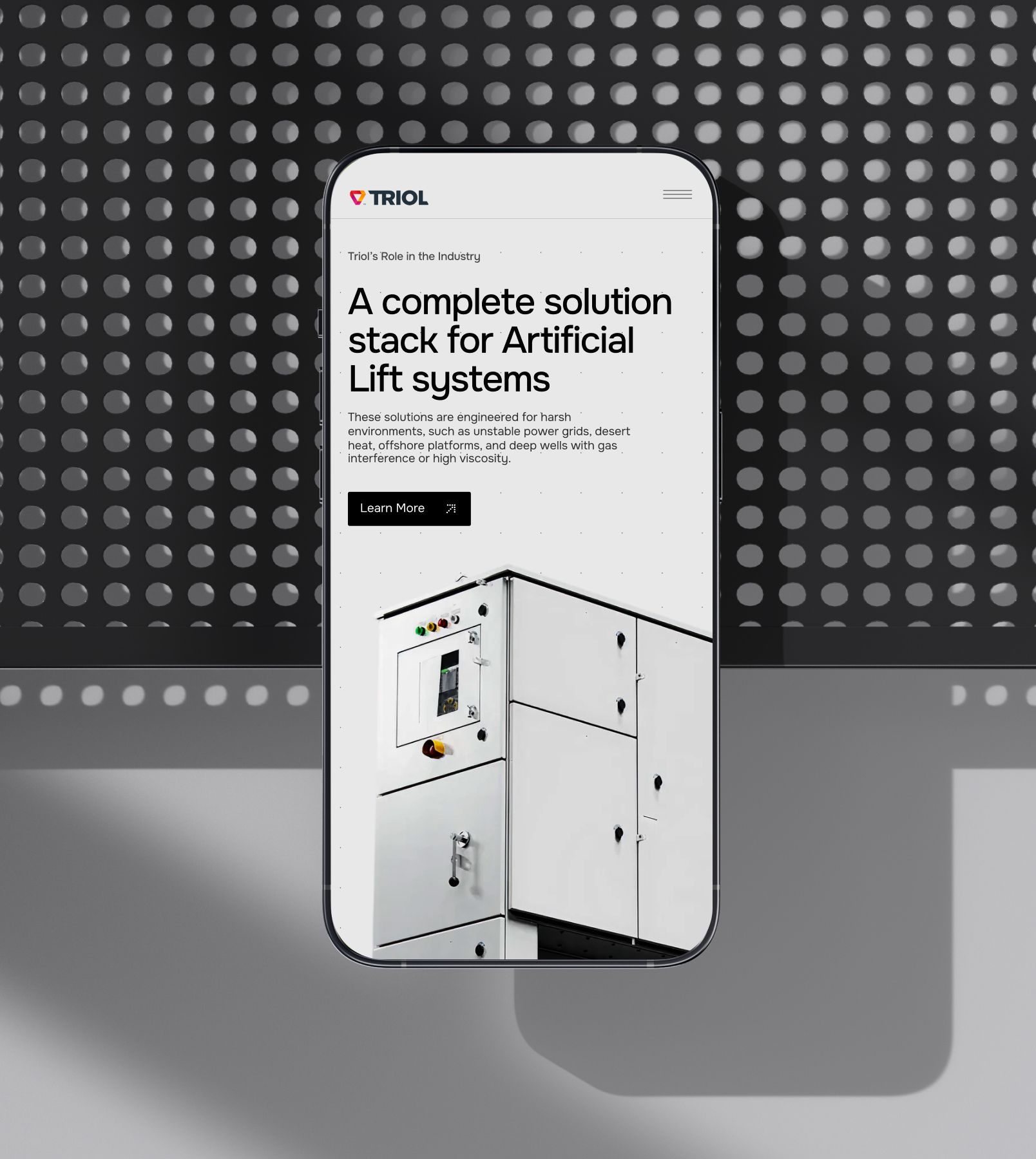
Based on a modern tech/corporate aesthetic with a dominant dark mode, the website uses a symmetrical structure and a minimal color palette. We added white space to highlight premium quality and draw attention to key content—and sprinkled clean sans-serif typography to reinforce the technological tone.
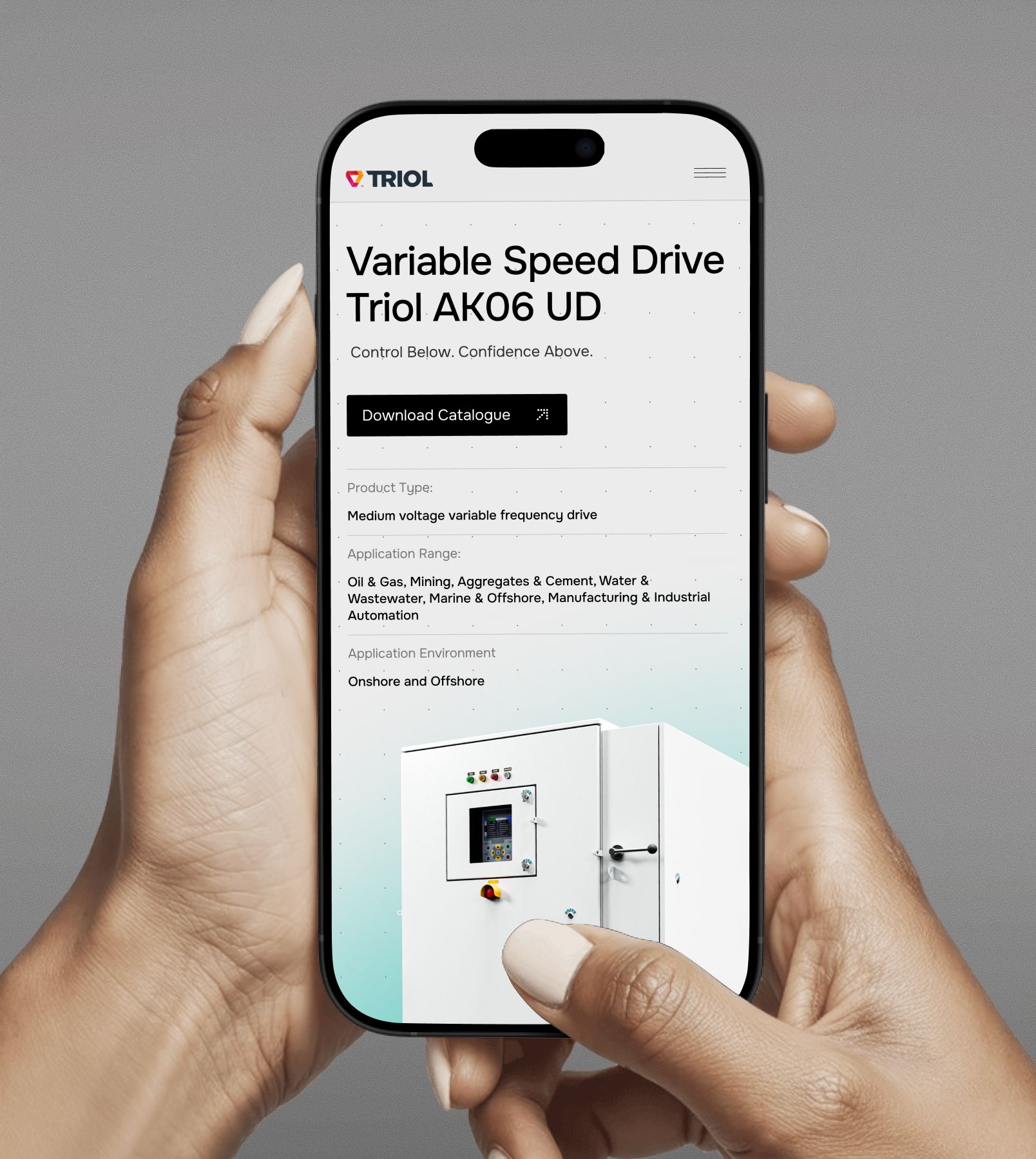
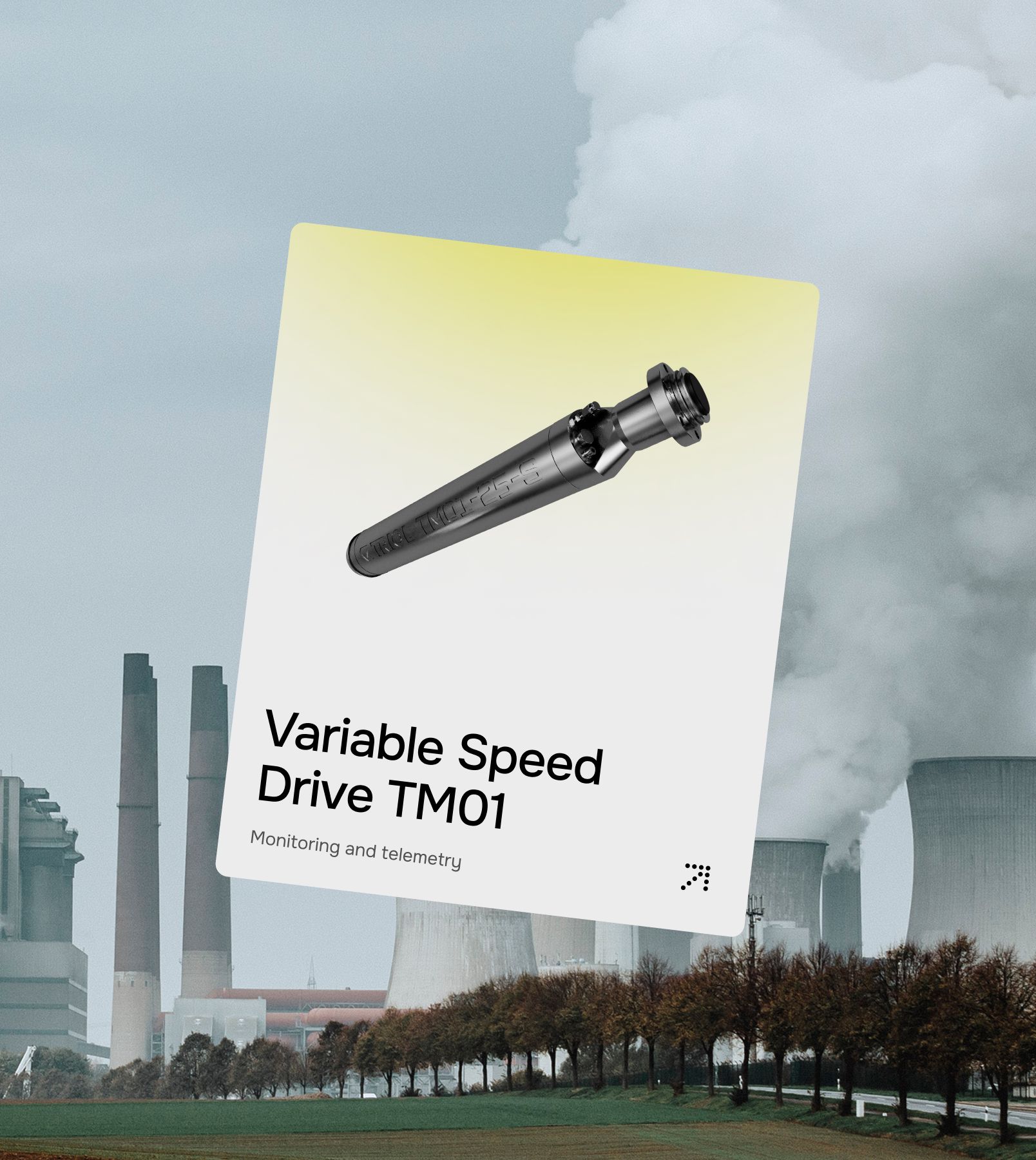
How we highlighted Triol’s engineering through 3D
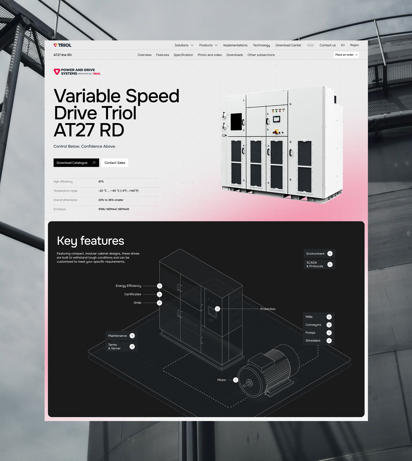
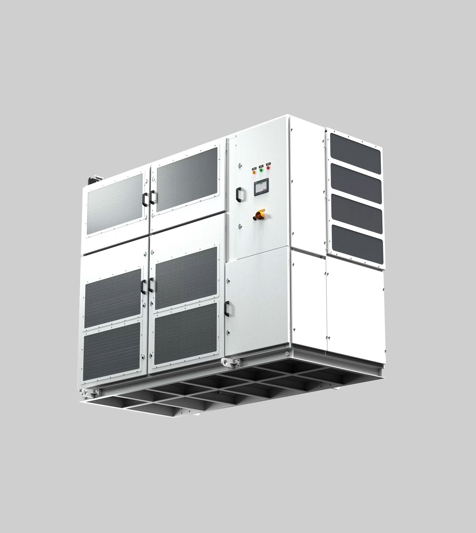
Triol’s devices are complex, beautiful in a very industrial way, and usually hidden behind boring photos or flat icons. We brought them to the front stage with 3D renders and motion that highlight engineering detail without turning the page into an outdated catalogue.
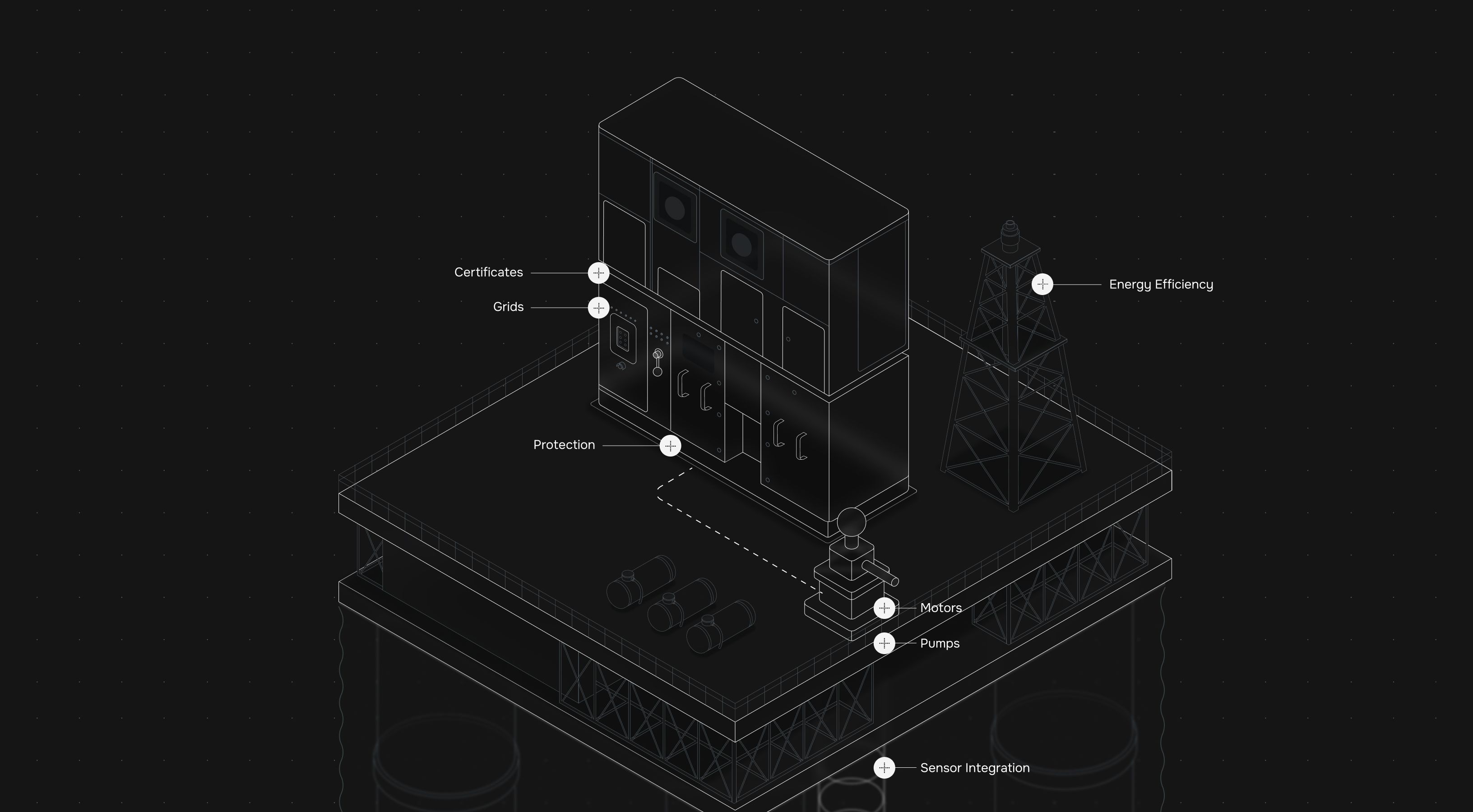
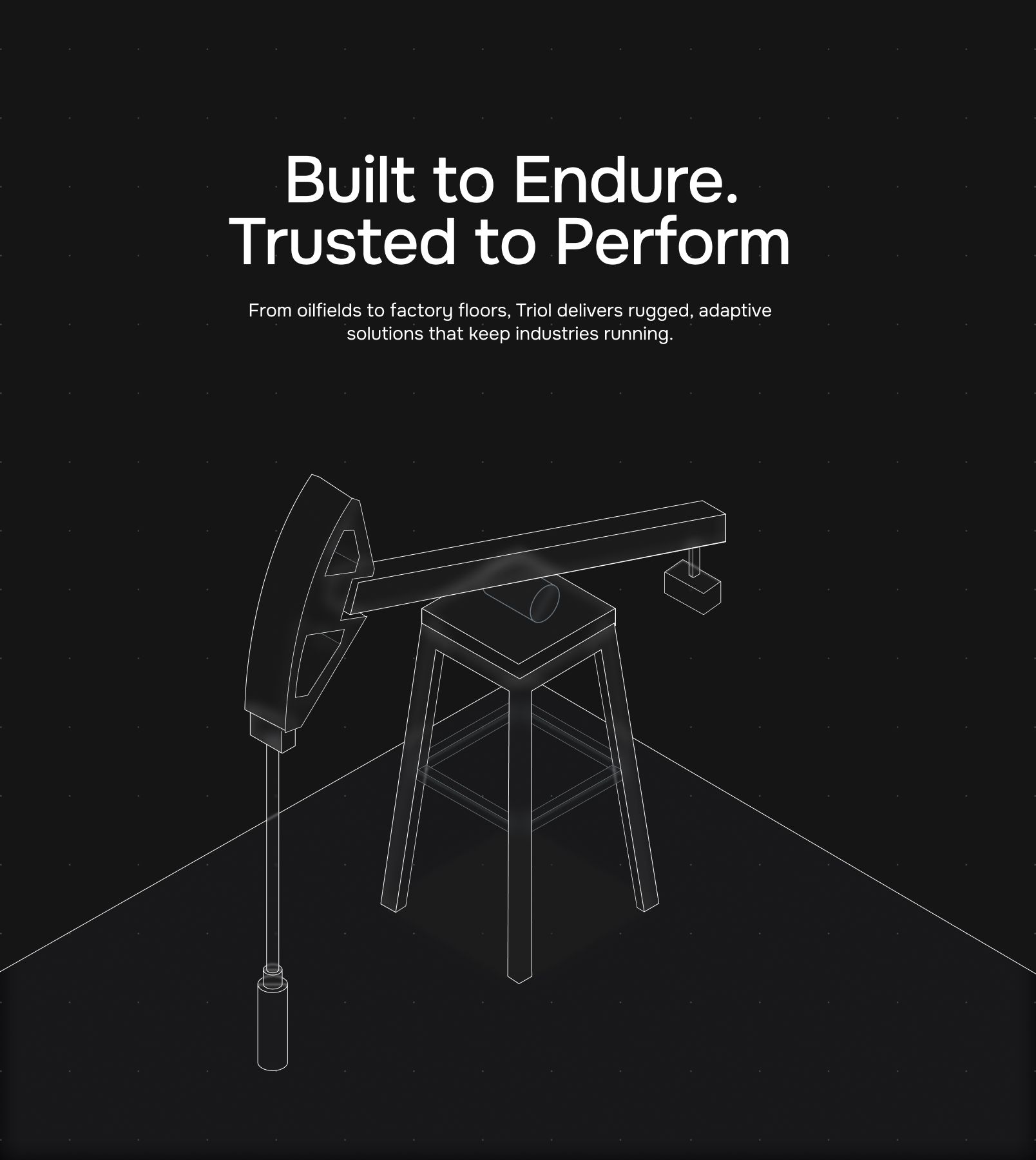
Explaining advanced industrial processes visually
We crafted a huge set of custom illustrations that simplify complex flows while staying clean, minimal, and on-brand. We ensured there is no visual noise or stock vibes, just structured graphics that help engineers, managers, and decision-makers get the point in seconds.
Custom development: built to scale
Complex tech requires complex dev solutions. We powered the site with a custom Strapi CMS so the Triol team can update content quickly without breaking layouts. The structure is flexible enough to update or add new product pages with no need to redesign each time.
They also needed Arabic localization, so we planned it from day one, using a plugin stack that won’t destroy the design. Sleek interface for global markets—the way it should be.