From 2.6% to 5.8%: how strategic testing doubled TimeCamp's conversion rate
TimeCamp had everything users could want in a time-tracking tool—powerful features and solid functionality. But in a sea of identical-looking trackers, great features don’t matter if users can’t find them.
Their homepage wasn’t converting well, and many visitors left before discovering what made TimeCamp special. Our challenge was to turn that around and boost their conversion rate.
Understanding why users bounce
We interviewed TimeCamp’s target audience—freelancers and business owners who live and die by billable hours. The research showed that users leave within seconds if they don’t see the key features right away.
TimeCamp already had those features—they just weren’t presented clearly. All it needed was the right structure, hierarchy, and visual language to help users find what they’re looking for, stay longer, and start signing up.
Hypothesis 1: Borrowed from the best
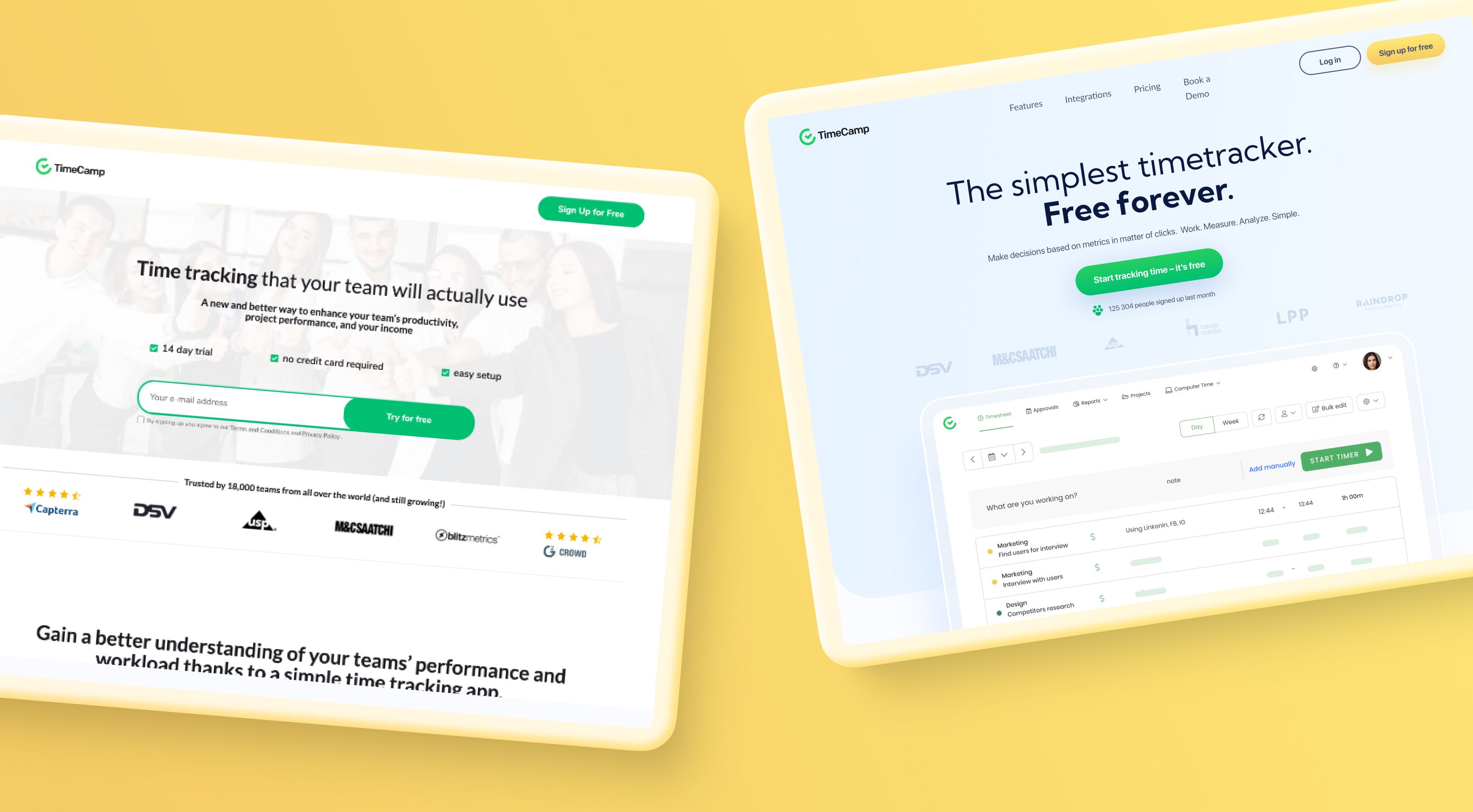
For our first A/B test, we recreated the structure and flow of the main competitor and market leader. It should work with a similar audience. We weren't copying design—we were testing whether a familiar information architecture would reduce cognitive load and improve conversions.
Result: 2,6 → 3.7% conversion rate. A 42% improvement over the original, proving that structure matters more than aesthetics alone.
Hypothesis 2: Custom design built on insights
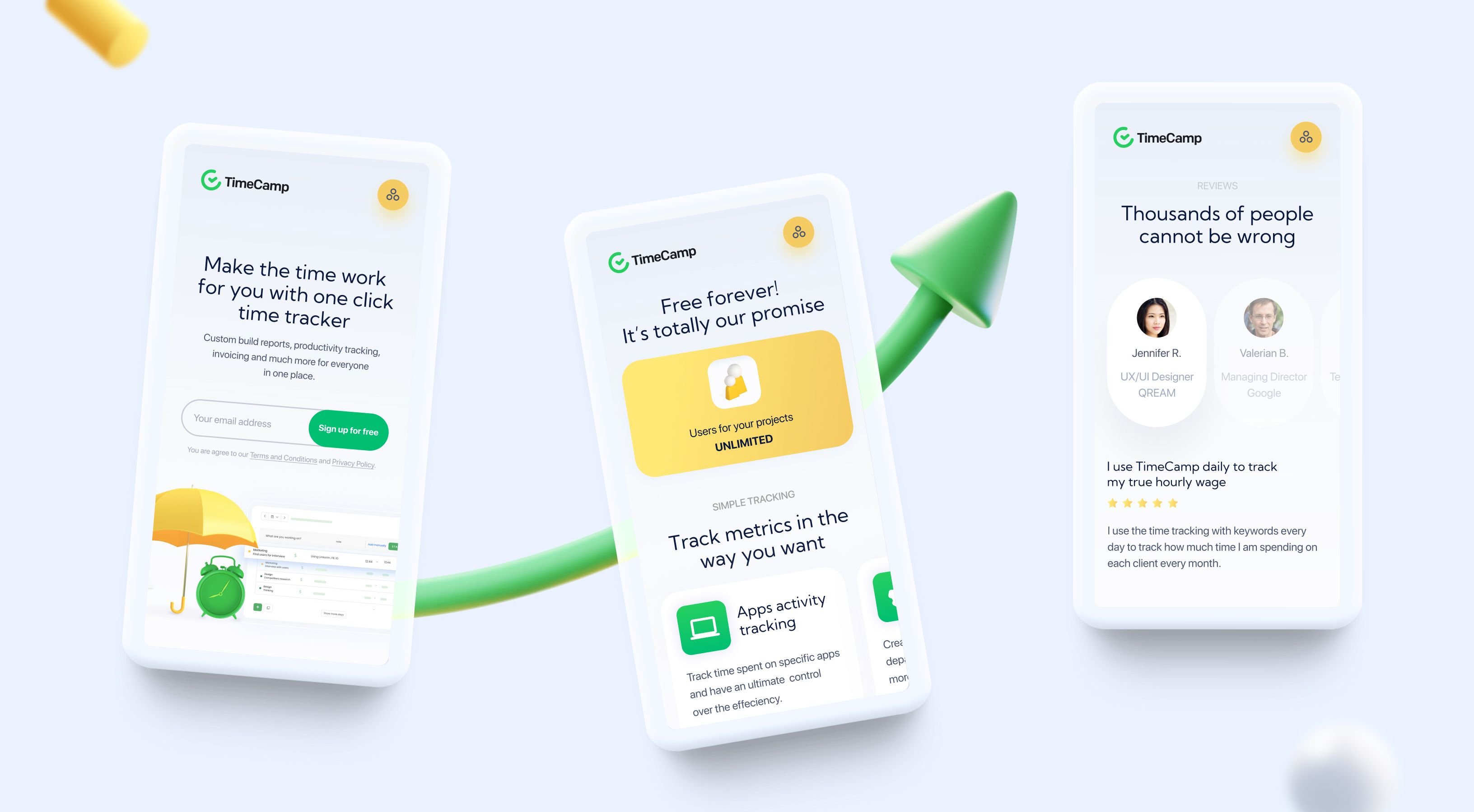
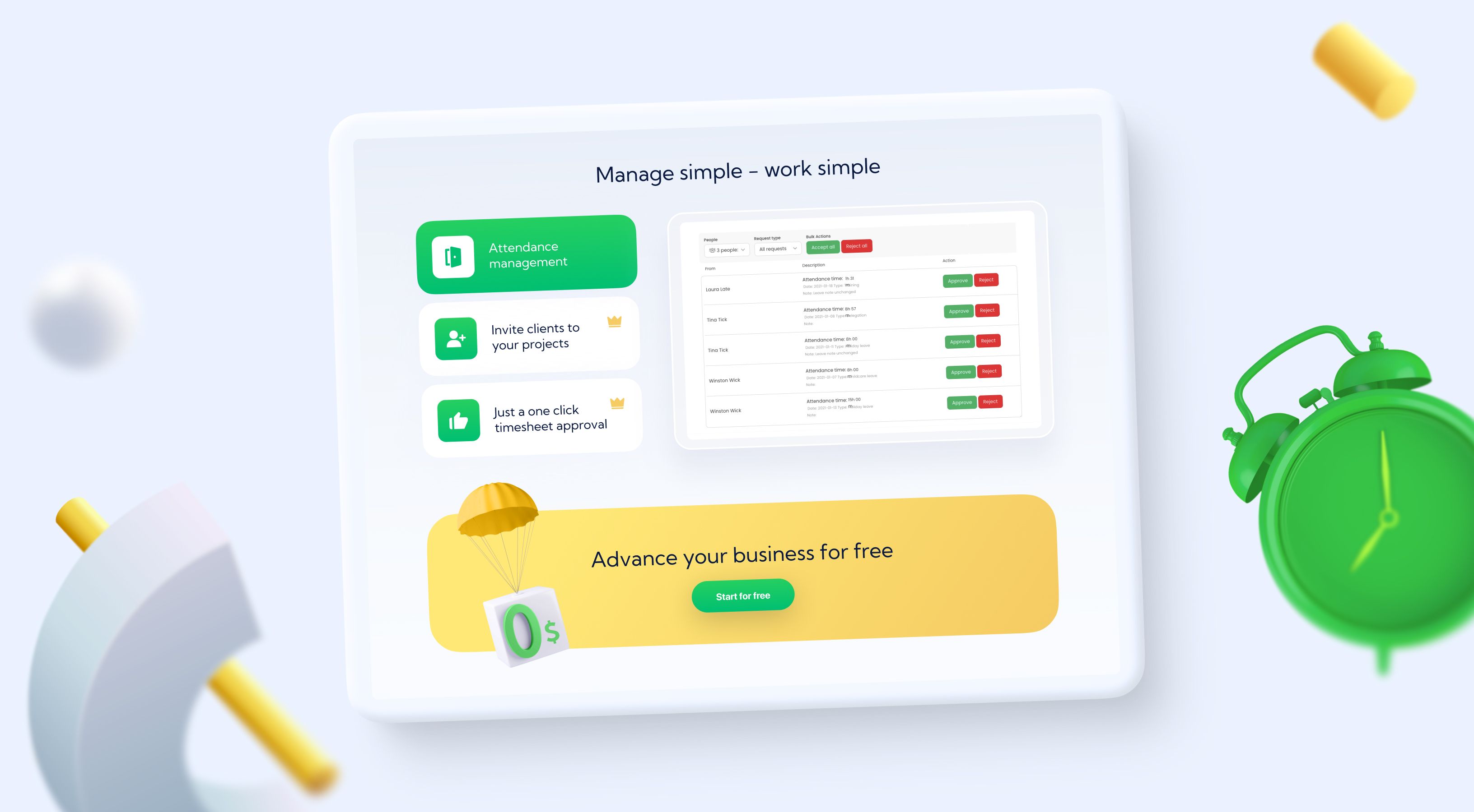
We beat the industry leader with original thinking. We developed a fully custom design concept built around three insights: time is presence, personality, and showcasing.
Result: 3.7% → 5.8% conversion rate. A 123% improvement over the original design and 57% better than the competitor-inspired version.
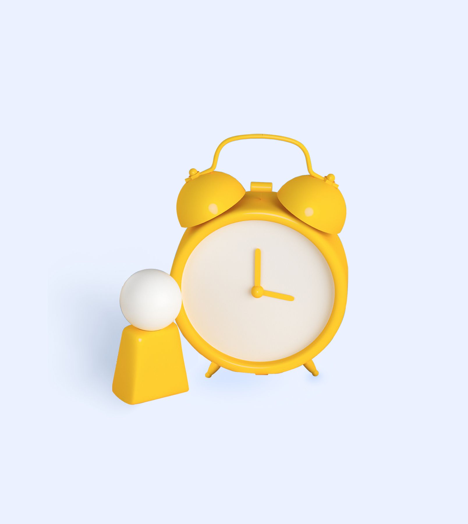
Time is presence
Classic clock associations establish instant context. But we added 3D elements that create depth and immersion, because time isn't just measured—it's experienced. The 3D treatment makes the abstract concept of “tracking time” feel concrete and present.

Features need personality
Generic feature lists disappear into white noise. We brought the most valuable features to the front and gave them memorable, benefit-driven names. Every feature got a custom icon because testing consistently shows users scan icons before reading text. Icons aren't decoration—they're navigation.
Show IRL
Animations beat static images every time for engagement and comprehension. But we didn't animate for aesthetics—we animated to demonstrate the actual product interface in action. Users could see exactly how simple the workflow would be after signing up. No trust leap needed—just visual proof that TimeCamp works the way they need it to.
The winning results
Two A/B test
provided
5.8% conversion rate
after redesign