Crafting a telecom brand, app, and web that works in every market
From business chaos to product ownership
Telfoni is a global telecom provider offering one SIM card that works everywhere. You buy it, activate regions, and pay only for what you need—when you need it. Sounds simple. The product logic behind it… wasn’t.
We were brought in to design a full-featured mobile app from scratch, while the business logic, zones, bundles, and even the pricing model kept changing. So our role quickly expanded beyond design: we became product owners, strategists, and business analysts. We had to help Telfoni figure out what they were building while simultaneously building it.
Architecture before aesthetics
We started with the foundation: mapping the entire information architecture with the client. Which features matter? What lives where? How do users navigate something as complex as global connectivity?
But their business logic kept evolving mid-design. Each change could invalidate whole flows. We had to stay flexible, pragmatic, and fast—designing a system that could survive constant shifts.
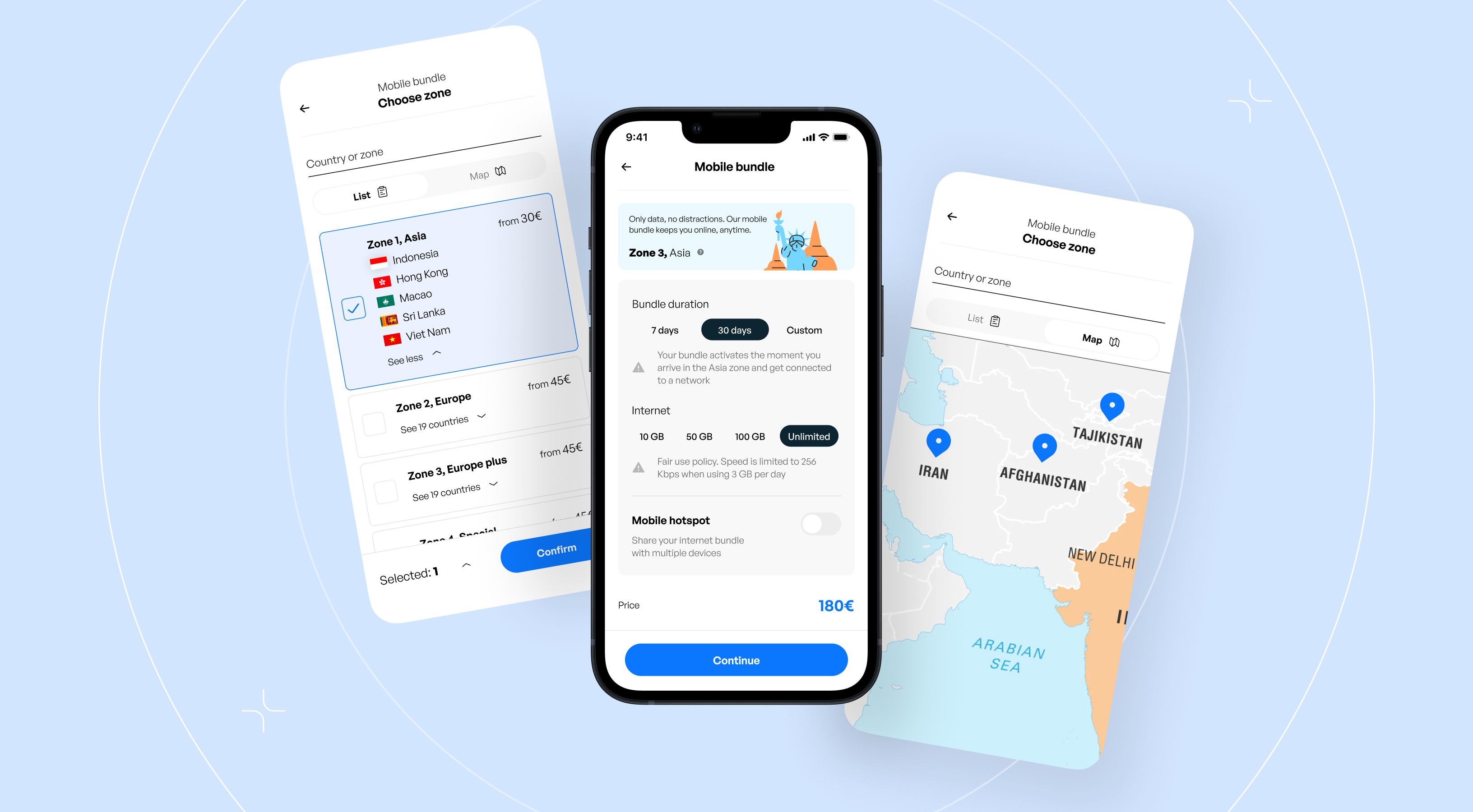
The bundles problem: zones, not countries
Telfoni doesn’t sell packages by countries—only by geographic zones. So we had to define: what packages should exist, how they should work, which features belong to which bundle, and how users should understand these groupings instantly.
To solve this, we created custom zone illustrations—simple, recognizable visuals that show which countries are included without making users read long lists. A fast, friendly way to communicate something traditionally confusing.
Building the brand as we built the product
We have complete creative freedom. No brand guidelines. No visual direction. Just logo. So we created visual concepts with full mood boards. The chosen direction: rounded, human, approachable, built around clean 2D illustrations. It struck the balance we needed—functional in-app, but still warm and recognizable.
Going global: adapting for Arabic markets
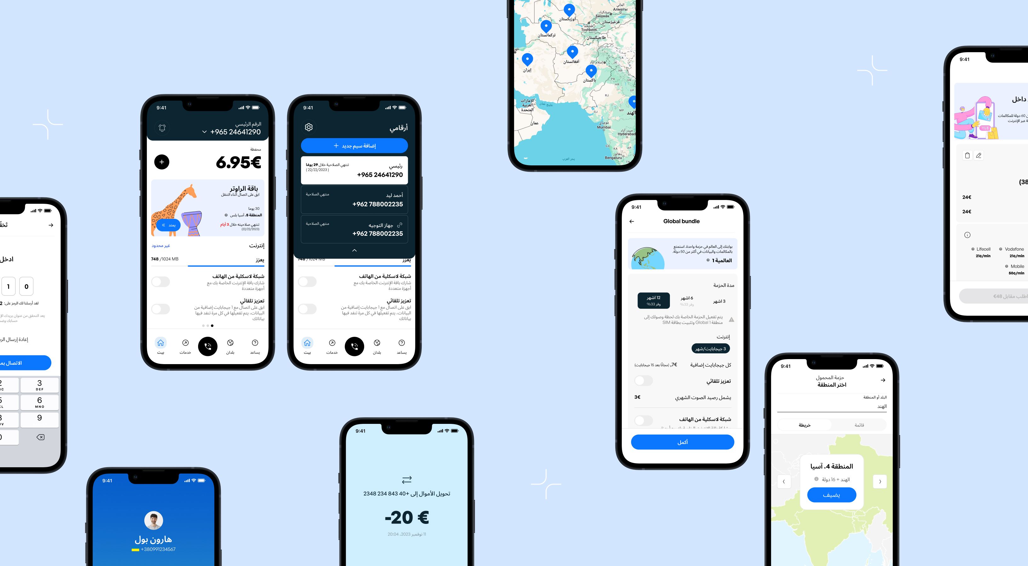
Telfoni works across Arabic-speaking regions, so we fully adapted the app for right-to-left layouts. This wasn't just translation—rethinking navigation, mirroring illustrations, reversing visual hierarchy, ensuring everything still feels intentional and intuitive.
One ecosystem, multiple touchpoints
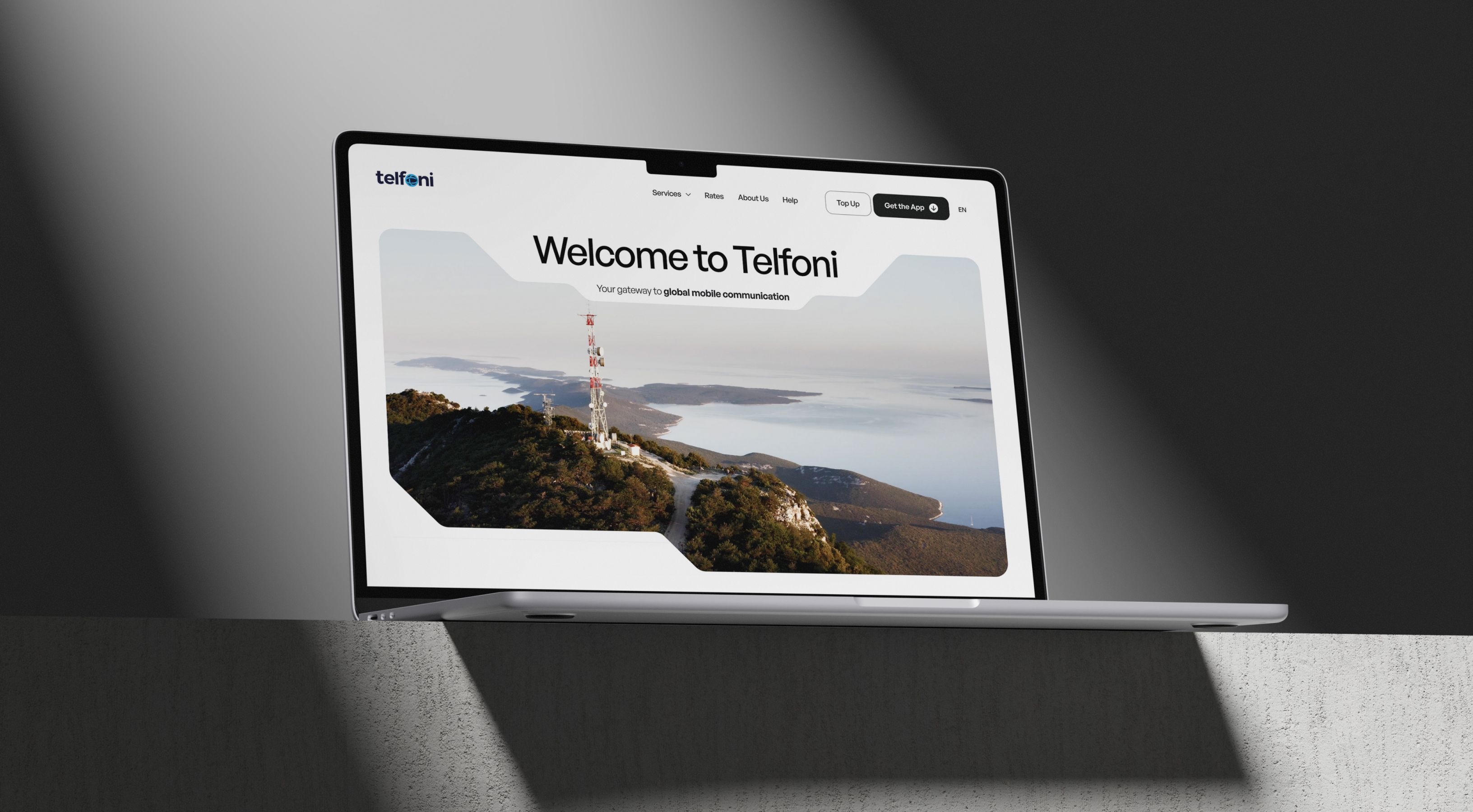
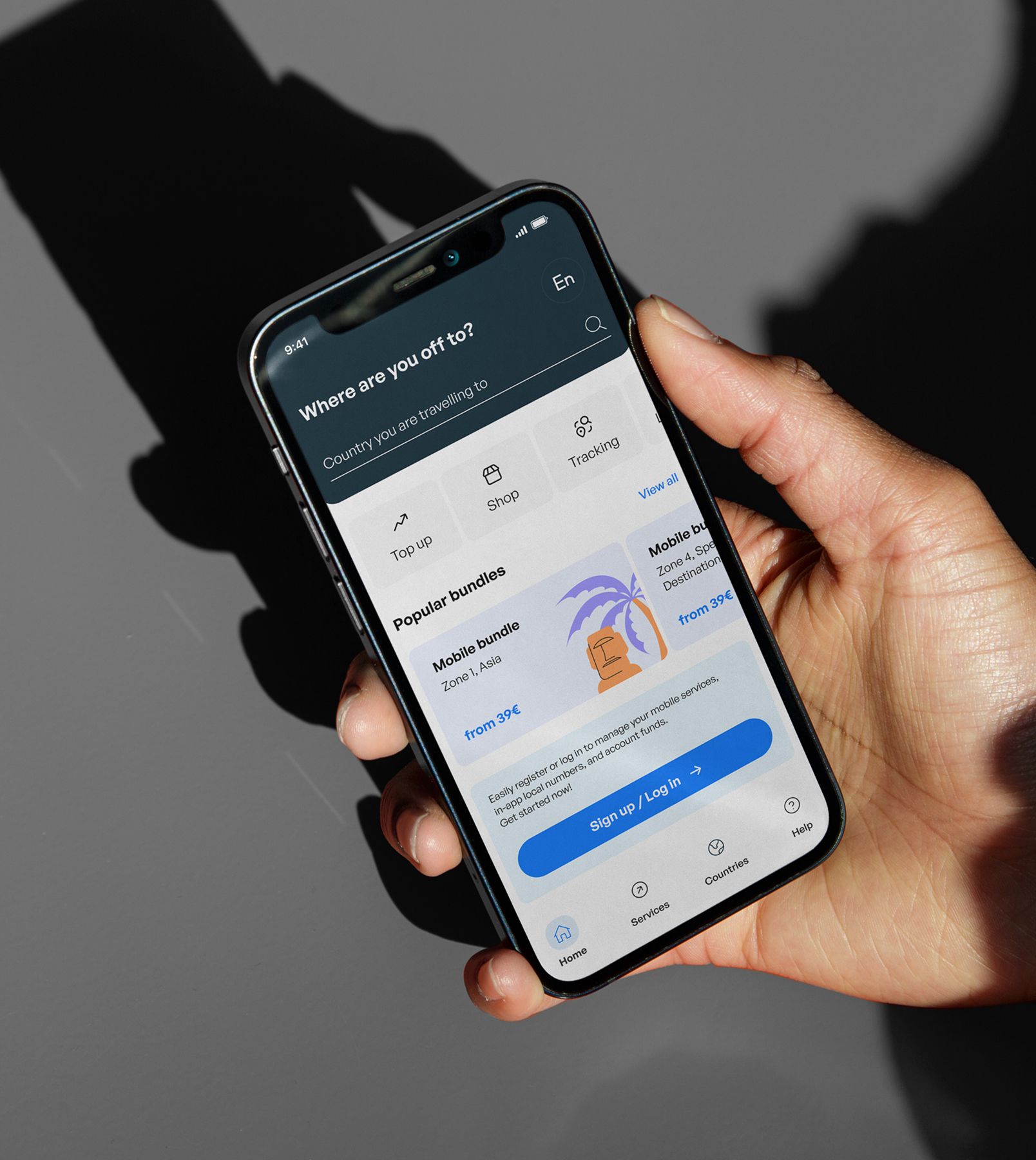
The same visual language flows across the entire system: rounded corners, consistent illustration style, unified color palette. The one intentional split: photography lives only on the website.
The app stays purely functional and lightweight. The site gets faces—travelers, humans, emotion—to ground the brand in real-life experiences. We initially tested illustration-only layouts for the site. They felt too playful at hero scale. Photography brought maturity without breaking the design language.
What we delivered
Brand identity
A friendly, global-ready visual system built on approachable 2D illustrations, rounded geometry, and warm, clean aesthetics.
Mobile app (iOS & Android)
Full-featured connectivity management with zone-based purchasing, bundle controls, and account management.
Website
A desktop-first experience with full feature parity for users who prefer managing their connectivity from computers.