Ditched visual clichés for the new Coralogix's cyber brand
Cyber that finally cuts through
Snowbit is Coralogix’s cool little sibling. It has the same cybersecurity DNA and is built for folks who don’t need the full Coralogix power pack but still want top-tier security.
The main challenge is keeping that family bond strong while giving Snowbit its own vibe. It’s gotta stand out—fresh, modern, and a little bolder than the old-school crowd. A new player, but not a newbie.

Brand Identity: make Snowbit visible
We’re bringing three solid concepts to the table—bold visuals, easy-to-scale designs, sharp colors, and strong shapes.
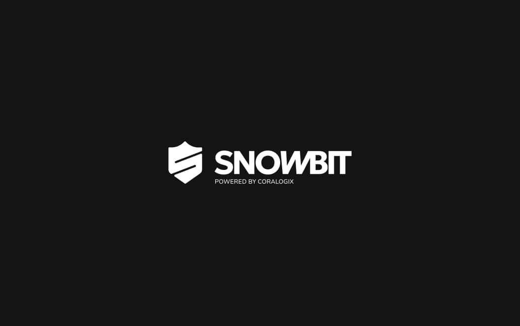
We ran with one concept—a slick icon built from two halves of a circle. Took Coralogix’s colors, split ‘em up, and boom—instant logo vibes. But here’s the twist: flip it, and suddenly, it’s not just a nod to Coralogix—it’s also rocking an “S” for Snowbit.
Snowbit’s stylebook
The brand guidelines lock in Snowbit’s vibe—bold, sharp, and built for serious protection. Every detail keeps things consistent and on point. Cybersecurity’s full of the same old visuals, but we dodged the clichés and made it fresh. Not easy, but hey, we pulled it off.
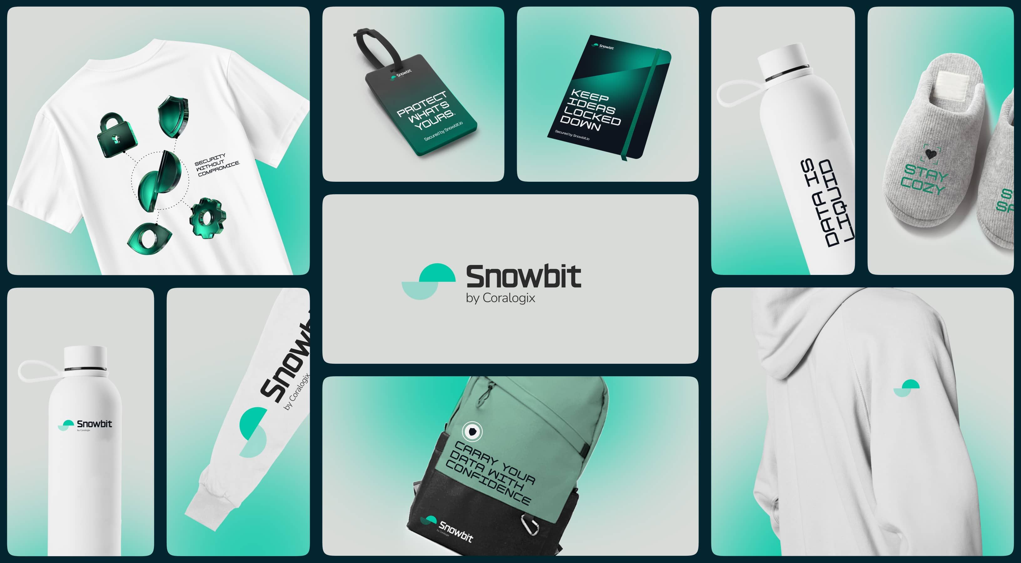
Merch you wanna grab
For the merch, we had some fun—crafted clever lines that mix cybersecurity with the item’s purpose. No generic swag here. Every product is tailored to the specs of the company printing it, so what you see isn’t just a mockup—it’s the real deal, ready to roll.
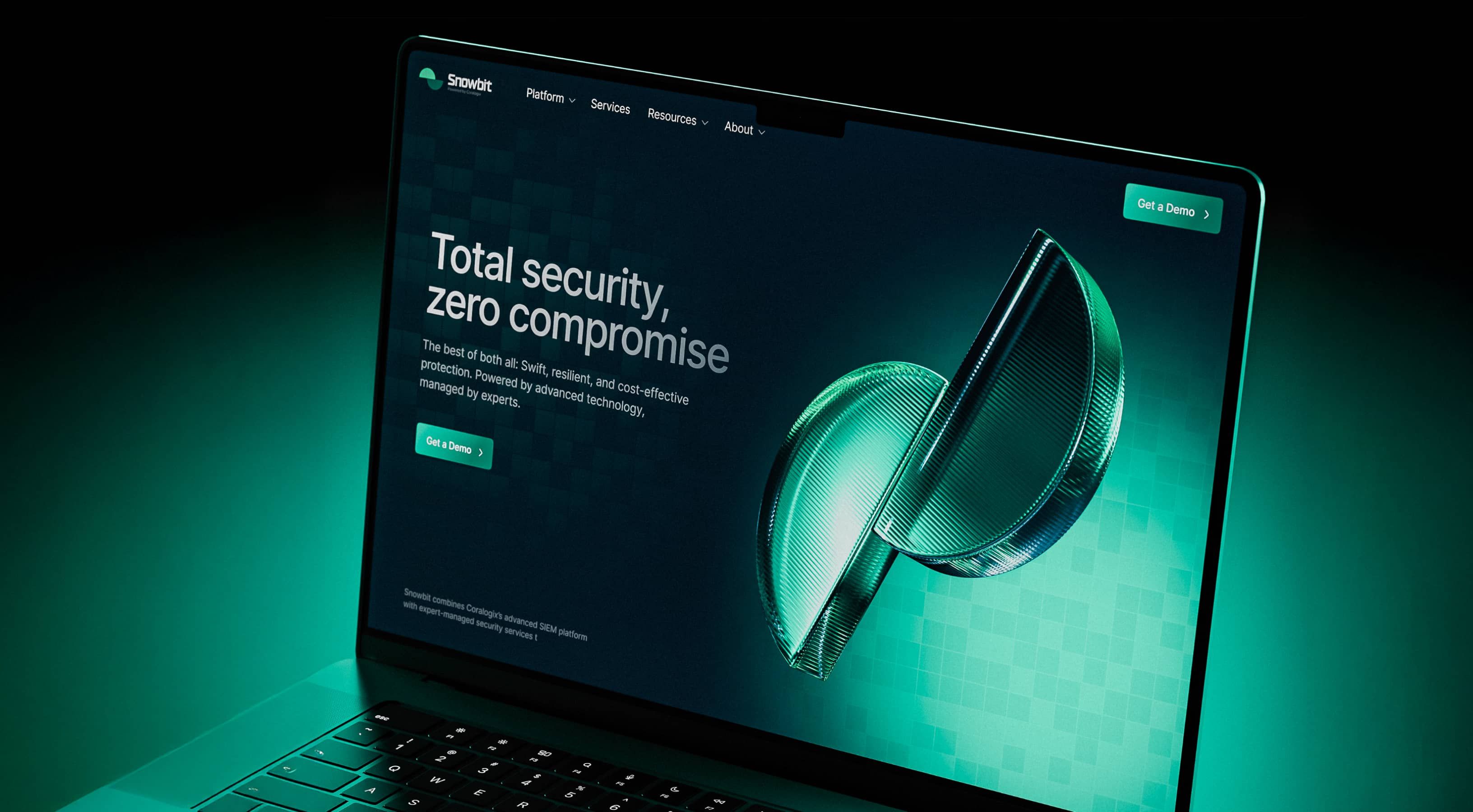
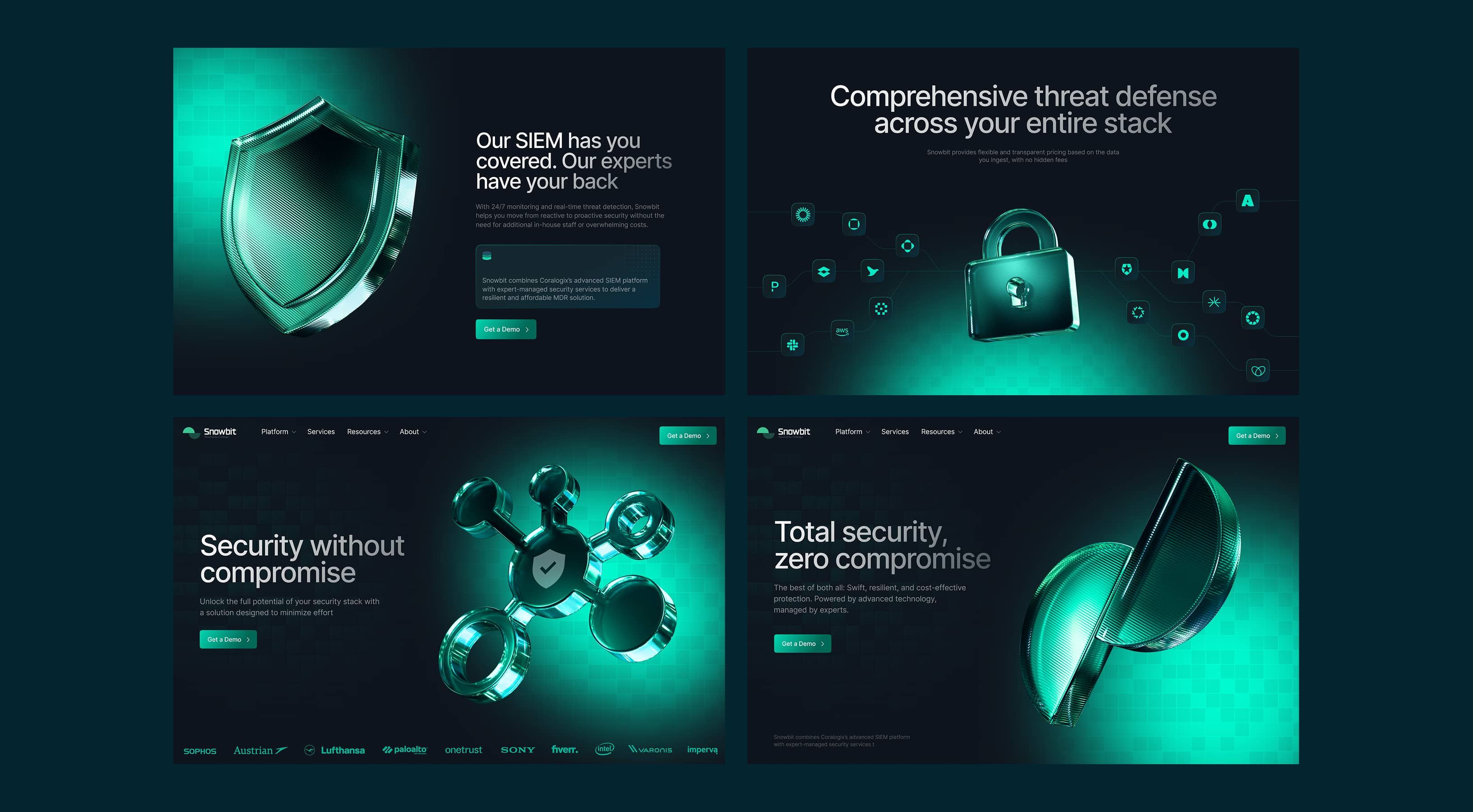
Website: make it happen
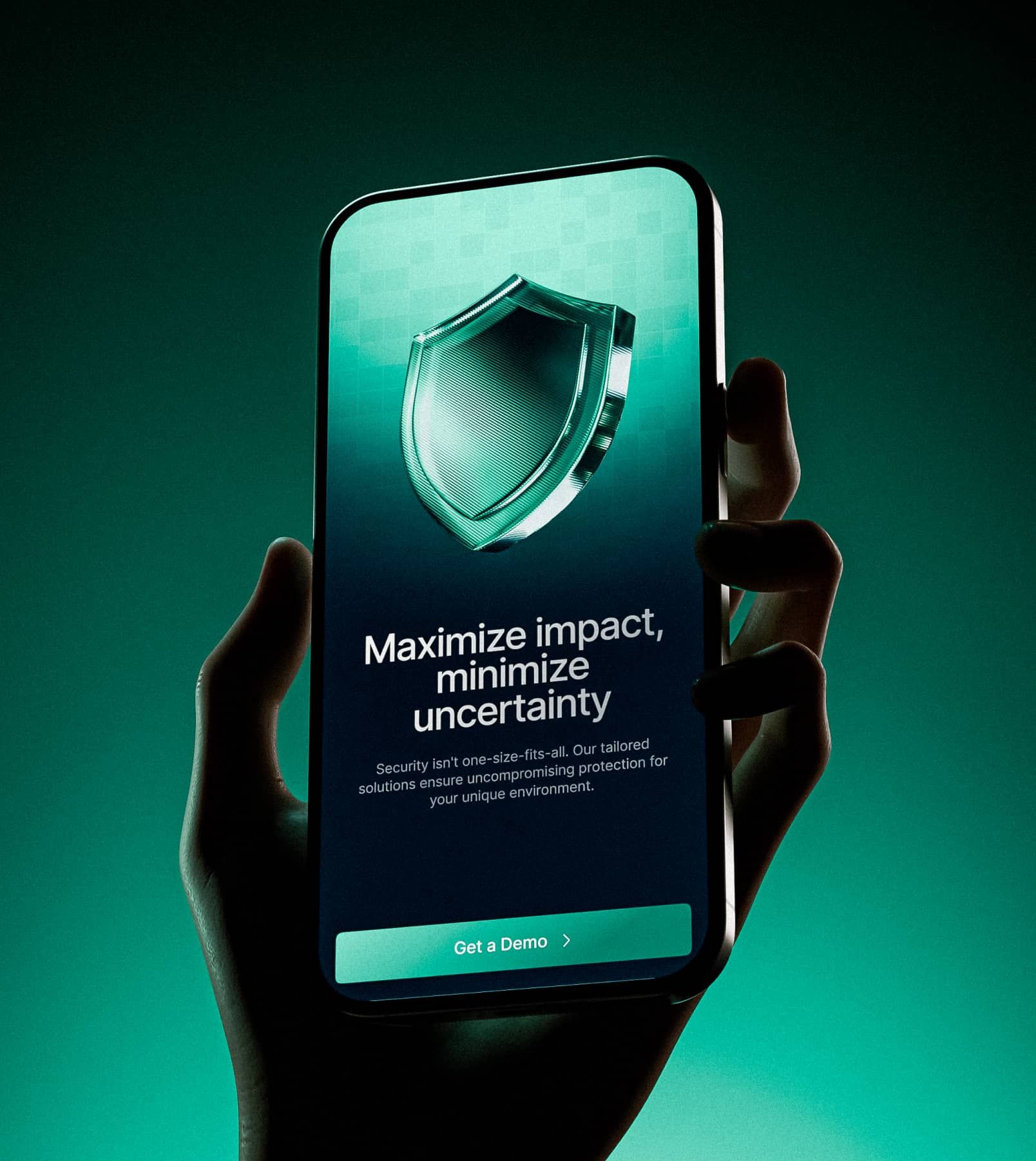
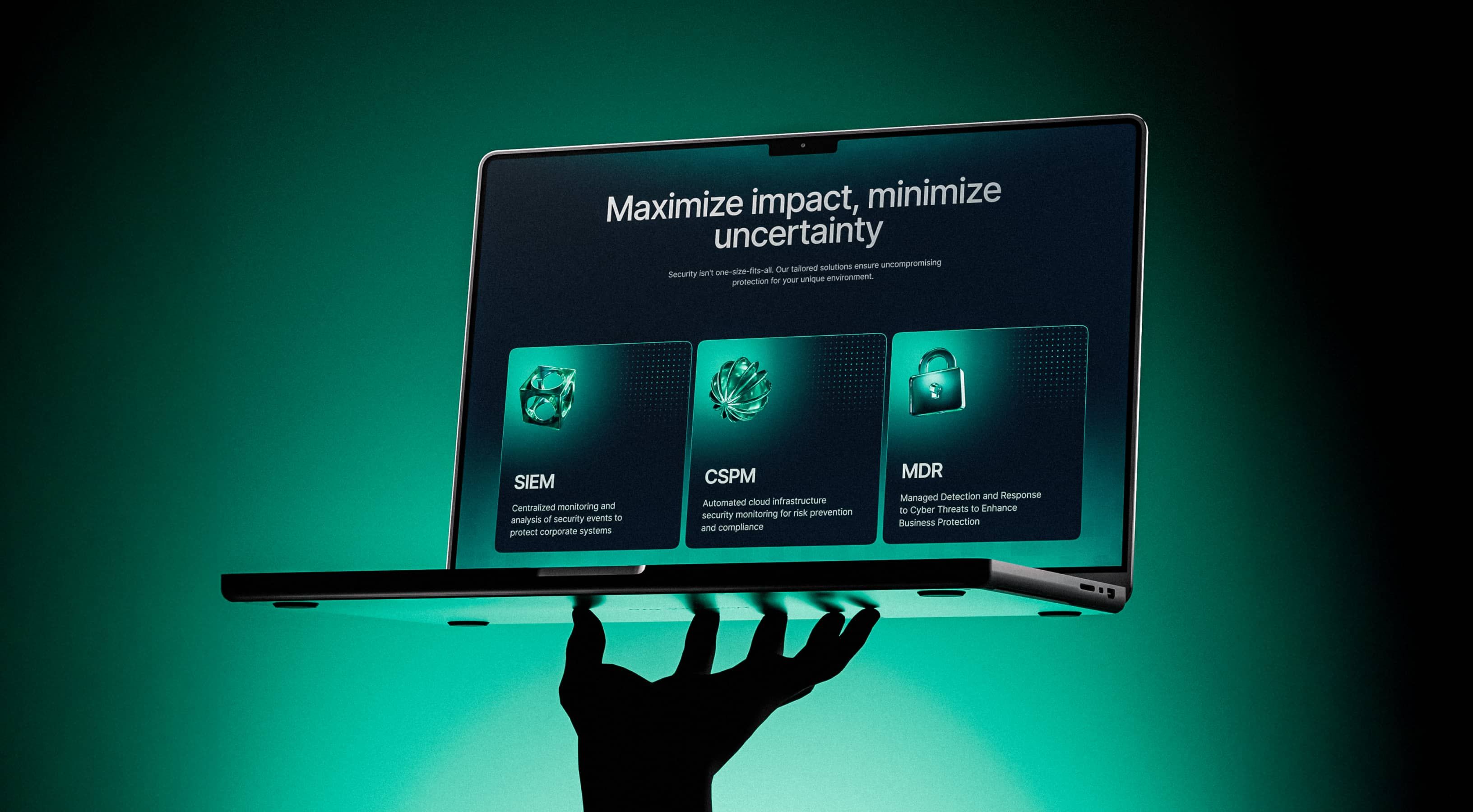
We crafted a UX concept that keeps users hooked—smooth interactions, smart animations, and a flow that just feels right. Then, we built a UI that doesn’t just look modern—it owns it. The website is a total standout in the cybersecurity crowd. The client brought the words, but we fine-tuned them—made ‘em sharper, clearer, and perfectly in sync with the site’s story.
Built on WordPress
Coralogix runs on WordPress, and their team’s already maintained it. So for Snowbit, they wanted the same setup—no need to bring in extra hands just to keep things running.
We built the admin panel with marketing managers’ needs in mind: smooth, familiar, and fast. Adding content is a breeze, with all the tools they know. And to keep things seamless, we made sure Snowbit and Coralogix work the same way under the hood.
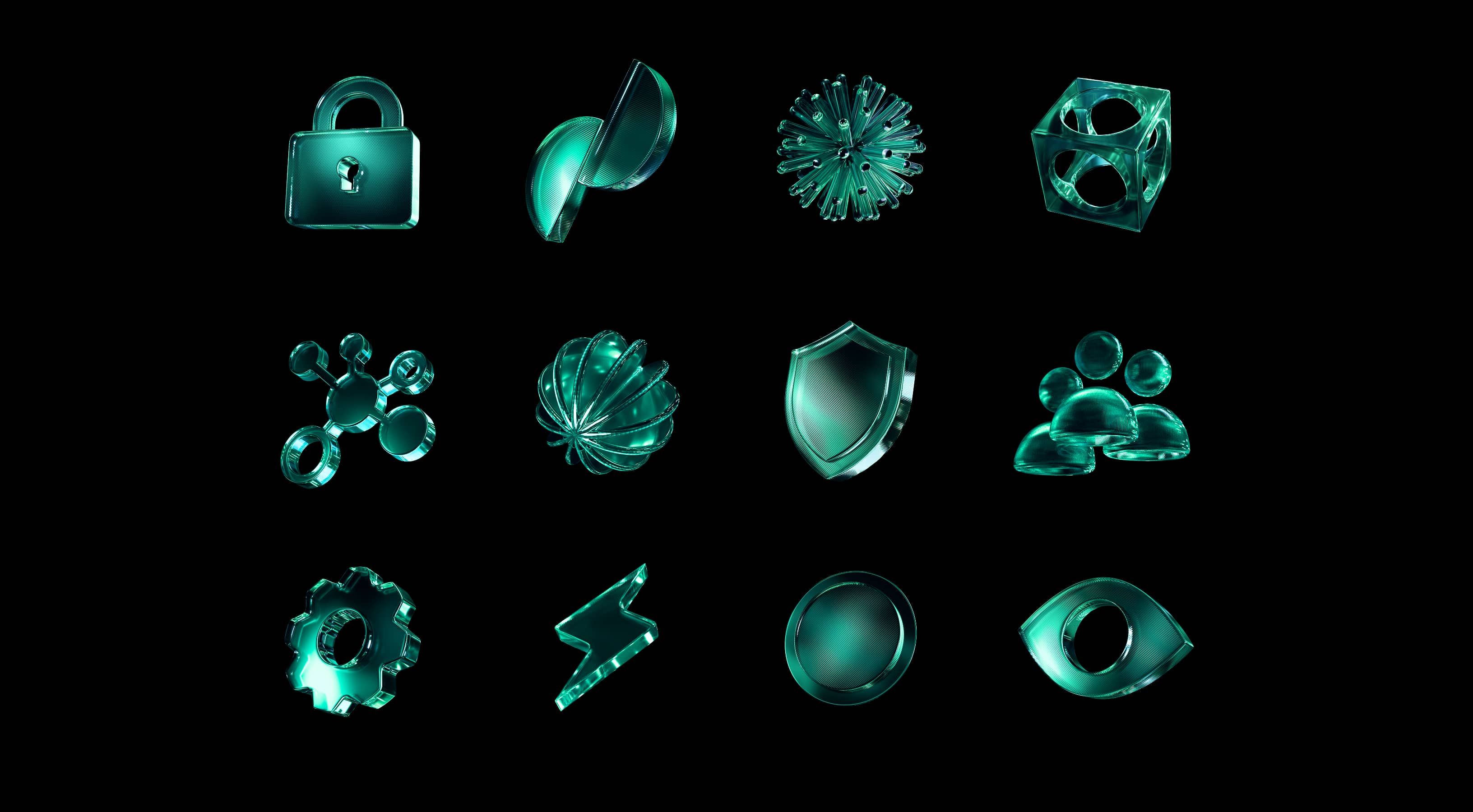
Add 3D icons
We threw in 3D icons for that extra wow factor—cuz let’s be real, no one bonds with a boring brand. Emotion drives connection, and these icons bring just the right punch to make Snowbit feel alive.
Sexy as hell 404
Clients always forget about the 404 page—classic. So, we didn’t just remind them, we reimagined it. No boring dead ends here. We gave it a twist, something unexpected, something that makes you stop. Cuz even an error page should have some swagger.
That is sexy as hell!

Lily Waldorf
Product Marketing Manager at Snowbit
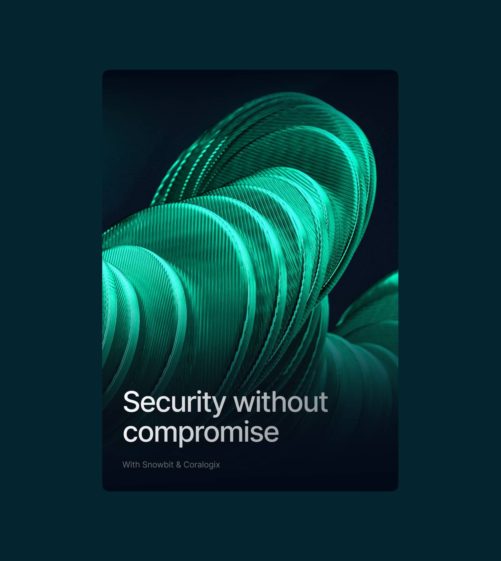
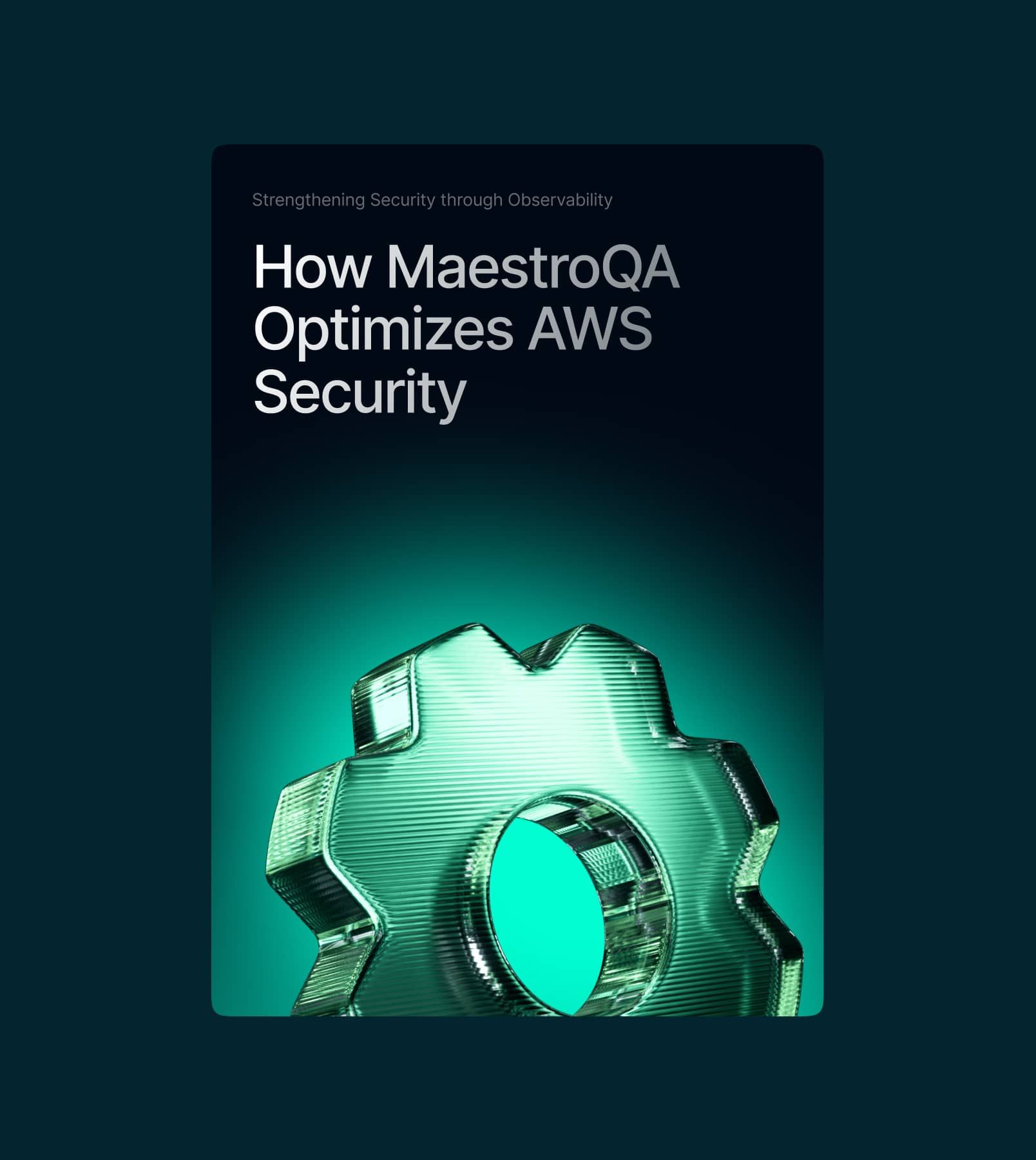
Blog banners
A lot of awesome websites hit a snag with their blogs—the visuals just don’t vibe with the overall look. Instead of letting that happen, we flipped the script. We designed a killer set of blog covers that match the site’s style perfectly and keep that aesthetic rolling for every new article. Consistency is key, and we’re all about that seamless flow.
Winning results:
165K
Impressions on LinkedIn
84%
Website performance based on Google’s Core Web Vitals
1
Newborn cybersecurity brand