Building a brand & product design ecosystem for a psychology-inspired app
Not your average mental health app
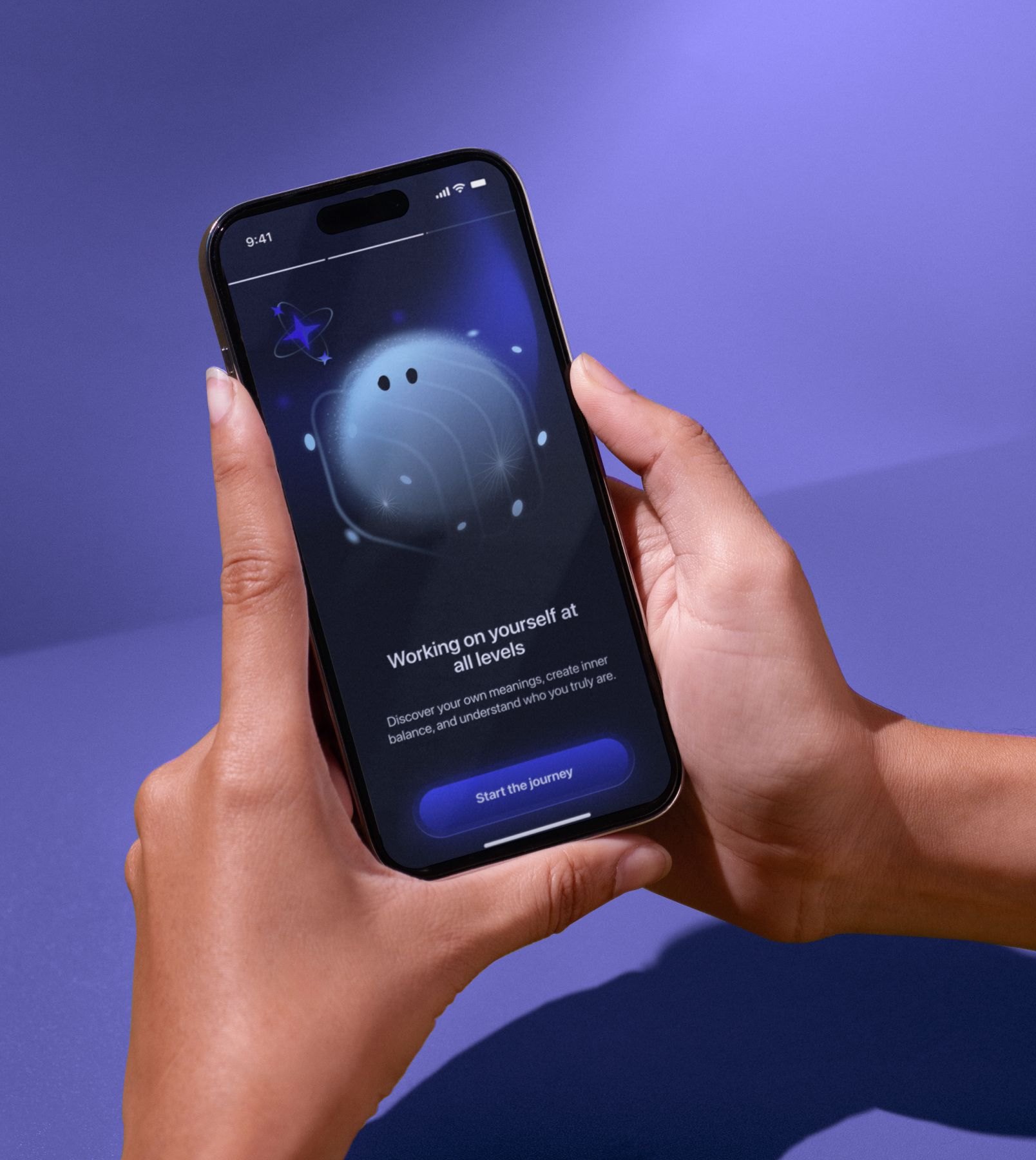
Self App isn’t about heavy psychology talk. It’s a daily practice in self-awareness, wrapped in a playful, gamified experience—like a guided coaching designed to help you meet your true self. And it needed to be wrapped up.
The idea without a shell
The client came to us with a solid concept but no brand universe around it. Jumping straight into UI would have killed the product’s potential. First, we refreshed their vision of UX and began building a brand that could carry the weight of their idea.
Branding first, always
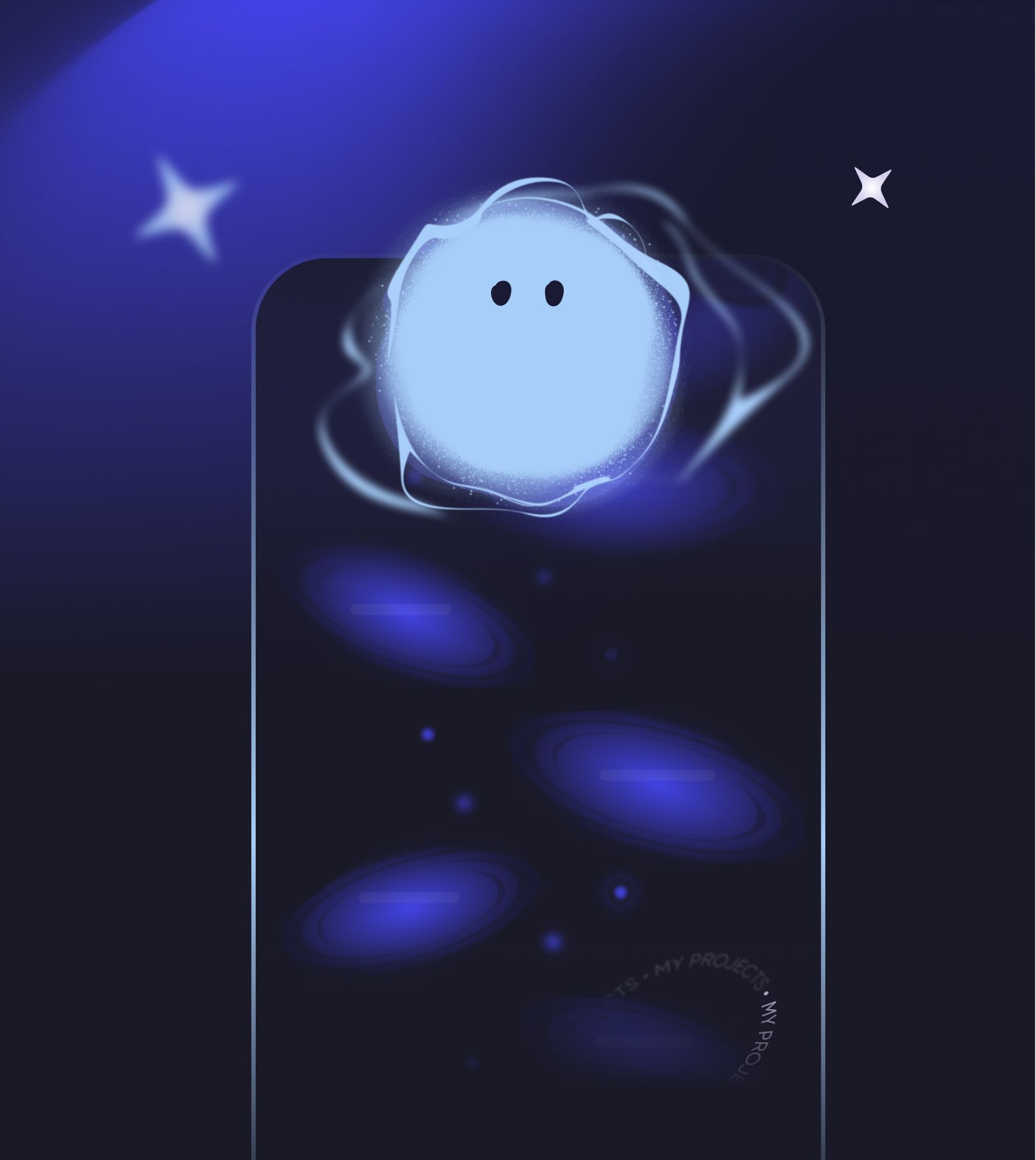
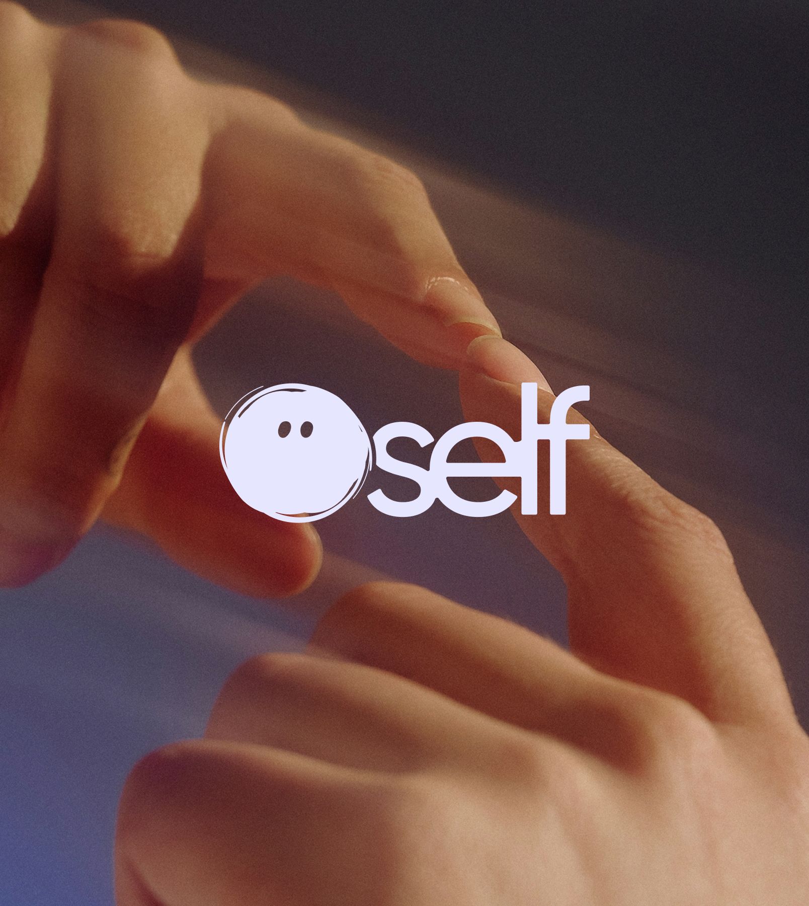
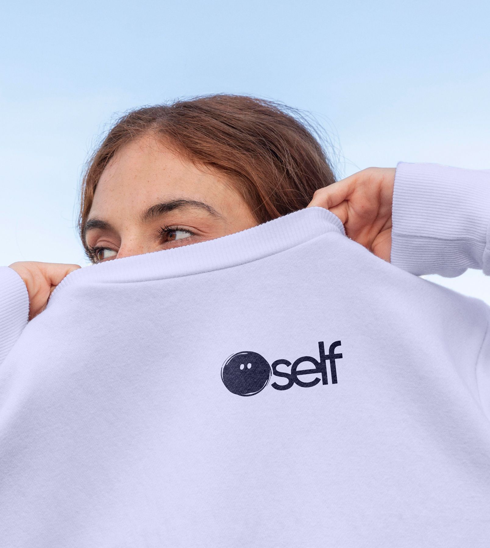
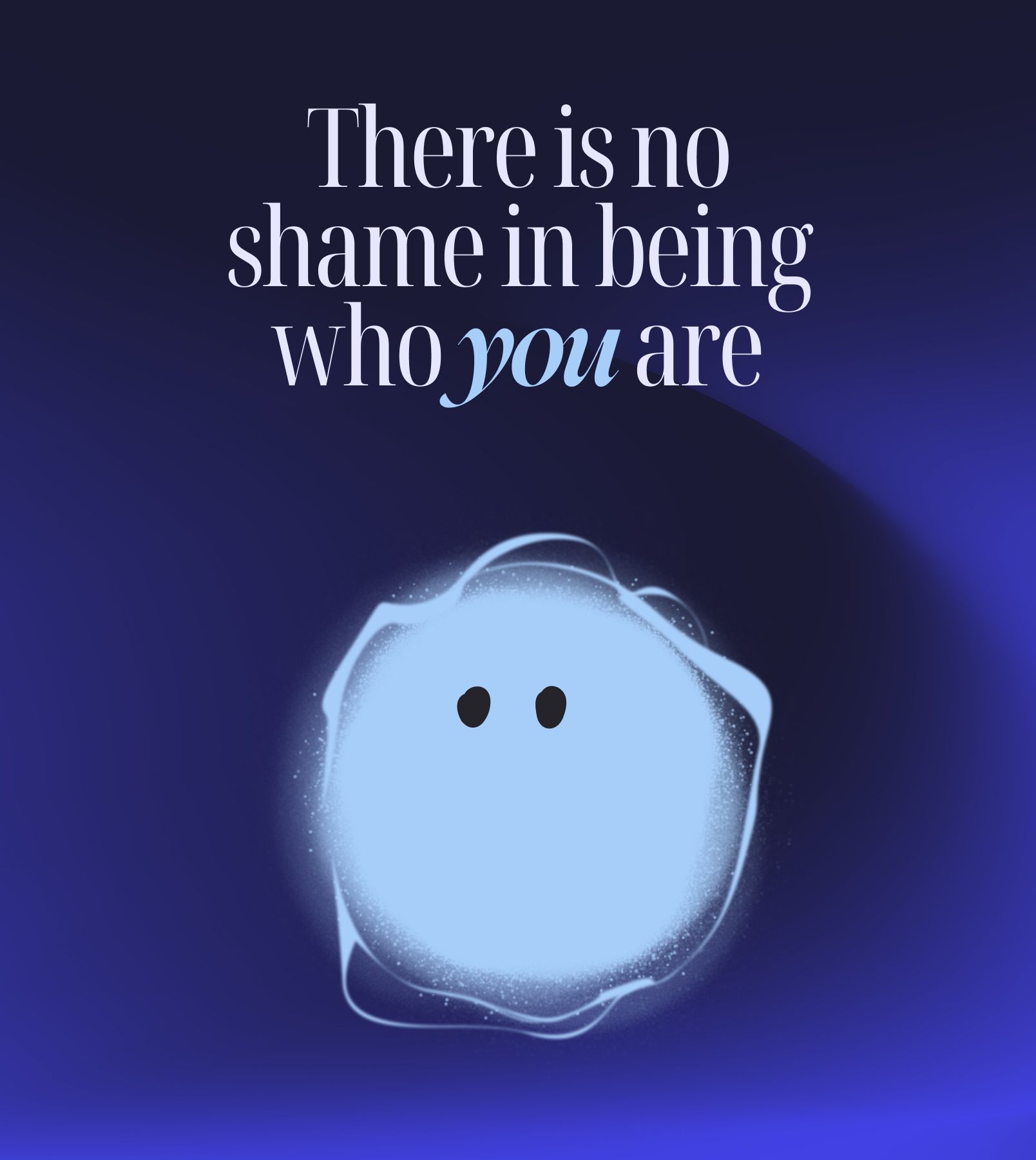
Self App is a safe space to explore yourself, so the vibe should also be calm, balanced, and made for self-expression. We leaned into cosmic-inspired purples, starry gradients, and some glow to spark emotional connection.
Not mascots but characters with the soul
The mascots personify Self’s states of mind, guiding users through each exercise. They’re abstract beings with no arms, no smiles, but with eyes that express feelings. Think of them as the emotional translators of the app.
Hundreds of screens aren’t a challenge for our UI
The total number of screens is huge! Besides the basics (onboarding, subscription, etc.), we worked on 10 unique exercises—each structured and polished with copy. Instead of launching all ten at once, we focused on four core exercises for MVP. That meant faster launch, lower costs, and real feedback before scaling.
Polishing some flows for retention
Polishing some flows for retention
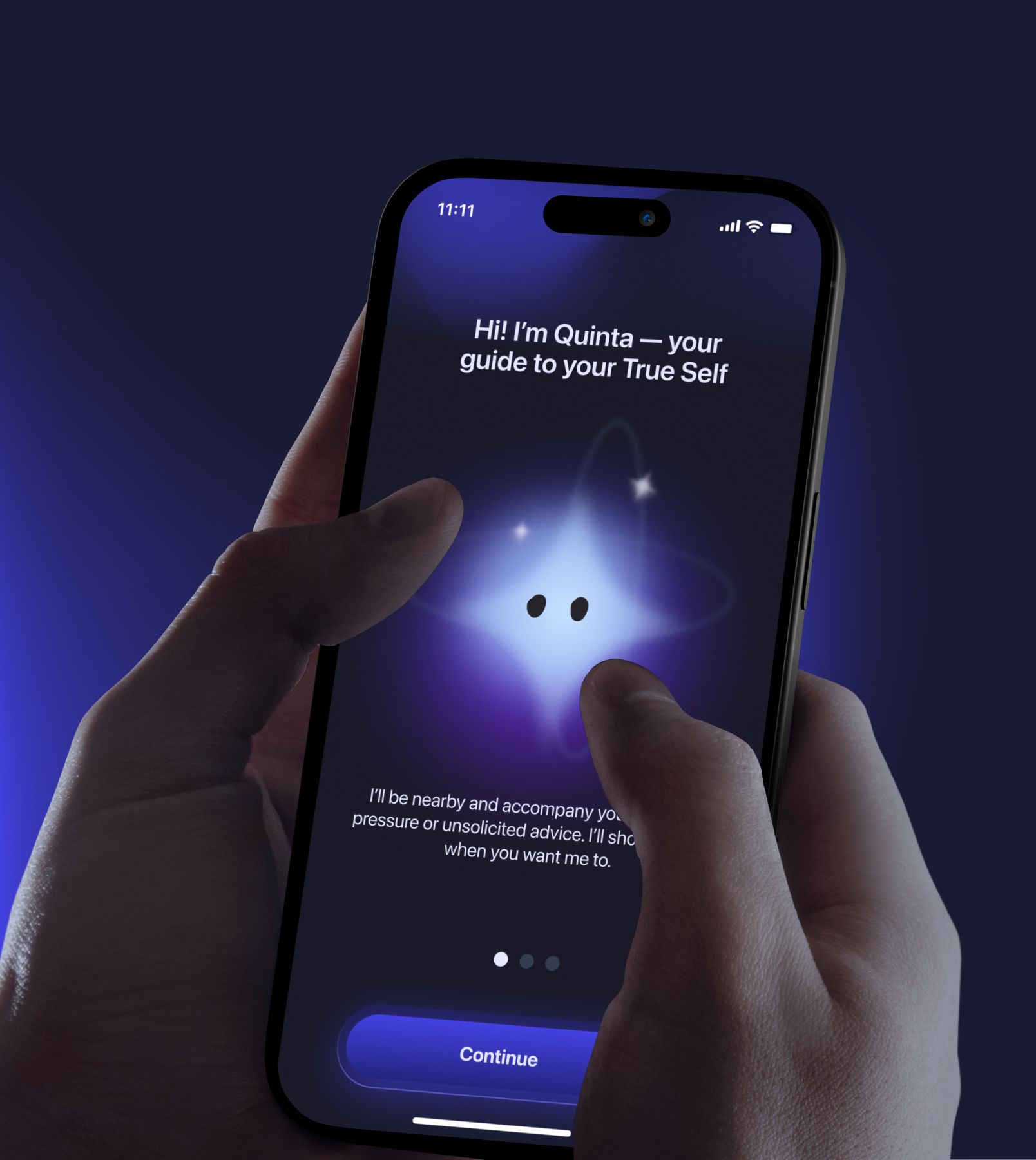
After launching the MVP, we rebuilt the onboarding flow to enhance the user experience. It’s built as a guided flow with a mascot-led narrative—Quinta, the star—suggesting grounding exercises and personalization questions to reduce drop-off and set up long-term engagement.
A website that speaks for the app
To launch big, we built a site that mirrors the app’s playful vibe. Dropped the main feature with mini-onboarding, spiced it with smooth micro-animations, made it SEO-friendly, and built on Webflow for scale & speed. The results paid off: the website won FWA of the Day.
Voice, writing rules, and red lines
Since the product would live with an in-house team, we built a comms guideline: brand role, tonalities, dos & don’ts, and checklists for writing across app, socials, and notifications. Locked in a glossary of product terms and delivered the editorial policy for 2 localizations (Ukrainian & English).
Transactional comms that aren’t ignored
We mapped out the user journey and crafted emails and push notifications that actually sound human (and on-brand, of course), reminding, supporting, and motivating users. So that every ping and touchpoint feels like part of Self App’s experience, not an interruption.

Qream integrates so naturally into the work with other teams that everything functions as a unified mechanism

Margarita Rybina
Product Manager
Project in numbers
8
Creative specialists onboard
1
FWA of the Day
4
Key assets: brand identity, app, website, comms guidelines
Recognition: