How we transformed a fintech platform: branding, product design, development
They turn financial fears into financial freedom
RetireUS is an American fintech platform helping users plan for retirement early—with advisors, unlimited chats, and tools to assess their financial health in minutes.
They came to us with a vision: make retirement planning cool (and actually understandable). So we had a mission: turn that dream into a brand people trust.
Building a trustworthy brand
We built the identity around the idea of financial mindfulness to keep calm confidence when it comes to money. It balances trust and warmth: shades of blue ground the brand in stability, while a touch of orange adds optimism and human energy. This palette is a reminder that planning your future isn’t cold calculation, it’s self-assurance in color form.
Decoding optimism in the visual symbols
The RetireUS logo unites a person, a sun, and a bird—a visual metaphor for confidence and freedom. It embodies the brand’s core idea: when you achieve financial clarity, you gain the strength to rise above uncertainty.

Don’t forget about the human touch
We created a set of illustrated retirees, friendly mascots that made the topic feel approachable and, dare we say, fun. It helped create some emotional safety, allowing users to relate and believe that, yes, they can take control of their financial future.
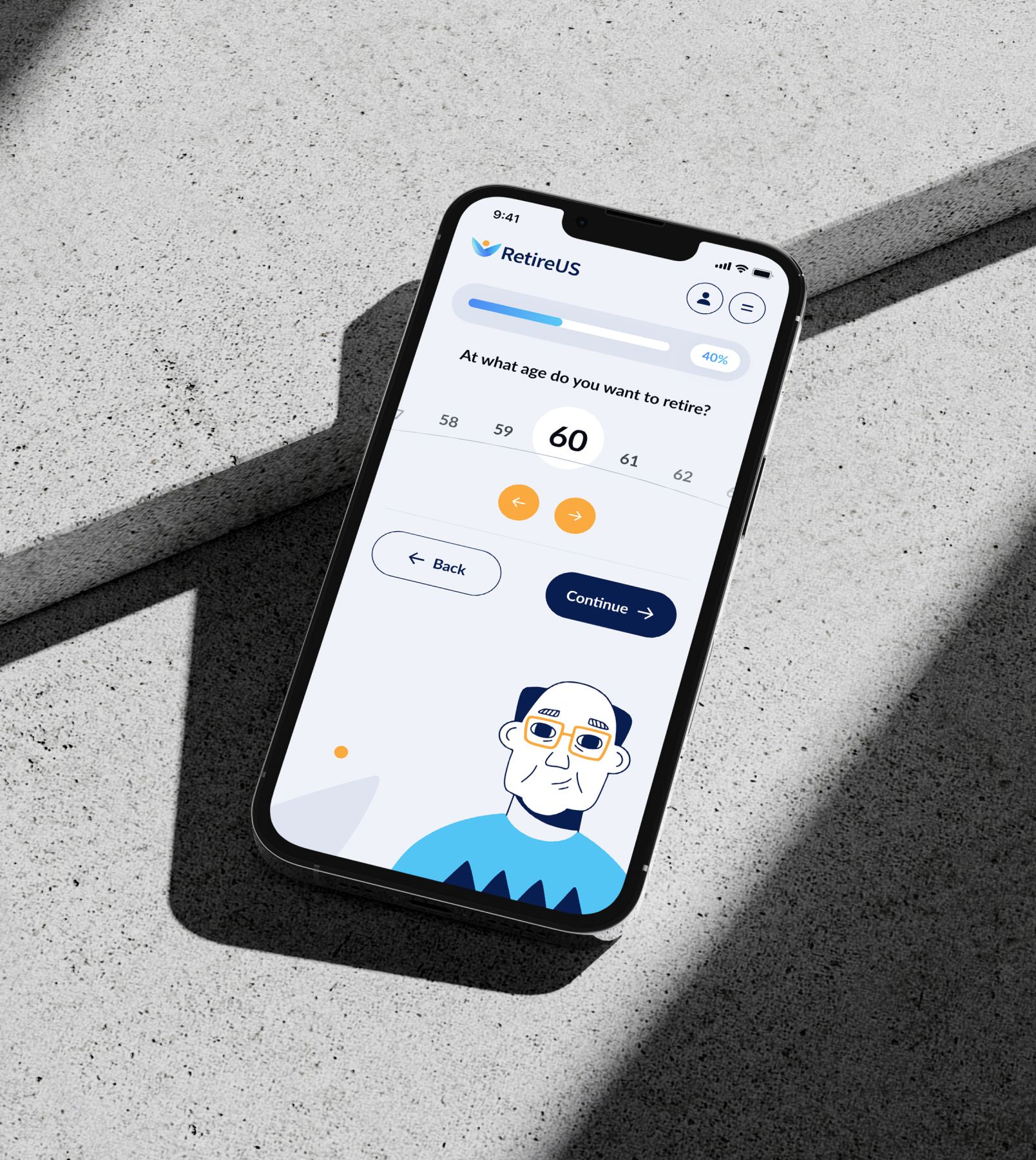
Breaking down complex financial info
The core of RetireUS is Financial Checkpoint—a comprehensive financial planning dashboard that brings users and advisors together. We mapped every flow from onboarding to goal tracking, turning complex data into simple steps & questions.
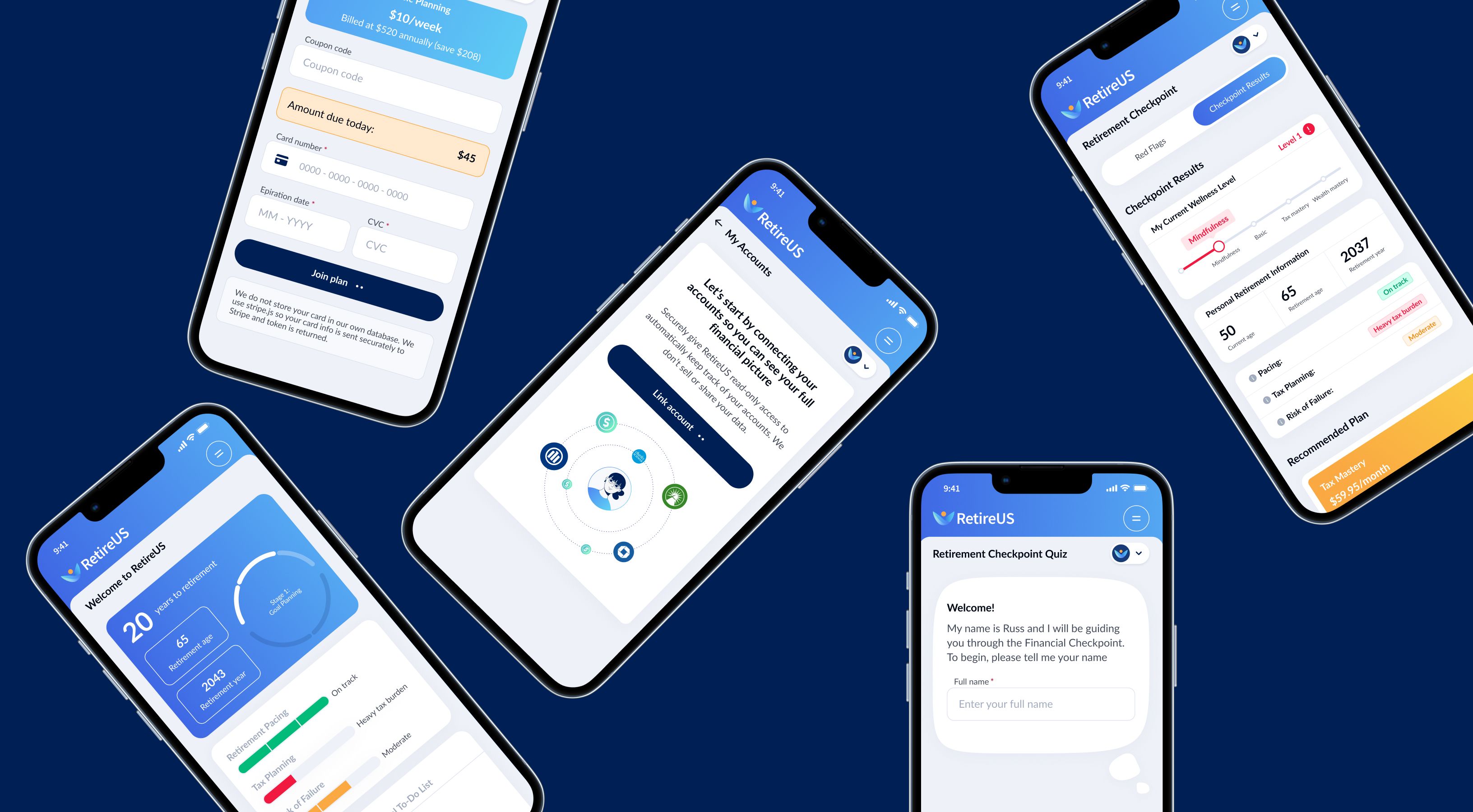
Polishing product & UX until it rocks
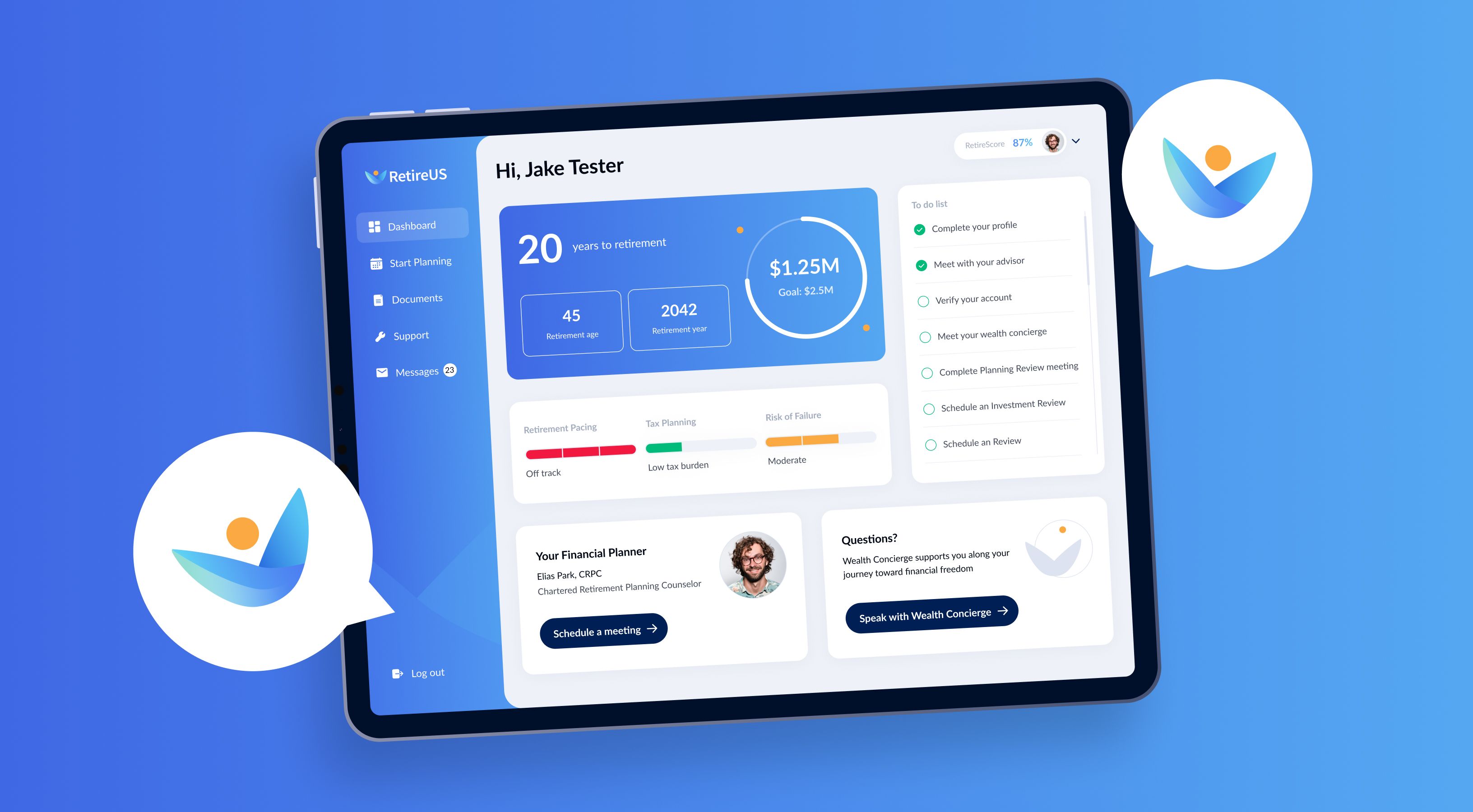
After launch, we kept pushing the product forward, rethinking how people engage with their financial data. Checkpoint 2.0 became more interactive and gamified, highlighting risks and wellness levels with actionable steps to improve them.
We added new tools that let users link all their external bank accounts, track debts, and monitor their full financial picture in real time. Every feature was designed and developed by the Q-team, making the dashboard more insightful and intuitive.
Product redesign made us look dramatically different and much more user-friendly and intuitive

Michael Scarpati
CEO of Retire US
Time to craft website experience
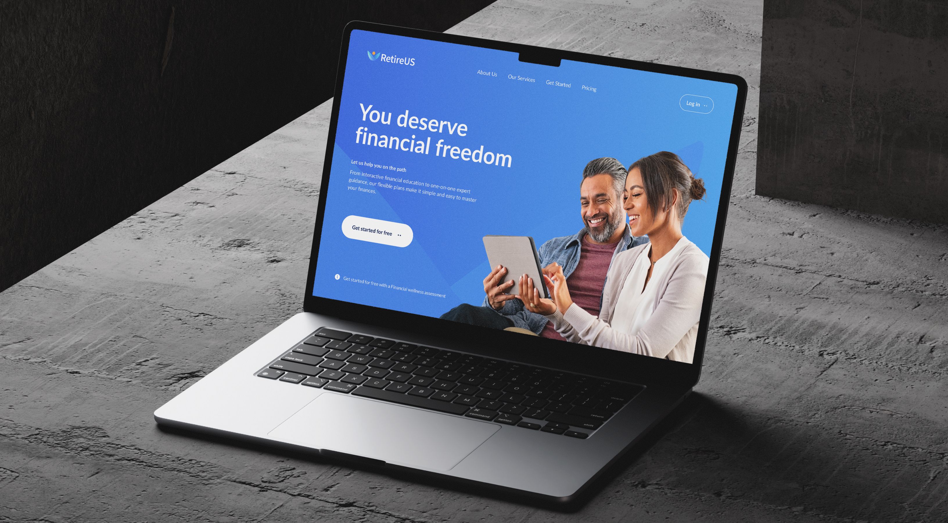
Once the brand and the product had a heartbeat, we gave them a body—a new website that turned awareness into action. It became more than a marketing tool but the entry point to the RetireUS ecosystem, seamlessly bridging education and product experience.
Every element was designed to reflect clarity and transparency. From the moment users landed on the homepage, they were guided toward what really matters: understanding their financial position and getting started with a trusted advisor.
Full-stack rebuild: modernizing the backend
As the product matured, it was time to strengthen the tech foundation. We led a complete refactor of the platform, migrating the backend, streamlining performance, and rebuilding the frontend with Next.js for speed and scalability.
We cleaned the codebase, optimized integrations, and designed a structure that could evolve with the business.
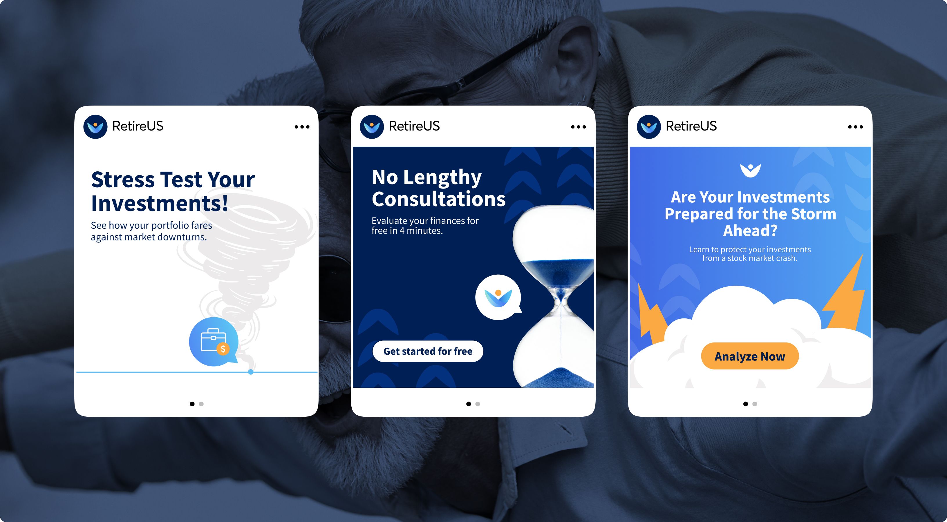
Slaying any other visual communication
Whenever needed, we’re becoming a RetireUS on-demand design team by supporting their marketing campaigns & social media, designing one-pagers & decks, and helping translate financial insights into any visual that resonates—some of which even made it onto Fox News.

And what we have now:
1399403
users actively engaging with the product
+1
Platform that turns complex financial data into clarity
+1
Brand that proves financial planning can feel easy