Smooth branding for a fintech that wants to stand out
Financial infrastructure that didn’t want to be bland
Creem is a Merchant of Record platform that helps teams accept payments globally—minus tax chaos, accounting pain, and cross-border drama. They reached out to us to make the brand more memorable and human, without breaking what already works (the name, color, and logo recognition had to stay).
The key rebranding goal was to turn Creem into a brand people would describe as approachable, cool, and community-driven—finances that feel smooth like ice cream. So we rolled up our sleeves and got to work.
3 vibes to start with
We explored three directions, aka brand concepts, to differentiate how exactly Creem can become emotional and human.
Concept #1
Everything
in one place
The core metaphor: folders that hold everything you need. Frames serve as visual cues that everything is structured and under control.
Concept #2
A true skipper
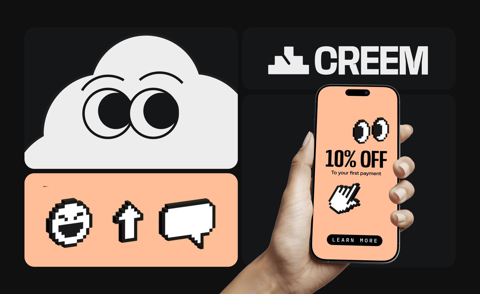
This one introduced a mascot that works as a visual guide, paired with 8-bit-style icons. Together, they reduce the flatness of typical fintech aesthetics.
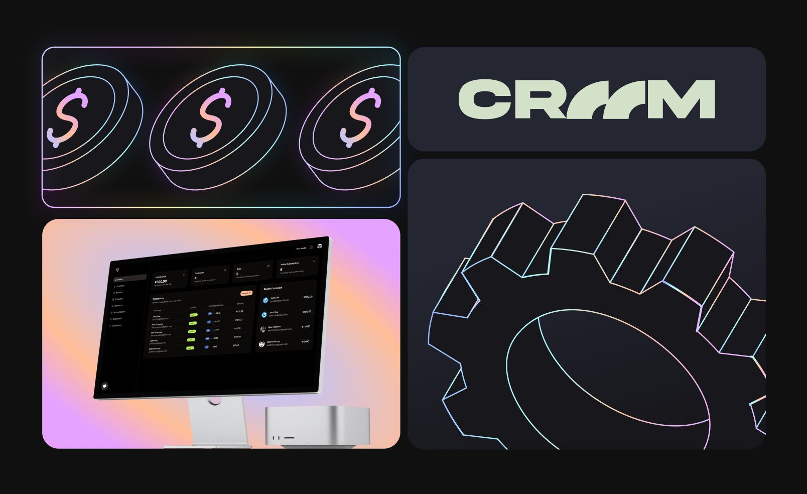
Concept #3
Full control
Linear, block-based layouts create a sense of precision. And bright gradients keep it from feeling cold or overly corporate.
Refining the idea that clicked
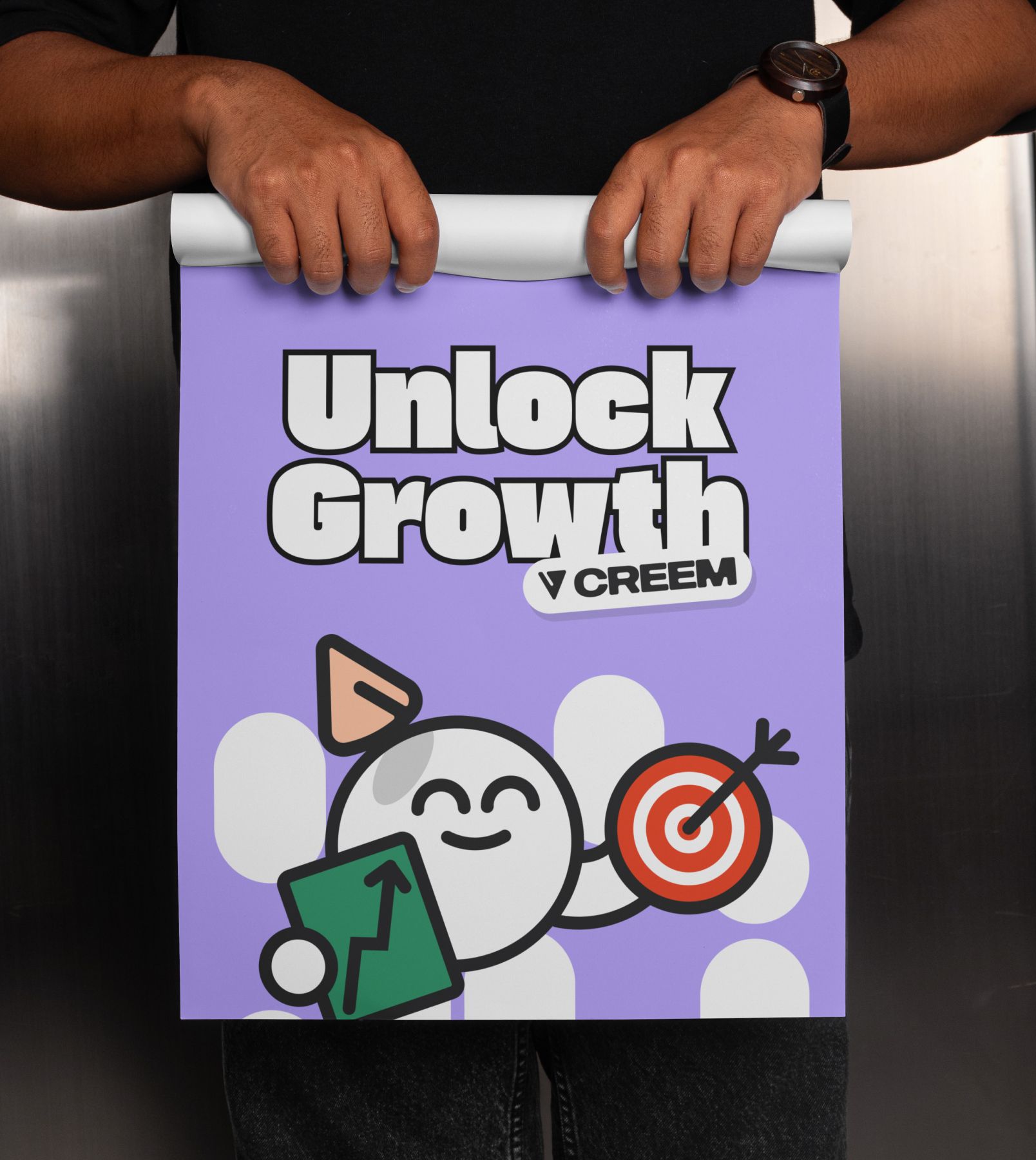
Concept #2 won with slight notes: the ice-cream shape and 8-bit icons didn’t fully fit. So we added a bit of personality and reshaped the mascot into a scoop with a cone hat that also reads as a speech bubble. That single move unlocked emotion, communication, and flexibility across the entire visual system.
Softening the logo without losing its spine
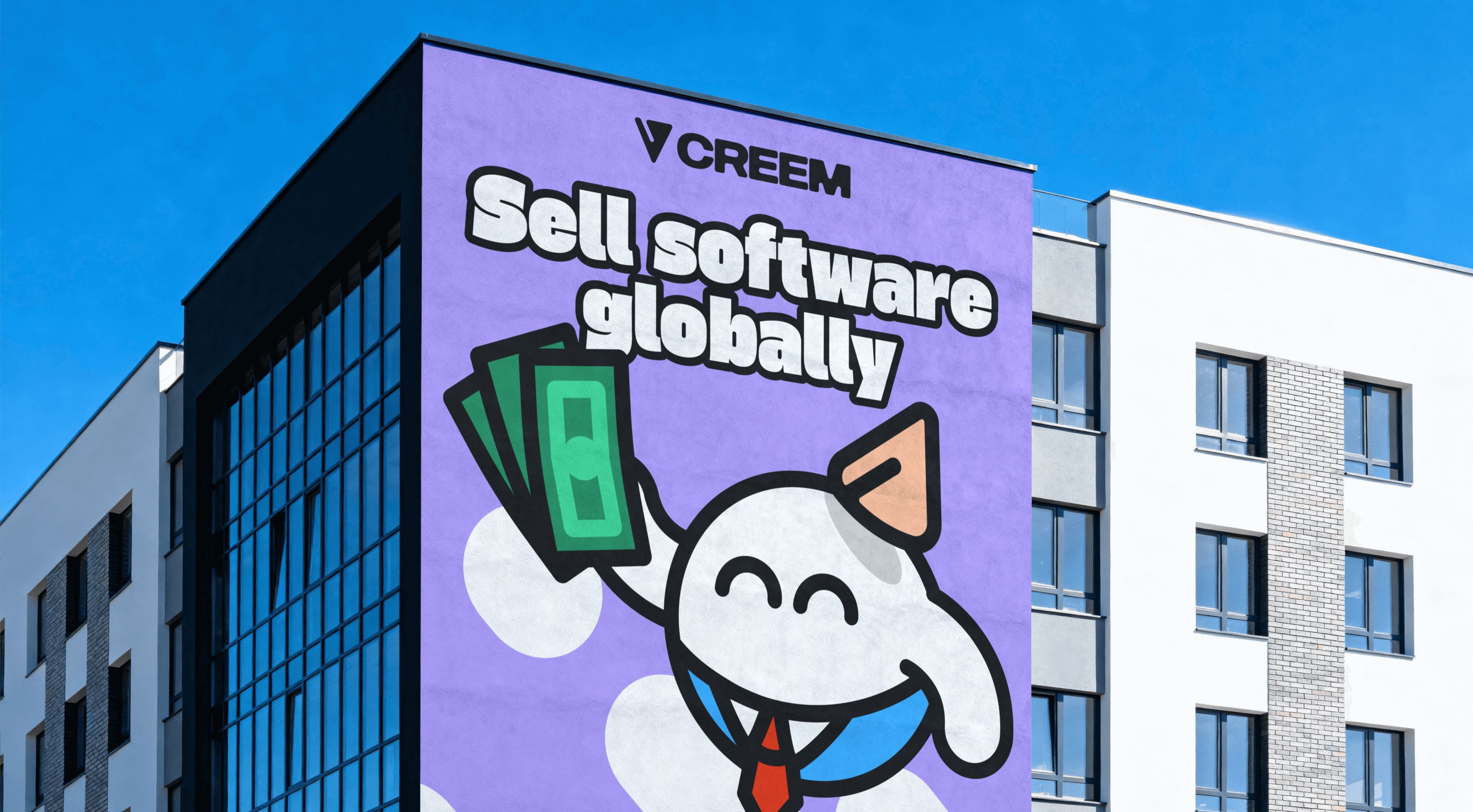
The original logo was sharp, triangular, and very fintech-coded. We kept the triangle, then softened it with a creamy texture inspired by ice cream. Same structure, but a new feeling—less corporate edge, more warmth, and still recognizable for the existing brand.
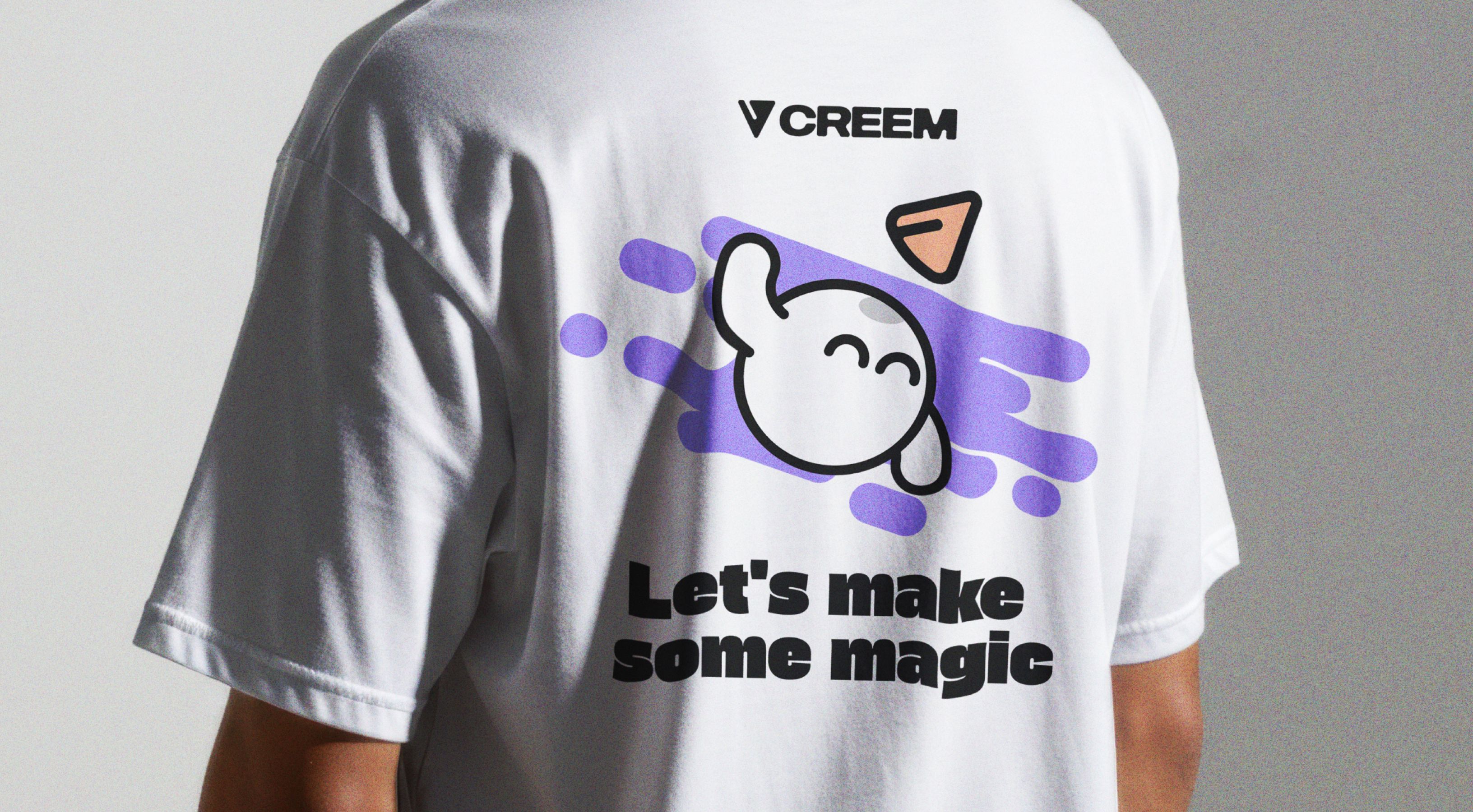
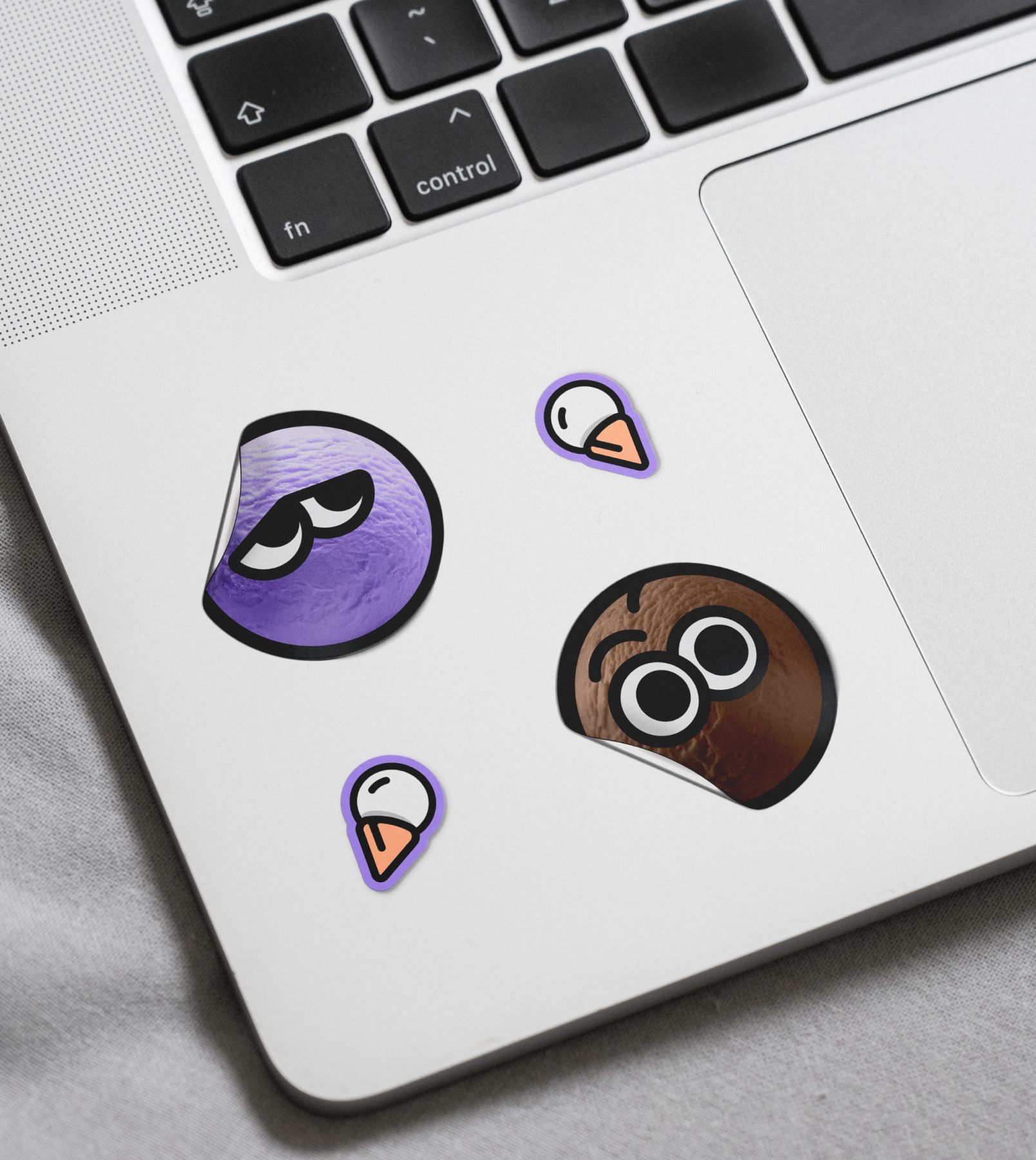
A mascot that makes you feel something
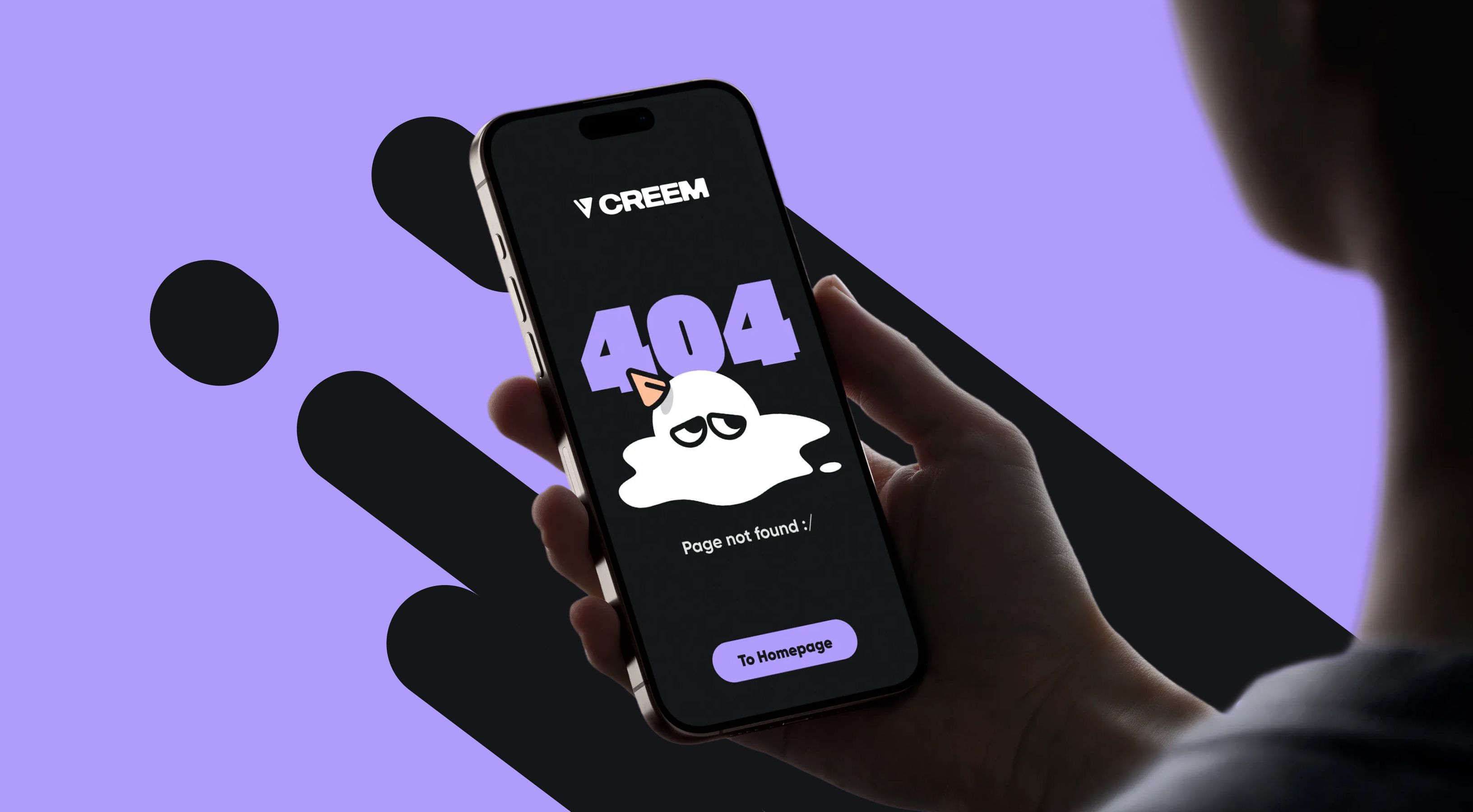
We expanded the mascot into a full character system: situational versions, festive moods, even a Bitcoin form. With eyes and arms, it can smile, panic, roll its eyes—or literally melt when things go wrong (like on the 404 page). Melted ice-cream shapes became graphic elements, adding more authenticity throughout the brand.
Absolutely love all of the mascots!

Gabriel Ferraz,
Co-Founder & CEO
Creating a brand system
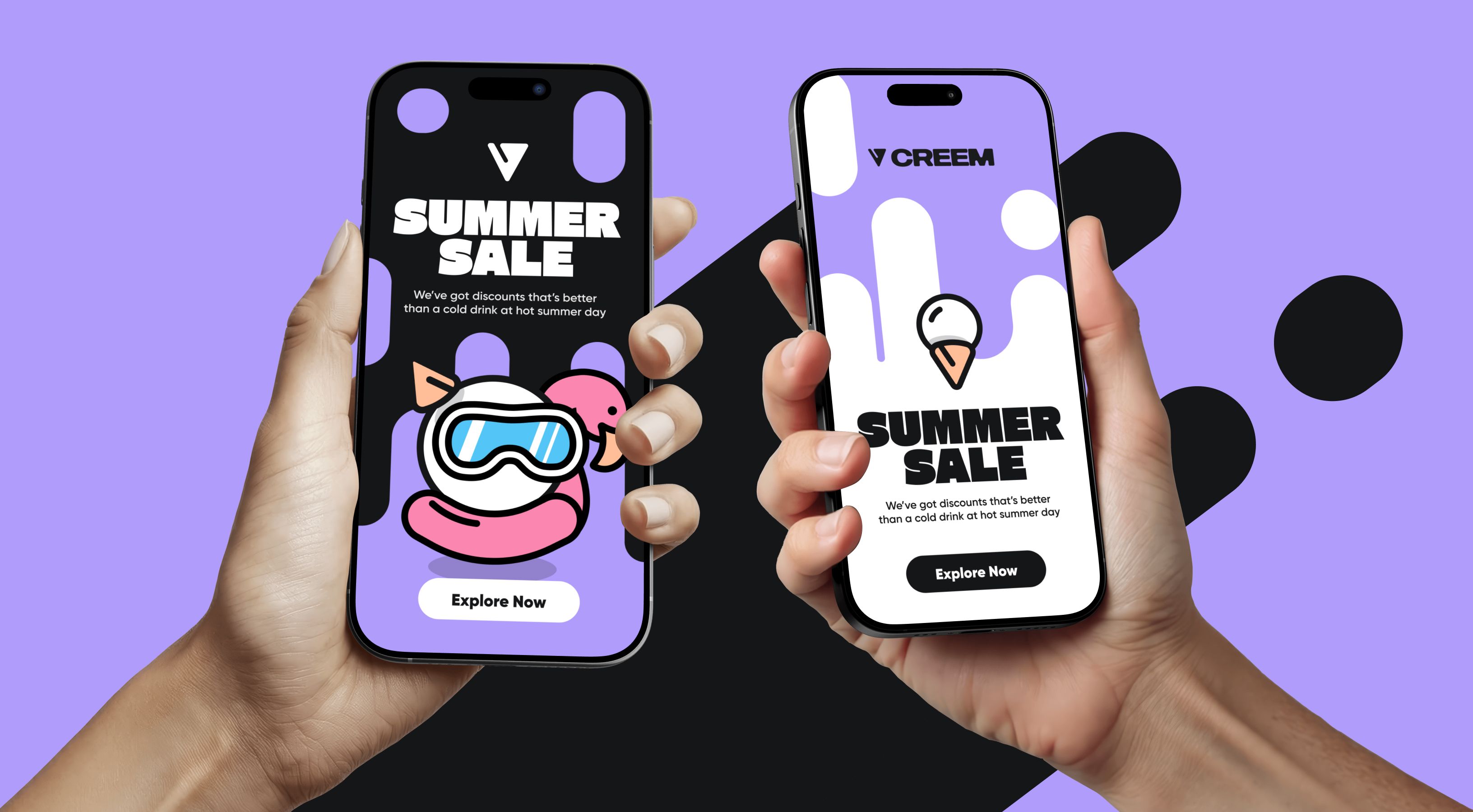
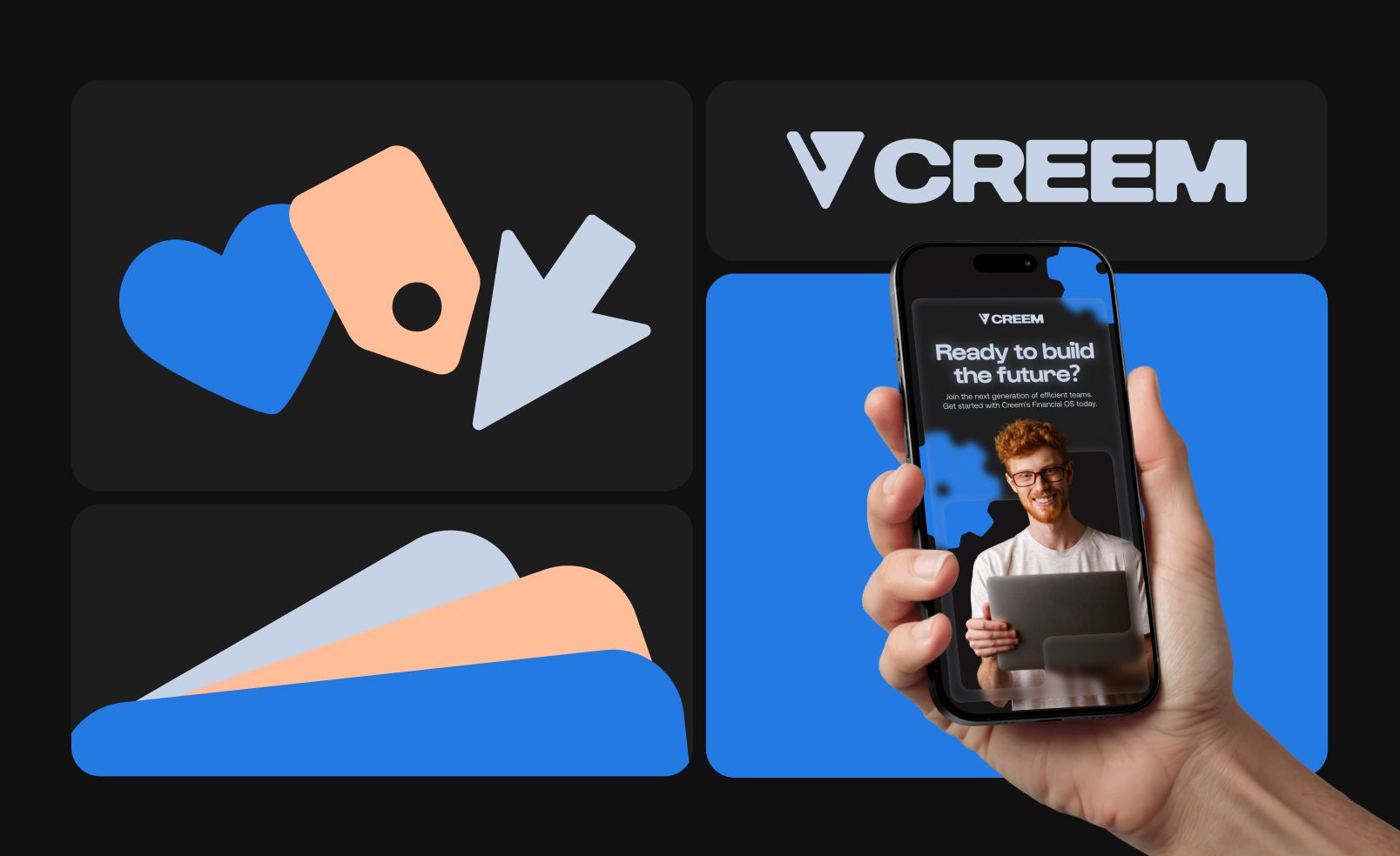
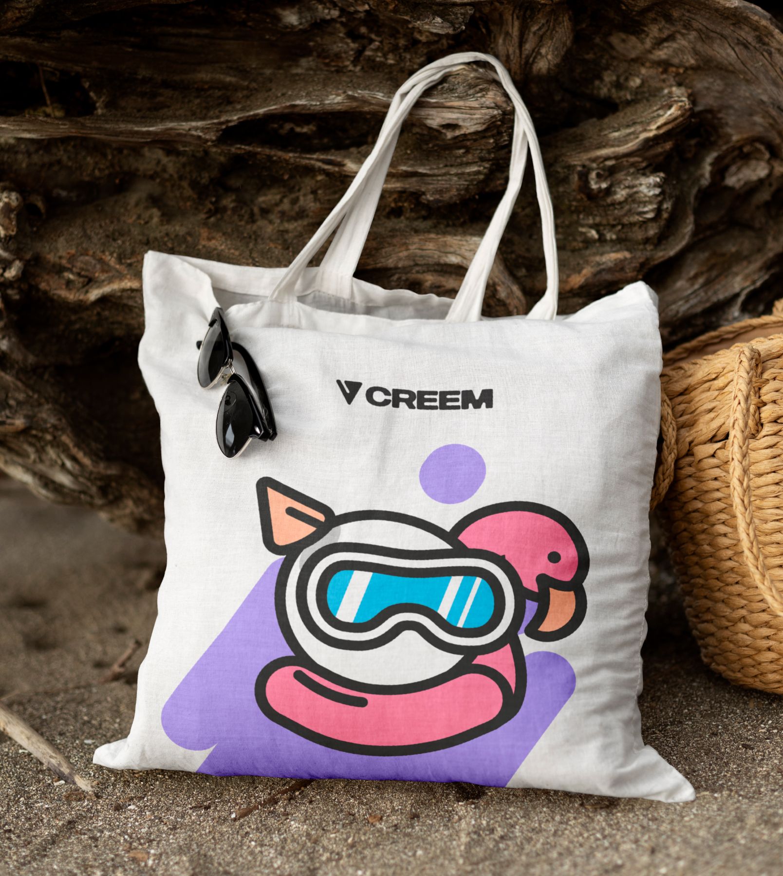
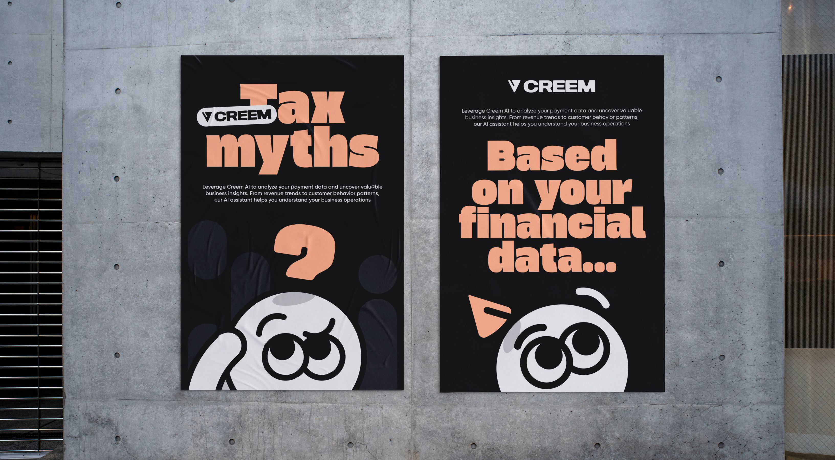
We locked the color palette and defined strict (but flexible) color pairings. Built a fully custom icon set with 30 options to go. Added backgrounds, stickers, speech bubbles, and supporting graphics. From now on, everything works as a cohesive system, prototyped in Figma.
Solutions that feel right for the client
Creem’s team uses Canva daily, so we didn’t fight that—we optimized assets for it. We delivered a Canva brand kit with all elements, icons, and a mascot constructor. Now the team can move fast and stay on-brand without friction.
Template everything marketing to save time
We templated all key assets: social posts (LinkedIn, Instagram, X), profile banners, posters, and pitch decks. Multiple layout variations per asset mean flexibility without reinventing the wheel—perfect for a small, fast-moving team.
Branding that shows up in the product
We ensured the rebrand is reflected not only in the guidelines but also applied the identity to Creem’s dashboard and app screens to show how it lives in-product. With color updates, mascot moments, and subtle micro-animations, we added the personality they were seeking.

The project in numbers
1
month for rebrand, templates, and product adaptation
4
creative minds involved
80
social media templates delivered