Setting the route for a new US nationwide brand
Road to rebrand
Nick came to us with a brand stuck in traffic—lost in a sea of soundalike competitors. They didn’t want to be just another buyer. They aimed to become a national brand that helps Americans easily get rid of their old cars.
Meet your break-up buddy
The brand name blended into the crowd, its messaging lacked emotional connection, and its potential was stuck in neutral. We saw a chance to shift gears—from logic to emotion, from transaction to transformation.
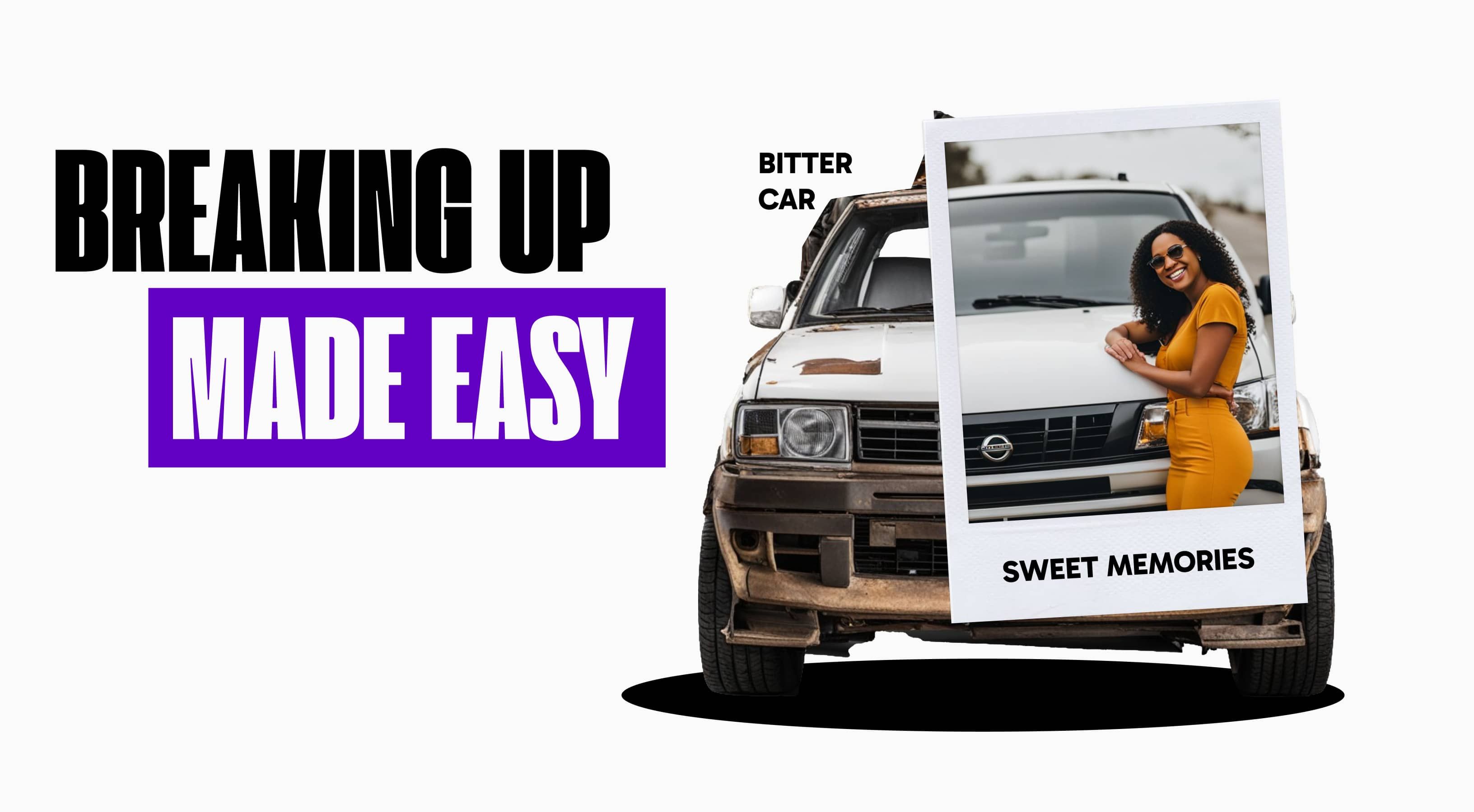
People aren’t just selling junk cars. They’re letting go of memories. Our big idea: be the trusted friend who makes parting with your car less painful. Not just a buyer—a break-up buddy who understands the bittersweet moment of moving on.
Add a lemon
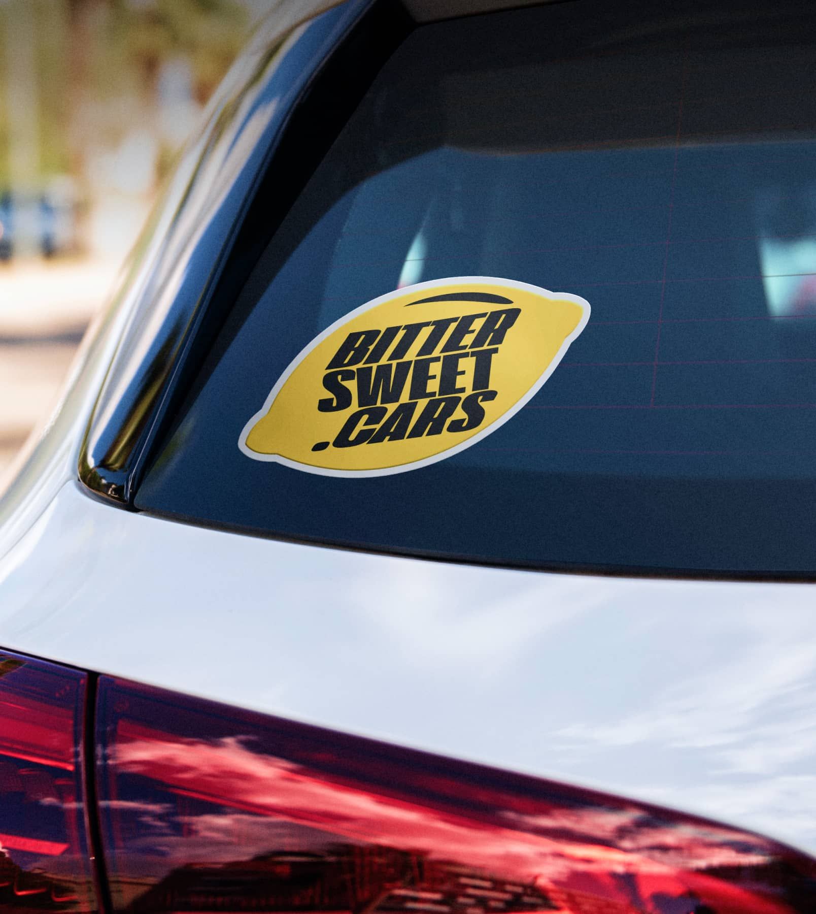
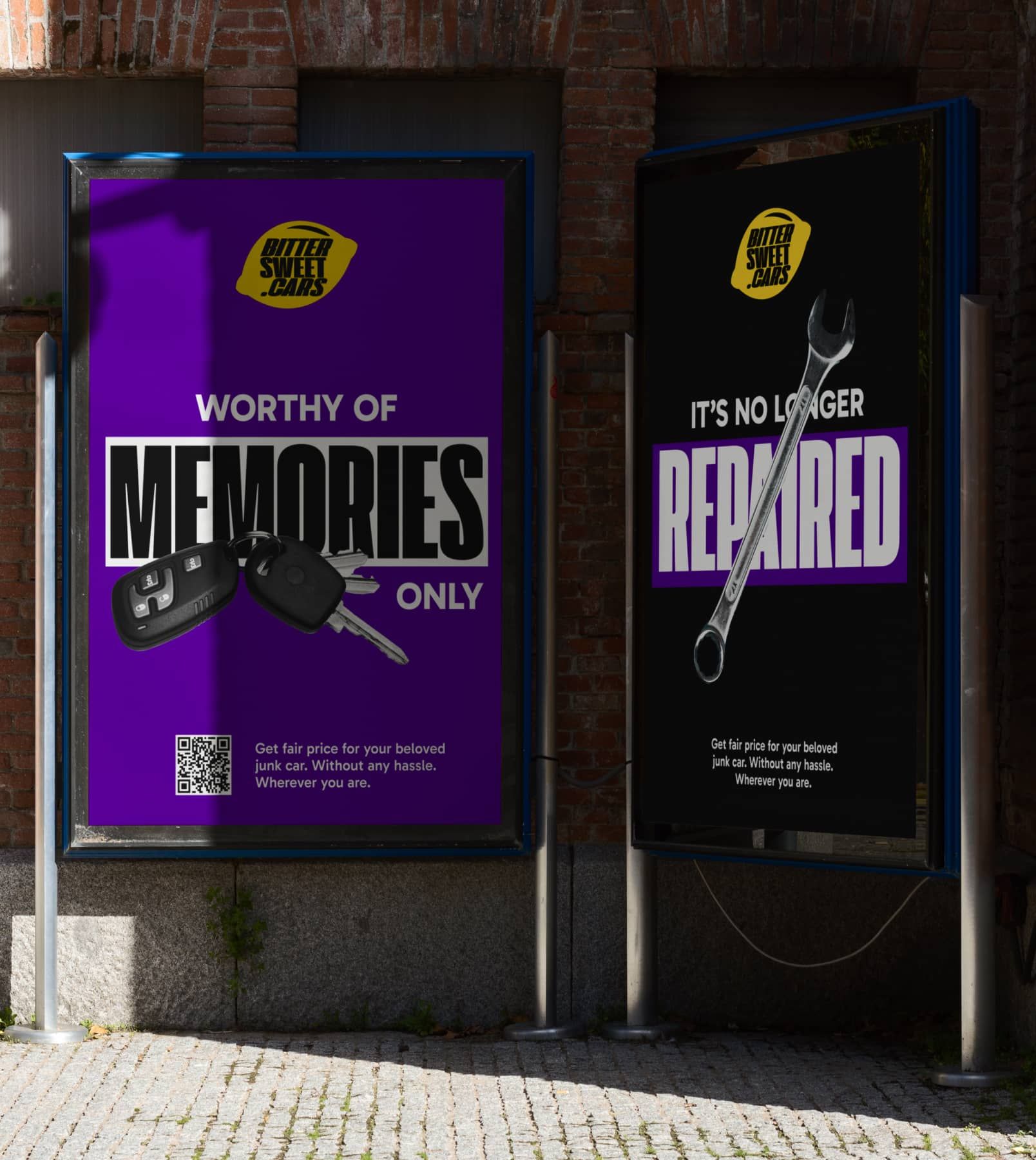
A new logo became the lemon—a playful nod to broken-down cars with a twist of irony. It is sweet on the outside, with a hint of bitter reality inside.
“Lemon” is slang for a broken car. That contrast felt just right—familiar and a bit ironic.
Follow the smoke and nostalgia
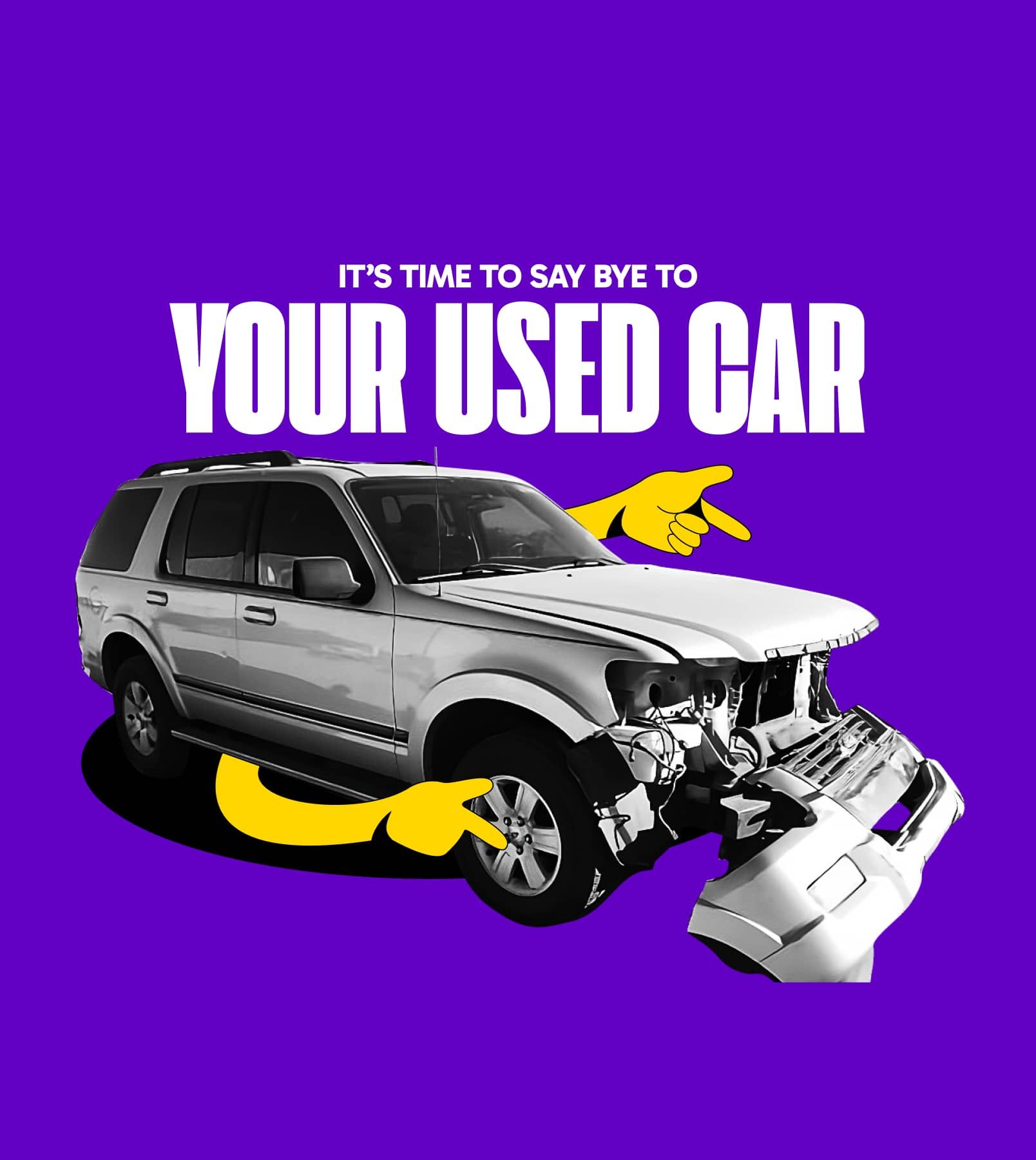
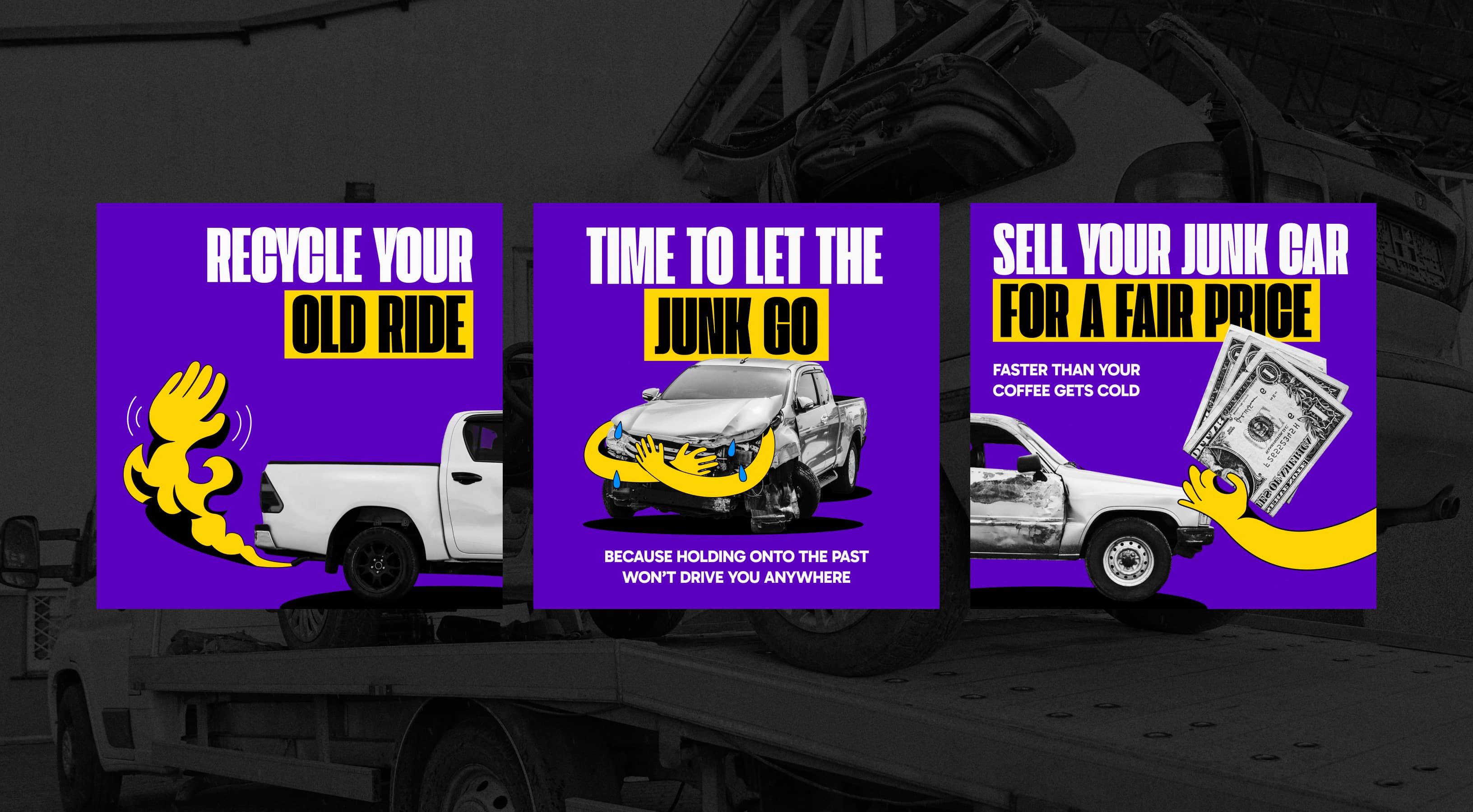
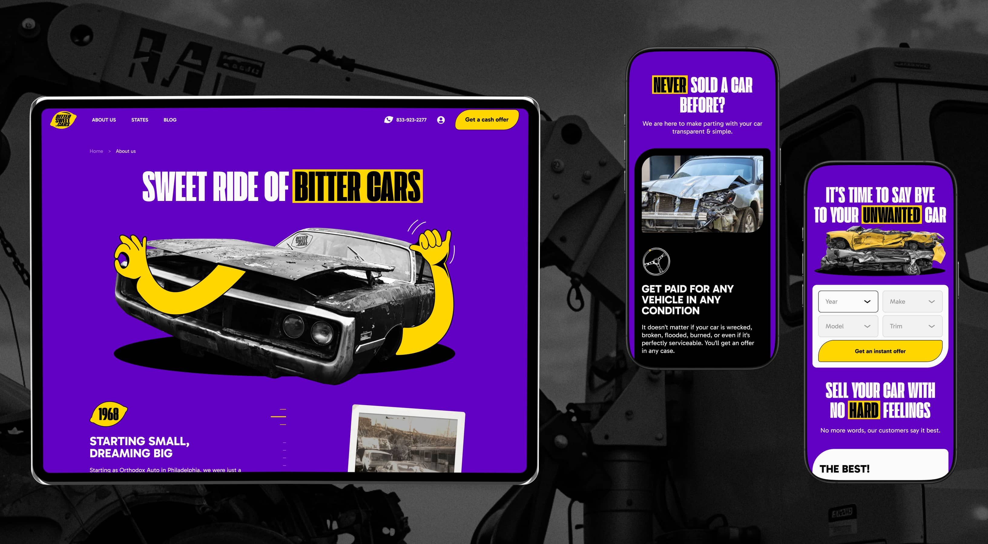
We gave the car a bit of personality too. The exhaust smoke isn’t just smoke—it turns into a hand, an arrow, whatever we need it to be. It moves, points, and guides. It’s a tool we use across different marketing pieces.
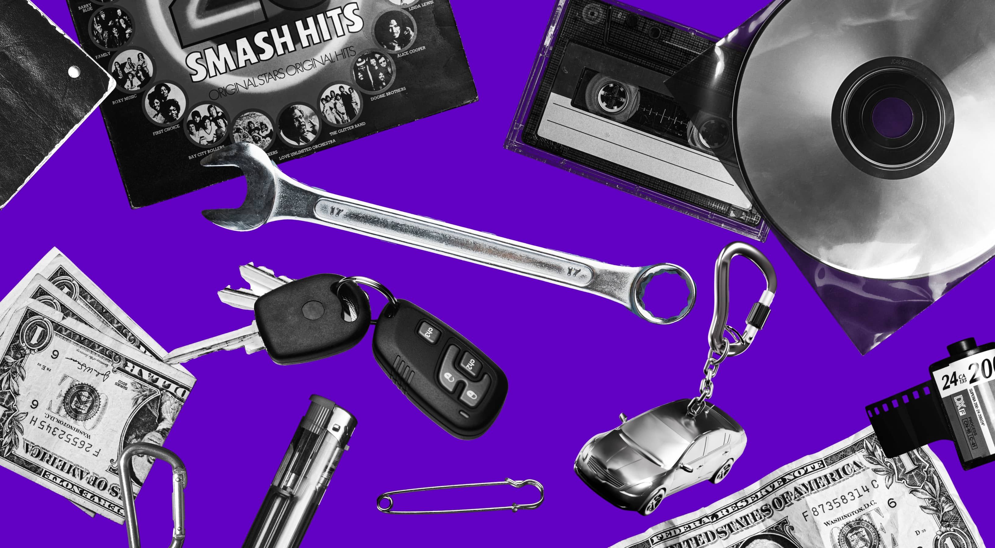
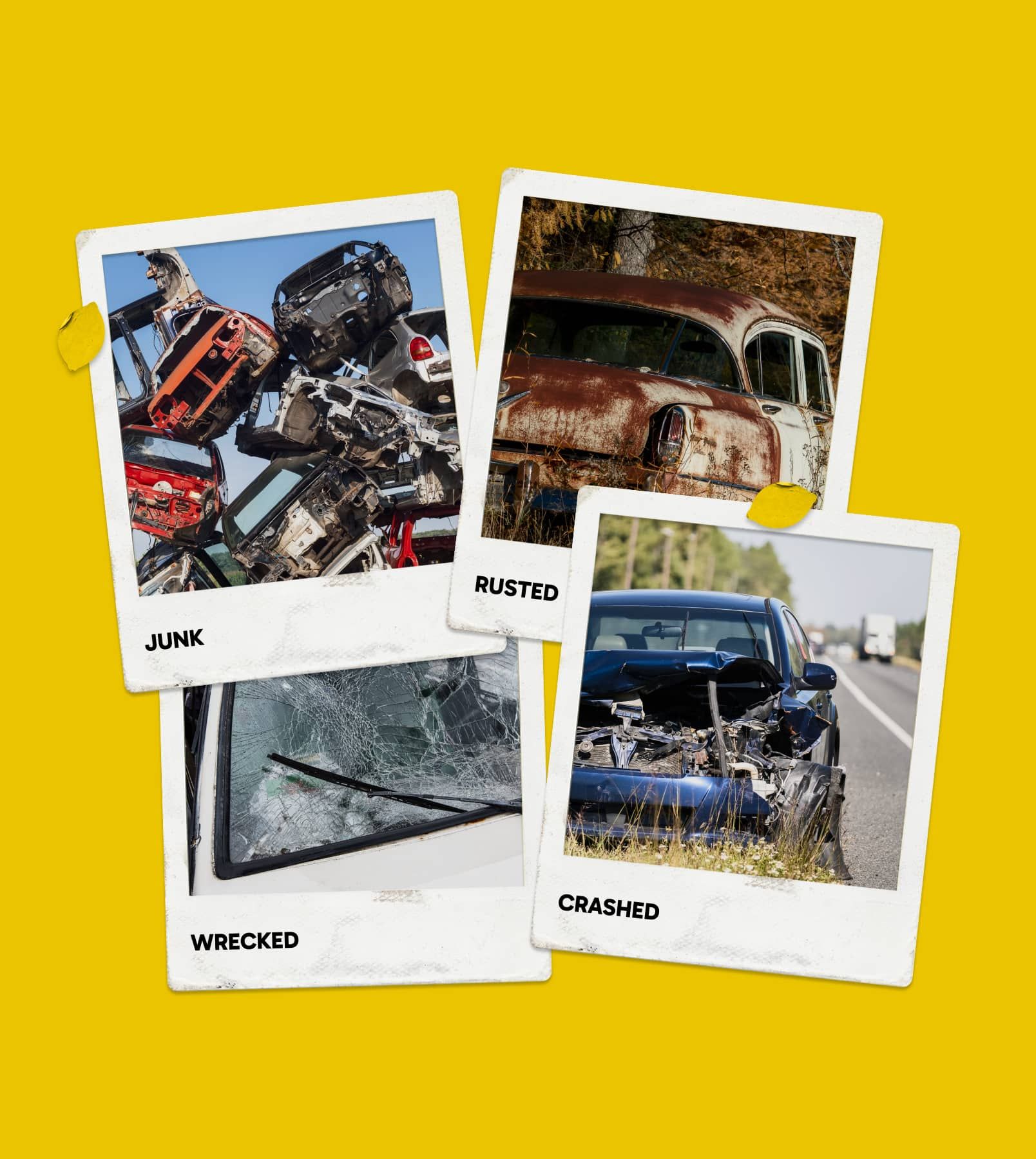
The identity taps into the kind of nostalgia you find in old cars—the quiet charm of coins in the cupholder, Polaroids fading on the dash, a lighter that somehow still works. Small, ordinary things—but loaded with stories.
Smooth out the roadblocks
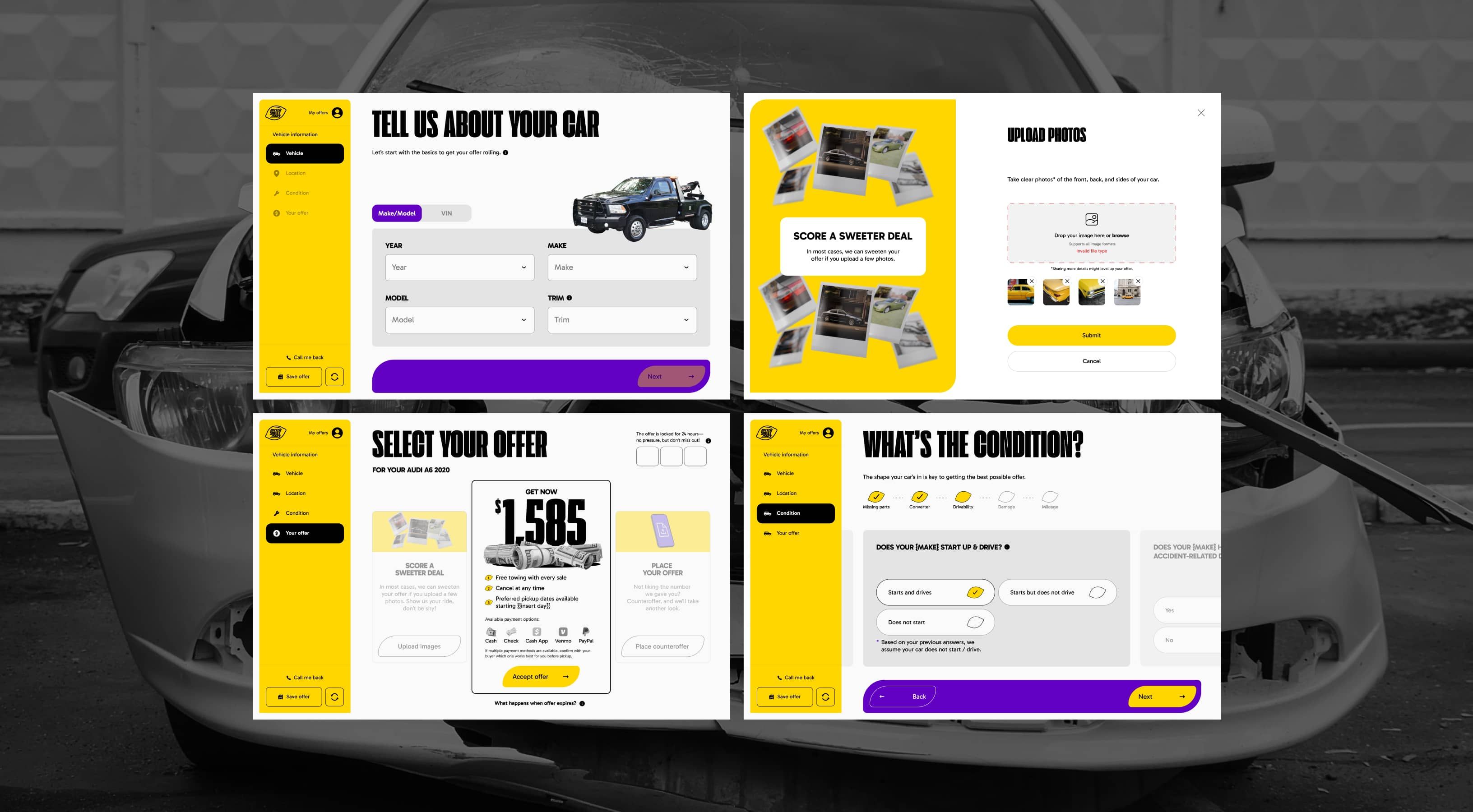
Most people think selling a car is like navigating without GPS—confusing, time-consuming, full of wrong turns. We rebuilt the digital experience to be as smooth as a freshly paved highway.
Through the website’s narrative, we showed just how simple the process actually is. We packed every step with helpful tooltips and built easy explainers for re-registering documents. No guesswork, no drama.
We handled the full storyline—mapped out the narrative, nailed the core messages, wrote all the copy, and built the structure. Then came the wireframes, the UI, and custom 3D icons that gave the whole thing character.
Test drive. Two versions, one destination
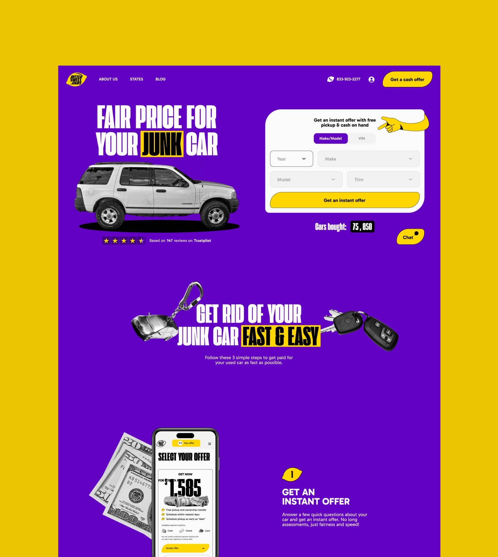
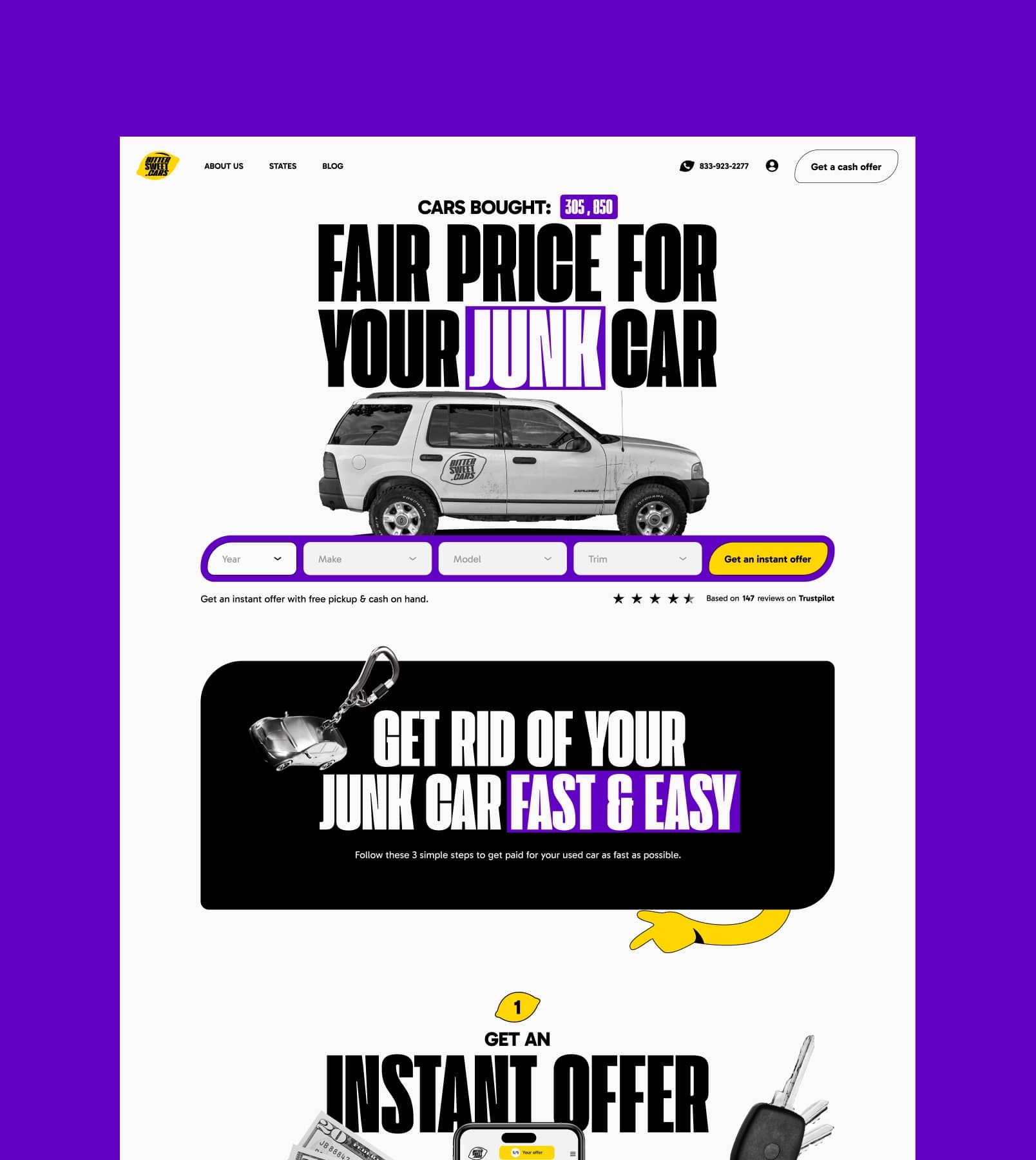
We built two site variants to see what drives clicks and conversions. Because we’re not here to guess what works, we measure it.
Fuel up with knowledge
One of the key features we built was the car sale calculator—an interactive, quiz-style tool that shows people how much they could sell their car for. We designed it for real usability: multiple scenarios, smooth UX, and clean, clear visuals that make everything click.
Equip the team
Even the best vehicle needs a trained driver. We developed comprehensive training materials, ensuring every team member spoke the same language and followed the same map.
From conversation blueprints to customer profiles, we built the navigation system that keeps the entire operation on course.

Signal on all channels
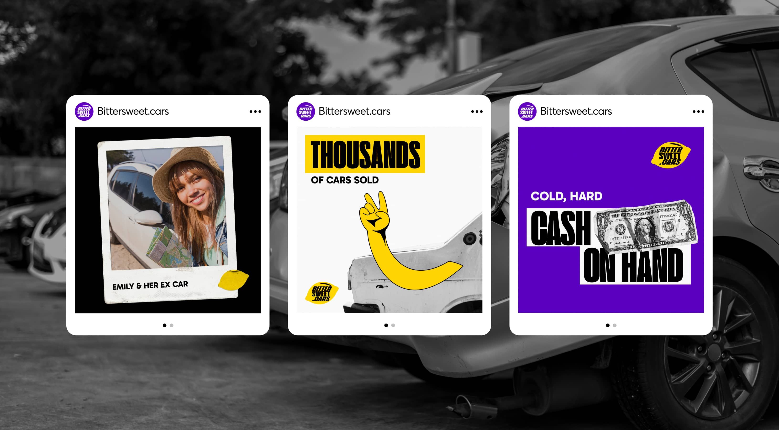
With the brand fueled up and ready, we took to every road and highway of digital marketing. Our team didn't just create the strategy—we drove it ourselves.
From social media campaigns to performance marketing tactics, we maintained a consistent, powerful presence that grew stronger with every mile.
